Graf von Faber-Castell, that’s Faber-Castell’s posh product line started in 1993. Back then our favourite count, Anton-Wolfgang Graf von Faber-Castell, introduced this line as part of Faber-Castell’s reorientation. As a pencil enthusiast, I am quite happy that the Graf von Faber-Castell line has not neglected the humble pencil. There was a Graf von Faber-Castell version with only an eraser cap, a pencil extender and the perfect pencil and there were some other pencils along the way, like the fluorescent Graf von Faber-Castells.
This Graf von Faber-Castell Journal and Pencil set is available for free with most purchases from The Pen Company’s Graf von Faber-Castell line. I got it free of charge when I recently placed an order with them.
The pencil included in this set is one of their fluted pencils with a silver plated end cap. I assume it is silver plated, not solid silver but I am not 100% sure. These pencils are a bit harder than the very old Graf von Faber-Castell pencils, but certainly softer than a Faber-Castell HB pencil. In any case, they are a pleasure to write with while keeping the point fairly well.
The notebook you get is clothbound and has thick, creamy paper in a kind of slightly yellow shade of light beige. It feels quite different to the ordinary white from most notebooks. Despite the smooth surface, the paper is taking the graphite on very well. I am spelling this out because some smooth paper, like the one found in the original Field Notes, is very smooth and doesn’t work well with pencils – as if the paper is too smooth and not abrasive enough to get the graphite off the pencil and onto the paper. This Graf von Faber-Castell paper does, however, feel very smooth to the touch but is ‘abrasive’ enough for use with HB pencils. The writing experience on this paper is just excellent. It’s a shame you can’t buy these individually, but since they’ve been around for at least five years I hope that we will still see this notebook as part of some special offers in the future.
This blog post has been published on The Pen Company’s Blog, too. Just to spell it out, I have not received any money for writing this blog post.
If blog posts had soundtracks this post would play Billy Ocean’s “When the Going Gets Tough, the Tough Get Going” in the background [1]Please hum along if you like. I assume that won’t infringe any copyright..
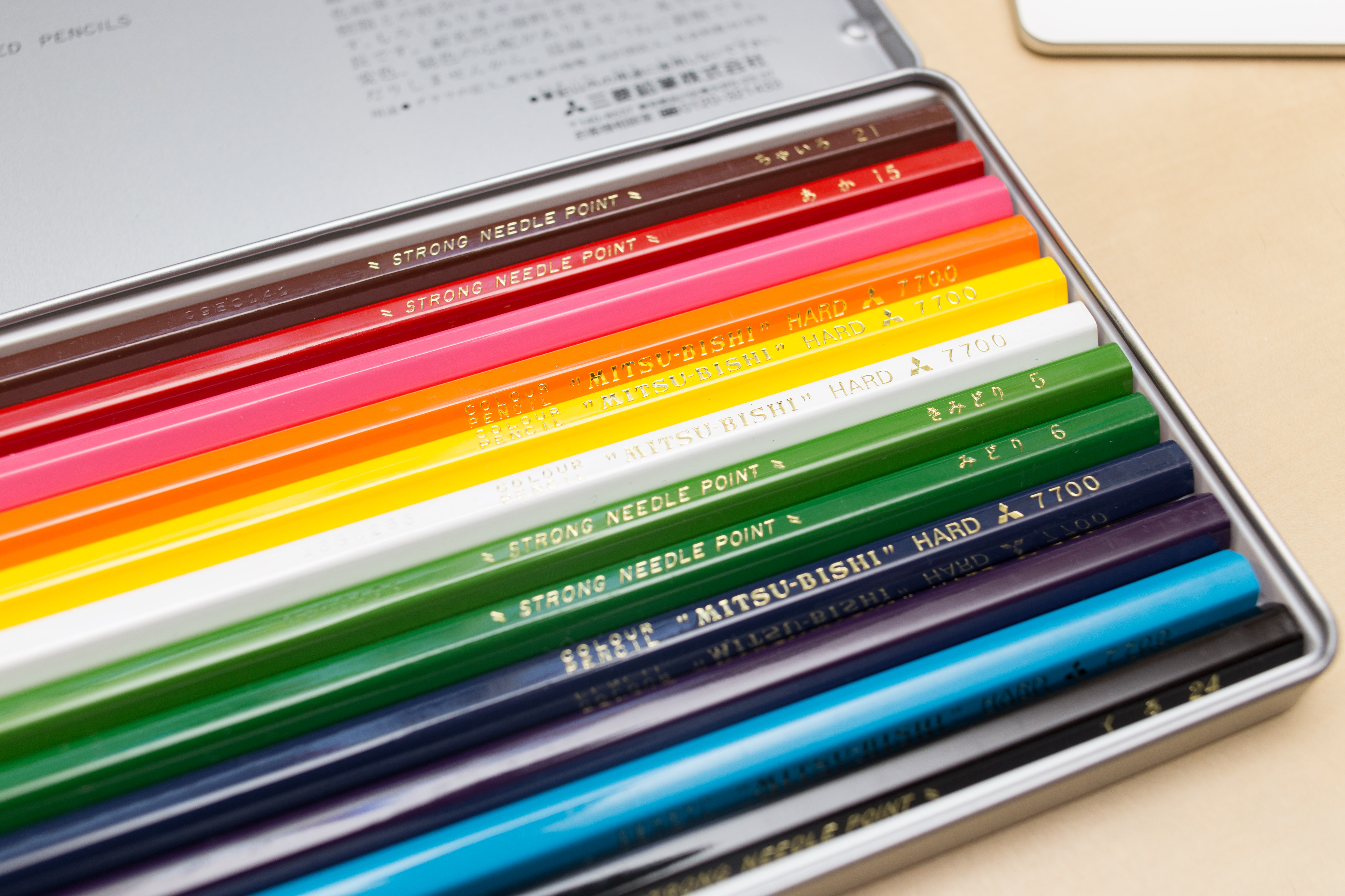
Today: a follow up of last year’s Noris colour wear and tear blog post, but this time I will compare the Staedtler Noris colour to another ‘hard’ coloured pencil: the Mitsubishi 7700.
Lexikaliker suggested that I should try the Mitsubishi 7700 after reading my first blog post about the Noris colour. He had previously suggested good coloured leads, I think it was after talking about redcircle leads, but knowing that I use coloured leads and pencils for writing he thought the Mitsubishi 7700 coloured pencils might be suitable as they are advertised as ‘hard’.
Mitsubishi 7700 and the price rise
I ordered my Mitsubishi 7700 in February 2015 and received them in March 2015. Back then I paid £9.82 (~$14.10; €12.90). You might have read in the news about what happened next, Lexikaliker covered this, too: End of last year Mitsubishi/uni decided to stop producing some of the 7700’s colours and prices have gone up a lot since then. Reminds me of what happened not long before that, when Hagomoro Bungu went out of business and people started hoarding their chalk[2]At the time of writing a box of this chalk sells for £168.05 on Amazon.. Well, the Mitsubishi 7700 has now more than doubled in price and the Amazon seller I bought from is currently selling a set of 12 Mitsubishi 7700 for £21.14 (~£30.30; €27.70). I wouldn’t be surprised if prices will rise even further.
Comparison
So let’s have a look at how the two toughies, the Mitsubishi 7700 and the Noris colour. I will compare the red and the (light) blue pencils. Since you are reading a stationery blog I won’t go into much detail, but would just like to point out that the Noris colour is an extruded pencil, so it is manufactured in very different way to other coloured pencils and that will probably also mean that it will have different properties, too.
The setup
First I looked at how dark/colour intense the line is that these pencils leave on paper. To do that I sharpened the pencils so that the point of both pencils is a conical frustum (a cone without the top). Both pencils’ points/frustum’s had the same top radii. This was achieve by sharpening with a Deli 0668 where I ‘dialled’ the point adjuster back. I then used a force of 1.8 N [3]With less force the lines would have been quite light. You do need to use quite a bit of force when you want to write with coloured pencils. and a speed of 25 mm/s to move the pencils across the paper [4]Actually, the pencil was stationary ;^) and I moved the paper.. The pencil had an angle of 90°, so axial pen force = normal pen force. The paper was from a Brunnen – Der grüne Block, which I have used many times before on this blog.
Darkness/Colour intensity
As mentioned before I compared red and blue. As my Mitsubishi 7700 set has far fewer colours than my Noris colour set I picked a colour from the Mitsubishi set and then tried to find the closest corresponding match form the Noris set, based on the colour of the pencil’s body more than based on the colour of the point.
Measuring colour intensity seems to be more complicated than expected, at least for someone like me who doesn’t know what he’s doing. I scanned the paper on my scanner with 2400 dpi, turning off all auto settings I could find and used the ‘linear’ settings for the colours. I then looked at the file with a graphics editor. The HSB values used for my Pilot neox Graphite blog post don’t seem useful here and only looking at the red and blue values alone seems slightly unfair as a different shade of red or blue might actually be darker for the eye but contain less red or blue, but it’s the best I got for now.
Visually the lines left by the Mitsubishi 7700 look darker than those from the Noris colour, but lets see whether we can measure this. I looked at a 150 pixel * 25 pixel area from each line to look at the histogram.
Come on you reds [5]No, I don’t follow football, but couldn’t resist.
Let’s compare the reds. The numbers at the top are for the red channel only. Lower numbers mean it’s darker, but the numbers are purely based on the red channel, so a shade of red that is different to the RGB red will provide numbers that should be used with caution.
Good that there’s no publication bias at Bleistift. Quite boringly the numbers confirm how it looks like anyway: the Mitsubishi creates a darker shade of red on the paper (…at least when used with 1.8 N and an angle of 90° while moving along the paper with 25 mm/s. The pencils will behave differently under different conditions).
Mitsubishi 7700 #15 Red
Noris colour, a similar shade of red
Sample:Histogram:
Sample:Histogram:
Come on you blues [6]No, I really don’t watch football.
Next up: the blues. I compared Mitsubishi’s #8 Light Blue to the closest Noris colour match.
Again, the Mitsubishi looks darker, but this time the numbers seem to contradict how it looks like. They seem to indicate that the blue colour of the line left by the Noris colour is a slightly darker blue. I am not sure why this is. Maybe other find the Noris colour’s line to be of a darker blue? It could be down to the Noris being a closer match to the RGB blue or to the fact that something makes the human eye/brain perceive the #8 Light Blue as darker, even though it isn’t. This time the numbers are for the blue channel.
Mitsubishi 7700 #8 Light Blue
Noris colour, a similar shade of red
Sample:Histogram:
Sample:Histogram:
Wear and tear
Let’s look at how hard these pencils really are. If they are to be used for writing they should keep their point as long as possible. For this I have done a similar test as in the Noris colour wear and tear blog post. I wrote a line of text with a freshly sharpened pencil, using the Deli 0635‘s 17° angle, while trying to keep writing angle and pressure constant.
Mitsubishi’s #15 (Red) started with a
horizontal width of 0.3 mm and a
diagonal width of 0.1 mm
and ended with a vertical width of 0.5 mm.
Mitsubishi’s #8 (Light Blue) started with a
horizontal width of 0.3 mm and a
diagonal width of 0.1 mm
and ended with a vertical width of 0.4 mm.
The Noris colour red started with a
horizontal width of 0.3 mm and a
diagonal width of 0.1 mm
and ended with a vertical width of 0.4 – 0.5 mm.
The Noris colour blue started with a
horizontal width of 0.3 mm and a
diagonal width of 0.2 mm
and ended with a vertical width of 0.4 mm.
The Noris colour seems to have kept the point slightly better, but the numbers indicate that for both brands the red pencil didn’t keep the point as well as the blue pencil. As this second test was not done using a measured force it might very well be that the actual pressure used was different.
The lines produced by constant force support the idea that the Noris colour keeps the point longer, but on the constant force lines it looks as of the blue pencils, especially the Mitsubishi, was worn down more.
Conclusion
Coloured pencil are nowhere near as good at keeping their point, so they are not great for writing (surprise, surprise), but some are better than other. The Noris colour keeps its point better, but the darker lines seem to indicate that the Mitsubishi 7700 is a better choise. It is a shame that the Noris colour pencils are not labelled by colour, that would have provided another way of selecting equivalent pencils to match the 7700’s colours. In the case of the Mitsubishi 7700 vs the Staetdler Noris colour you might just pick a darker shade of red or blue for the Noris colour and get similar levels of darkness as you do from the 7700.
I had fun writing this blog post, but I realise this is not everyone’s cup of tea – the DelGuard blog post with a pressure diagram wasn’t very popular at all, so I will try to limit these kind of blog posts in the future.
A heavily scaled down version of the test sheet
Prices: Dates as explained
Exchange rates: January 2016
As usual: open the images in a new tab/window to look at them in full resolution.
This morning I got the order I placed yesterday with The Pen Company. Diamine’s shimmer ink and the Lamy Safari in Neon Lime (the stationery part of my birthday gift).
After a bit more than three years and many posts later the Bleistift Facebook page reached 100 likes this week. Well, I have to confess that I cheated and invited some of my friends to like the page, anyway: next aim: 200 likes by 2018, but that will be more difficult, as I have already invited some friends plus some people will probably unlike the page over the next three years. We will see…
Wopex vs Noris
Anyway, onto the real blog post:
You might remember the blog post about the Staedtler 501 180 sharpener. Staedtler’s rotary sharpeners start with 501 and their Wopex pencils are associated with the number 180. Despite this sharpener being officially available in the UK I didn’t come across it yet, so I keep using my Deli to make a great Wopex point. Here’s a comparison of a Wopex, sharpened in a Deli 0635 and a Noris, sharpened in the same Deli.
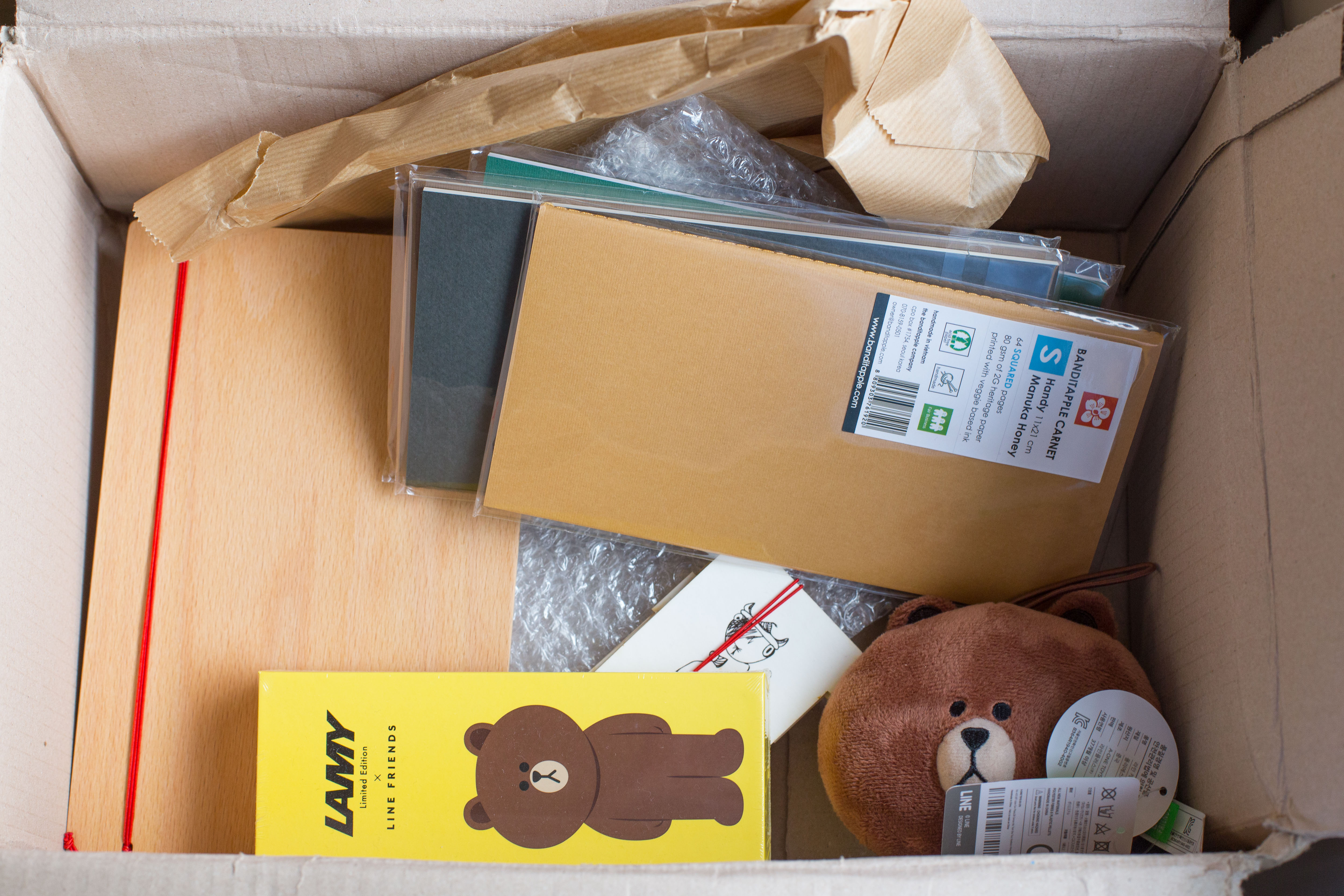
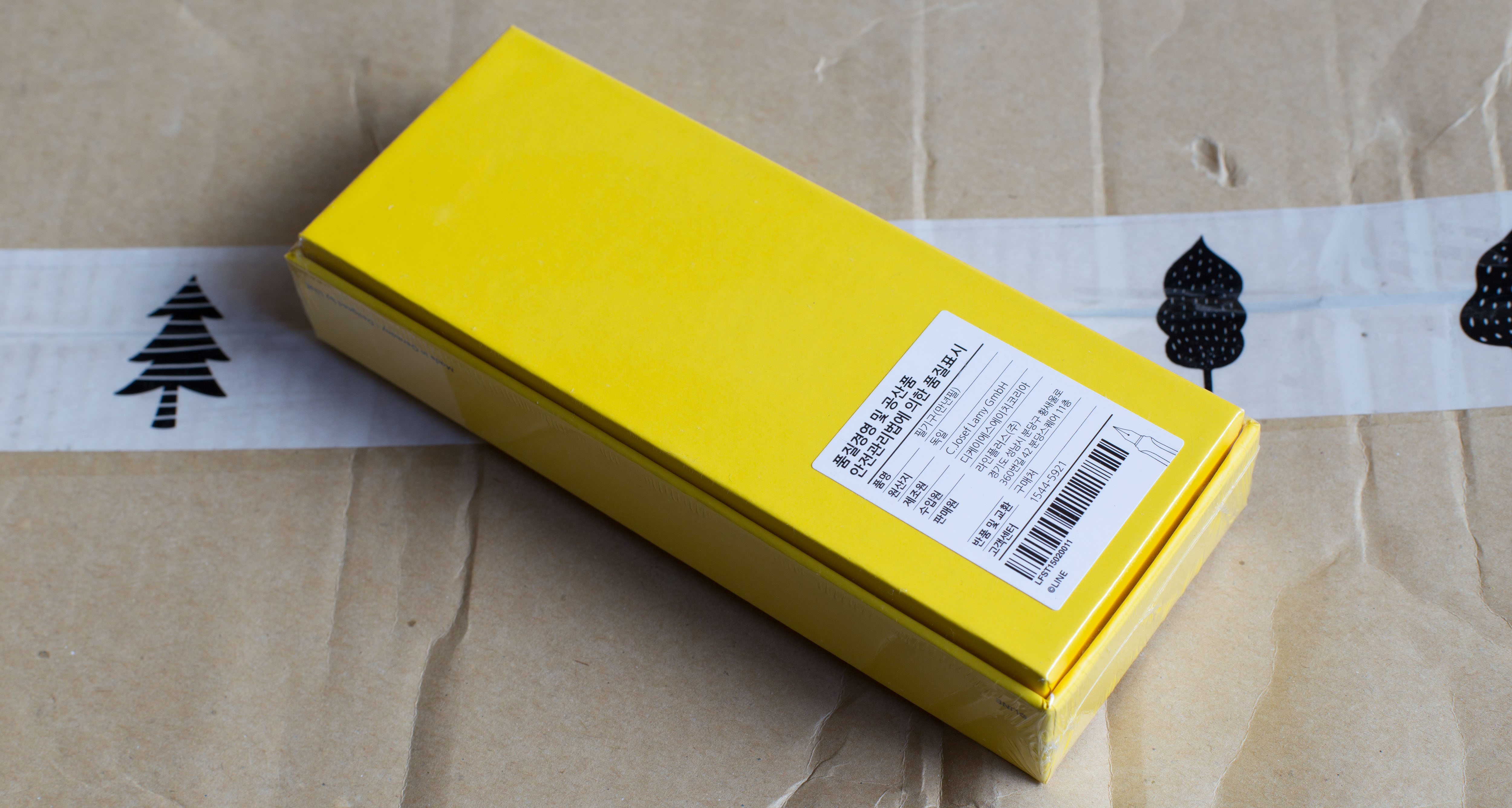
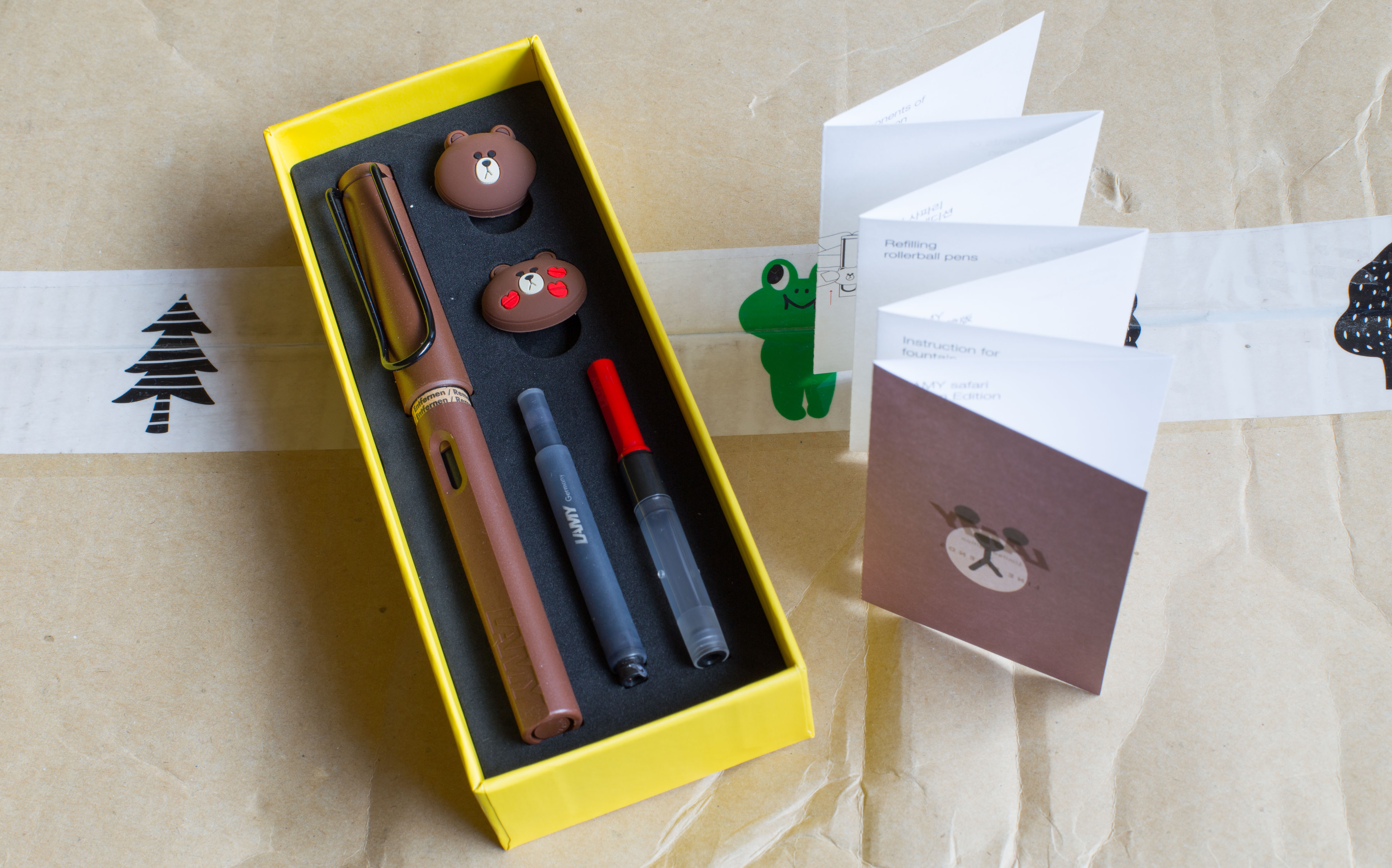
After Brad and Myke mentioned the Lamy Line Friends pens in the last two episodes of the Pen Addict podcast I couldn’t resist and just have to show my ‘Line Safari’ – despite my intentions of keeping the number of fountain pen posts in the blog low so that the focus can be on pencils.
The Line characters started life as icons in a messaging app, but became so popular that now there’s a whole range of merchandise based around them. I think my first exposure to them was as icons in the WeChat app.
I got Line Friends Lamy Safari from Arnie Kim, the man behind the Banditapple notebooks I reviewed five years ago. Initially I contacted Arnie about this in February or early March, but it took quite a while for him to get his hands on any, in the beginning they always sold out as soon as new stock arrived, with long queues forming.
I think I paid about ₩ 54.000 (~$45; €40; £30) plus shipping, but I also ordered a few Banditapple notebooks the same time.
I plan to soon write more about the other exciting items I got in this parcel from Korea.
 Today: a noble notebook and pencil.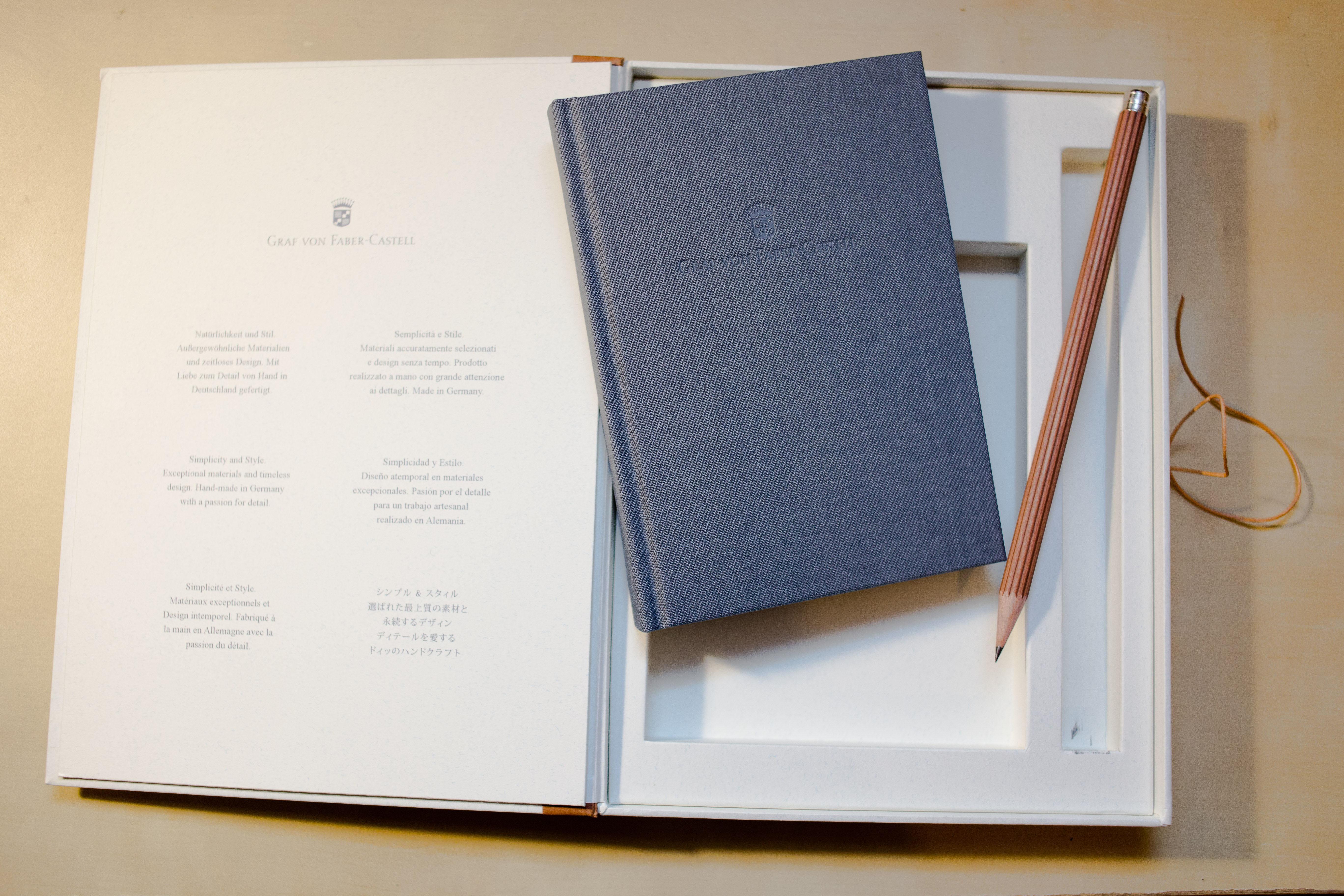

 The notebook you get is clothbound and has thick, creamy paper in a kind of slightly yellow shade of light beige. It feels quite different to the ordinary white from most notebooks. Despite the smooth surface, the paper is taking the graphite on very well. I am spelling this out because some smooth paper, like the one found in the original Field Notes, is very smooth and doesn’t work well with pencils – as if the paper is too smooth and not abrasive enough to get the graphite off the pencil and onto the paper. This Graf von Faber-Castell paper does, however, feel very smooth to the touch but is ‘abrasive’ enough for use with HB pencils. The writing experience on this paper is just excellent. It’s a shame you can’t buy these individually, but since they’ve been around for at least five years I hope that we will still see this notebook as part of some special offers in the future.