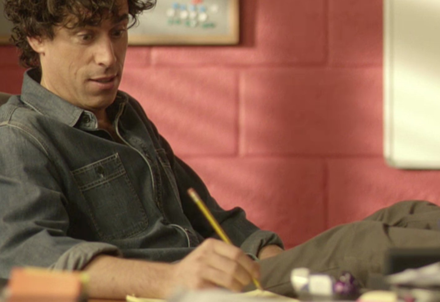
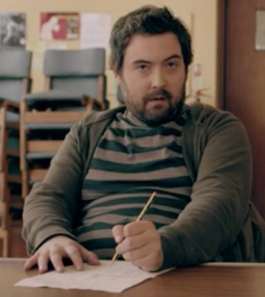
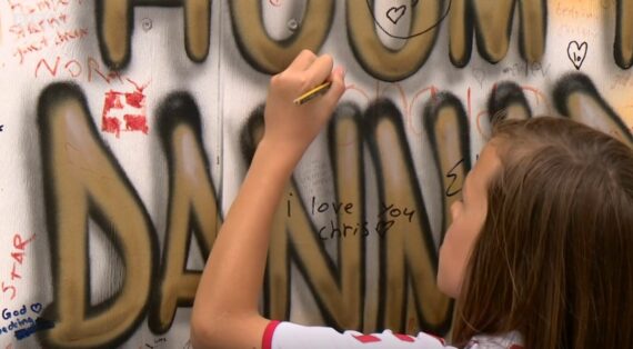
I believe that the use of the image from Series 5 Episode 9 of George Clarke’s Amazing Spaces, shown in this blog post, falls under “fair dealing” as described by the UK Copyright service.
If blog posts had soundtracks this post would play Billy Ocean’s “When the Going Gets Tough, the Tough Get Going” in the background [1]Please hum along if you like. I assume that won’t infringe any copyright..
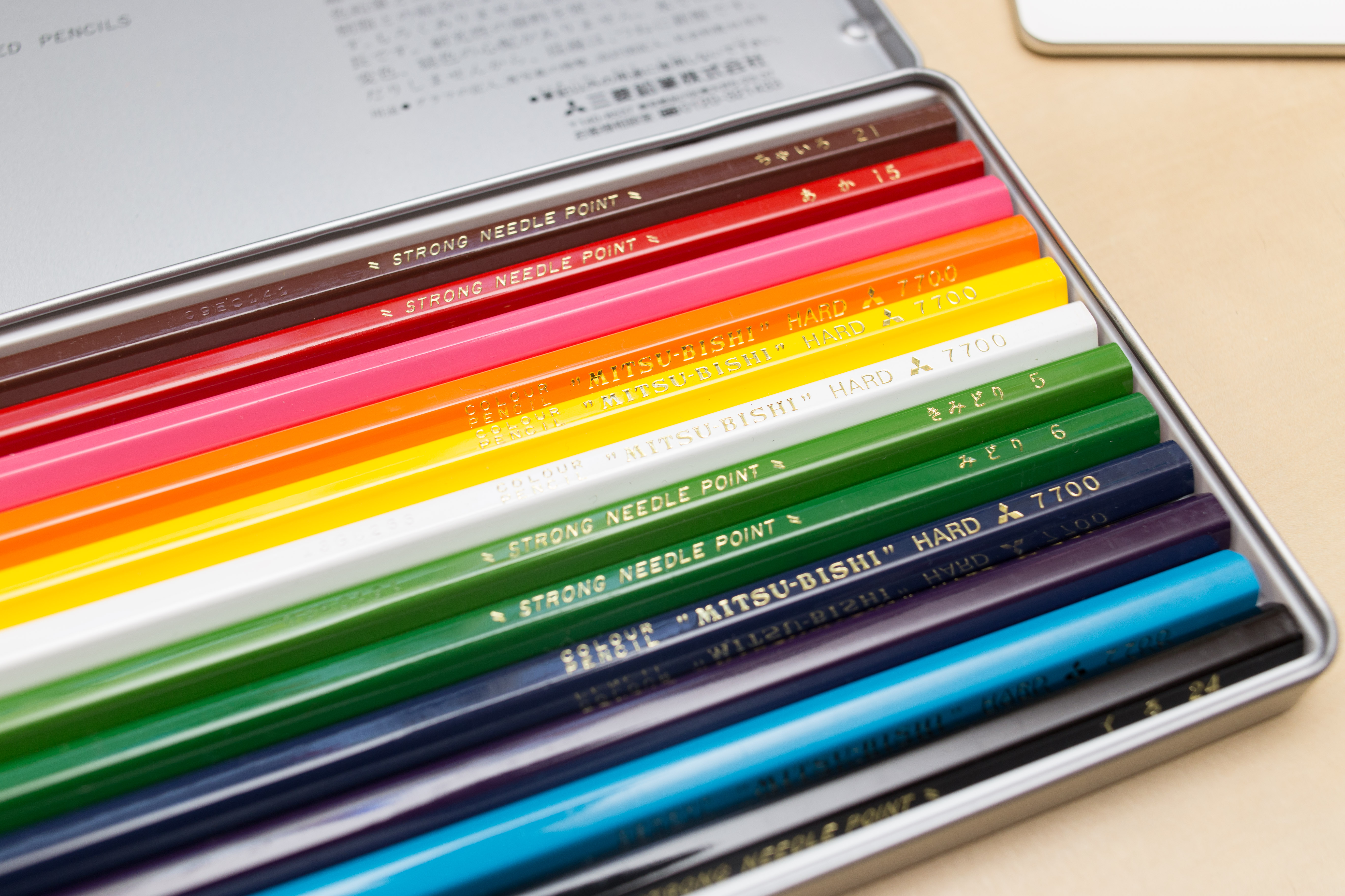
Today: a follow up of last year’s Noris colour wear and tear blog post, but this time I will compare the Staedtler Noris colour to another ‘hard’ coloured pencil: the Mitsubishi 7700.
Lexikaliker suggested that I should try the Mitsubishi 7700 after reading my first blog post about the Noris colour. He had previously suggested good coloured leads, I think it was after talking about redcircle leads, but knowing that I use coloured leads and pencils for writing he thought the Mitsubishi 7700 coloured pencils might be suitable as they are advertised as ‘hard’.
Mitsubishi 7700 and the price rise
I ordered my Mitsubishi 7700 in February 2015 and received them in March 2015. Back then I paid £9.82 (~$14.10; €12.90). You might have read in the news about what happened next, Lexikaliker covered this, too: End of last year Mitsubishi/uni decided to stop producing some of the 7700’s colours and prices have gone up a lot since then. Reminds me of what happened not long before that, when Hagomoro Bungu went out of business and people started hoarding their chalk[2]At the time of writing a box of this chalk sells for £168.05 on Amazon.. Well, the Mitsubishi 7700 has now more than doubled in price and the Amazon seller I bought from is currently selling a set of 12 Mitsubishi 7700 for £21.14 (~£30.30; €27.70). I wouldn’t be surprised if prices will rise even further.
Comparison
So let’s have a look at how the two toughies, the Mitsubishi 7700 and the Noris colour. I will compare the red and the (light) blue pencils. Since you are reading a stationery blog I won’t go into much detail, but would just like to point out that the Noris colour is an extruded pencil, so it is manufactured in very different way to other coloured pencils and that will probably also mean that it will have different properties, too.
The setup
First I looked at how dark/colour intense the line is that these pencils leave on paper. To do that I sharpened the pencils so that the point of both pencils is a conical frustum (a cone without the top). Both pencils’ points/frustum’s had the same top radii. This was achieve by sharpening with a Deli 0668 where I ‘dialled’ the point adjuster back. I then used a force of 1.8 N [3]With less force the lines would have been quite light. You do need to use quite a bit of force when you want to write with coloured pencils. and a speed of 25 mm/s to move the pencils across the paper [4]Actually, the pencil was stationary ;^) and I moved the paper.. The pencil had an angle of 90°, so axial pen force = normal pen force. The paper was from a Brunnen – Der grüne Block, which I have used many times before on this blog.
Darkness/Colour intensity
As mentioned before I compared red and blue. As my Mitsubishi 7700 set has far fewer colours than my Noris colour set I picked a colour from the Mitsubishi set and then tried to find the closest corresponding match form the Noris set, based on the colour of the pencil’s body more than based on the colour of the point.
Measuring colour intensity seems to be more complicated than expected, at least for someone like me who doesn’t know what he’s doing. I scanned the paper on my scanner with 2400 dpi, turning off all auto settings I could find and used the ‘linear’ settings for the colours. I then looked at the file with a graphics editor. The HSB values used for my Pilot neox Graphite blog post don’t seem useful here and only looking at the red and blue values alone seems slightly unfair as a different shade of red or blue might actually be darker for the eye but contain less red or blue, but it’s the best I got for now.
Visually the lines left by the Mitsubishi 7700 look darker than those from the Noris colour, but lets see whether we can measure this. I looked at a 150 pixel * 25 pixel area from each line to look at the histogram.
Come on you reds [5]No, I don’t follow football, but couldn’t resist.
Let’s compare the reds. The numbers at the top are for the red channel only. Lower numbers mean it’s darker, but the numbers are purely based on the red channel, so a shade of red that is different to the RGB red will provide numbers that should be used with caution.
Good that there’s no publication bias at Bleistift. Quite boringly the numbers confirm how it looks like anyway: the Mitsubishi creates a darker shade of red on the paper (…at least when used with 1.8 N and an angle of 90° while moving along the paper with 25 mm/s. The pencils will behave differently under different conditions).
Mitsubishi 7700 #15 Red
Noris colour, a similar shade of red
Sample:Histogram:
Sample:Histogram:
Come on you blues [6]No, I really don’t watch football.
Next up: the blues. I compared Mitsubishi’s #8 Light Blue to the closest Noris colour match.
Again, the Mitsubishi looks darker, but this time the numbers seem to contradict how it looks like. They seem to indicate that the blue colour of the line left by the Noris colour is a slightly darker blue. I am not sure why this is. Maybe other find the Noris colour’s line to be of a darker blue? It could be down to the Noris being a closer match to the RGB blue or to the fact that something makes the human eye/brain perceive the #8 Light Blue as darker, even though it isn’t. This time the numbers are for the blue channel.
Mitsubishi 7700 #8 Light Blue
Noris colour, a similar shade of red
Sample:Histogram:
Sample:Histogram:
Wear and tear
Let’s look at how hard these pencils really are. If they are to be used for writing they should keep their point as long as possible. For this I have done a similar test as in the Noris colour wear and tear blog post. I wrote a line of text with a freshly sharpened pencil, using the Deli 0635‘s 17° angle, while trying to keep writing angle and pressure constant.
Mitsubishi’s #15 (Red) started with a
horizontal width of 0.3 mm and a
diagonal width of 0.1 mm
and ended with a vertical width of 0.5 mm.
Mitsubishi’s #8 (Light Blue) started with a
horizontal width of 0.3 mm and a
diagonal width of 0.1 mm
and ended with a vertical width of 0.4 mm.
The Noris colour red started with a
horizontal width of 0.3 mm and a
diagonal width of 0.1 mm
and ended with a vertical width of 0.4 – 0.5 mm.
The Noris colour blue started with a
horizontal width of 0.3 mm and a
diagonal width of 0.2 mm
and ended with a vertical width of 0.4 mm.
The Noris colour seems to have kept the point slightly better, but the numbers indicate that for both brands the red pencil didn’t keep the point as well as the blue pencil. As this second test was not done using a measured force it might very well be that the actual pressure used was different.
The lines produced by constant force support the idea that the Noris colour keeps the point longer, but on the constant force lines it looks as of the blue pencils, especially the Mitsubishi, was worn down more.
Conclusion
Coloured pencil are nowhere near as good at keeping their point, so they are not great for writing (surprise, surprise), but some are better than other. The Noris colour keeps its point better, but the darker lines seem to indicate that the Mitsubishi 7700 is a better choise. It is a shame that the Noris colour pencils are not labelled by colour, that would have provided another way of selecting equivalent pencils to match the 7700’s colours. In the case of the Mitsubishi 7700 vs the Staetdler Noris colour you might just pick a darker shade of red or blue for the Noris colour and get similar levels of darkness as you do from the 7700.
I had fun writing this blog post, but I realise this is not everyone’s cup of tea – the DelGuard blog post with a pressure diagram wasn’t very popular at all, so I will try to limit these kind of blog posts in the future.
A heavily scaled down version of the test sheet
Prices: Dates as explained
Exchange rates: January 2016
As usual: open the images in a new tab/window to look at them in full resolution.
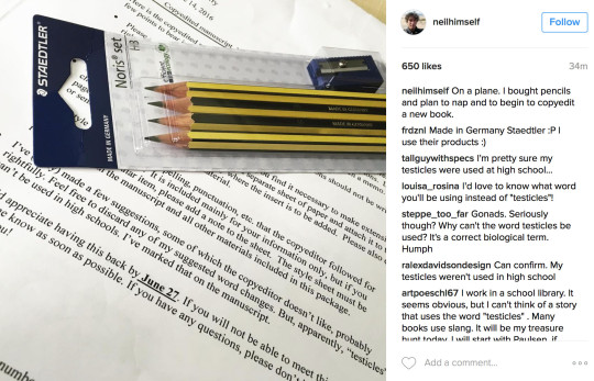
The England and Wales Cricket Board’s “ECB.tv” interviews fast bowler Mark Wood after the team’s match against Pakistan A. The reporter has tucked an end dipped Noris HB (by the looks of the dip’s colour) behind his ear.
The screen grab in this blog post has been taken from ECB’s Instagram feed. I believe that the use of the screen grab shown in this blog post falls under “fair dealing” as described by the UK Copyright service.
After a bit more than three years and many posts later the Bleistift Facebook page reached 100 likes this week. Well, I have to confess that I cheated and invited some of my friends to like the page, anyway: next aim: 200 likes by 2018, but that will be more difficult, as I have already invited some friends plus some people will probably unlike the page over the next three years. We will see…
Wopex vs Noris
Anyway, onto the real blog post:
You might remember the blog post about the Staedtler 501 180 sharpener. Staedtler’s rotary sharpeners start with 501 and their Wopex pencils are associated with the number 180. Despite this sharpener being officially available in the UK I didn’t come across it yet, so I keep using my Deli to make a great Wopex point. Here’s a comparison of a Wopex, sharpened in a Deli 0635 and a Noris, sharpened in the same Deli.
Then something else happened: after more than ten years I got the first Noris from my employer! We usually get Lyreco pencils in the stationery cupboard at work, but last week and this week I did another task in another part of my employer’s organisation [1]In case you are familiar with the UK Higher Education sector: I was doing clearing. – and there was a box of Noris pencils in the stationery basket. Maybe the good stuff (the Noris pencils) is usually reserved for management and special occasions? We did get all the good stuff on the day: they did provide tea, coffee, biscuits, even Snickers etc [2]and there must have been a serious Snickers thief. Every day at least three shoe box sized baskets of Snickers, Mars and KitKat disappeared. I guess everyone would have had to eat at least five bars … Continue reading, so if they give us expensive food, why not expensive pencils, too? I wish we had Noris pencils all year round at work…
A School Noris
…and finally – more Back to School offers. This time in Sainsbury’s. Five Noris pencils for £1.12. Not as good as the Staples offer I mentioned recently, but at Sainsbury’s you don’t have to take five HBs, you can also take the ‘graded’ pack.
The screenshots in this blog post has been taken from Episode Three of Are Our Kids Tough Enough? Chinese School, a documentary on the BBC. I believe that the use of the screenshot shown in this blog post falls under “fair dealing” as described by the UK Copyright service.
and there must have been a serious Snickers thief. Every day at least three shoe box sized baskets of Snickers, Mars and KitKat disappeared. I guess everyone would have had to eat at least five bars to make so much food disappear.
..wallpaper, that is: A French Noris wallpaper – a new Noris related post after the blog post about the Franconia Noris and the Franken Noris.
You might remember Lexikaliker’s blog post from 2013 featuring the Noris 1100 pencil. Back then he told Sean and me where he got them from: they were from someone in France. I couldn’t resist and bought some, too. The seller was kind enough to include the packaging for one gross, probably because I bought the last ones he had.
I like the packaging so much that I use it as a wallpaper / desktop background on my computer. I asked Staedtler whether I could put scans of the packaging on my blog for download. I wasn’t sure whether they’d agree, because we are talking about a scan of their material, not just a photo pf a product, but Staedtler was kind enough to allow me to post Noris wallpapers for people to download and use.
Many modern monitors have an aspect ratio of 16:9, so I made two 16:9 wallpapers. I used the highest resolution I have heard of (Retina 5K) thinking that you can always scale down. I also made one wallpaper with an aspect ration of 5:4, which is the aspect ratio older monitors use. I know that they are other aspect ratios around, but I thought this should cover most – and, too be honest, I don’t expect anyone (except myself) to actually use these anyway.
Wallpaper: Right click New tab or Download Linked FileWallpaper: Right click New tab or Download Linked FileWallpaper: Right click New tab or Download Linked File
After I scanned them I started to remove the stains in a graphics editor but then stopped and thought “Why am I removing these when many logos etc have artificial marks added afterwards? [1]For example to look as if they were stamped or written on a manual typewriter or printed on paper.” – so I just left the stains. They do look nice I guess, and hey: the packaging nearly sixty years old. If the packaging was a British citizen it would get a free bus pass and heating allowance soon.
Nuremberg Imperial Castle – photo by DALIBRI (CC license)
The image download instructions (Right click New tab or Download Linked File) are browser dependent. Depending on your browser and language settings the menus might have different names. Also right click in this context is just your secondary click. If you are left handed it might be the left mouse button.
See what I did there? I used the title of the previous blog post, but changed ‘Franconia’ to the German word for Franconia: Franken.
The association is now with Frankenstein’s Monster instead of Franconia. Just a reminder, Franconia is the area in Bavaria the size of Massachusetts where most German stationery manufacturers are from [1]as well as some other famous companies like Adidas or Puma.
…and what a monster I have created. Muah hua hua. An unholy mix of parts from Staedtler and Faber-Castell.
You might remember my recent blog post about me losing my Perfect Pencil. Well, now I do have a new one – a very special one. It’s the black version of the ‘Castell 9000 Perfect Pencil’. I first read about it in a blog post from Pencil Talk in 2010. As far as I can tell this version was for sale in Japan, from 2009 onwards.
I just hope I won’t lose it again, like I lost my green one after six years. The black version is much more expensive and more difficult to get. Including shipping the pencil cost nearly £30 (¥4644 for the pencil plus¥890 shipping) (~$45; €40), I wouldn’t have spend so much, as mentioned before I stopped buying expensive stationery, but I was in the lucky position to pick a gift I wanted.
The black of this Perfect Pencil goes very well with the black of my favourite pencil, the Noris. I think I will try out the pencils that came with the Perfect Pencil before changing to Noris refills.
I still have short eraser-tipped Castell 9000 pencils as well as official Castell 9000 Perfect Pencil refills, so next time I go to Germany, probably next year, I might also get a dark green Perfect Pencil again (which is only £5 over there).
Please click (or right click new tab) to admire the Perfect Pencil’s beauty in higher resolution.
Price: June 2015, Exchange rates: July 2015.
I’d like to thank Sola for her advice that helped me get a black Perfect Pencil.
According to Wikipedia “only two European regions continue to be associated with the Franks” [1]I’m not sure whether this claim is true, but nevertheless I’ll just repeat it here:
Franconia – to link this blog post to Franconia: it’s where the pencils in the following pictures were probably made (unless they were old stock)
and Île-de-France where the pencils in the following pictures were being filmed.
Meanwhile, on the other side of the channel. Actually, not meanwhile, but kind of 40 years earlier: MI5’s Alan Montag is using a Staedtler Noris. There are a lot of pencils in the series, but usually they are unidentifiable yellow/orange pencils. For a few minutes I thought Joe Lambe’s accent is Irish until I realised it’s one of the different types of Scouse [2]I should have recognised it earlier …a few years ago I had a student with a very similar accent.
The previous screenshot is from the great TV series “The Game” – from 2014, but set in the 1970s. In contrast here’s an MI5 pencil from the real 1970s – from the story Atout…coeur! / Hartkloppingen! from Franco-Belgian comic series Clifton. Burton and Taylor seems to be a reference to Richard Burton and Elizabeth Taylor, the design of the pencil seems to be based on the Staedtler Lumograph.
After the BBC’s Make me a German this time: Make me Welsh. Funnily enough the TV series The Game I just mentioned was produced by BBC Cymru Wales, too. Sean told me about this programme and sent me a screenshot showing pupils using Staedtler’s Noris (very common in British schools).
If that’t not enough Franconian pencils yet – there are plenty more in the latest season of Episodes. Episodes does again feature an extremely high density of Noris pencils per episode. I’ll skip the screenshot though as it would be virtually indistinguishable from the last one I posted.
I would like thank Sean for the Make me Welsh screenshot.
I believe that the use of the screen shots, taken from Engrenages, The Game, Clifton and Make me Welsh falls under “fair dealing” as described by the UK Copyright service.
Here’s my (incomplete) collection of Noris spottings in the wild.
In computers
An icon I used to see on a daily basis, it looks like the Noris. Found in Okular, the document viewer in KDE 4.
In advertising
Staedtler’s pencils’ image as typical pencils means that you can see them often when an association with school is needed or in related advertising, as in the example seen on the right. The advertising, probably created specifically for the UK and Ireland, was on a phone booth. A Staedtler Noris can be seen, even though the film is from the USA, where the Noris is not officially distributed and not available.
In the next example Harvey Nichols, a posh department store, used Noris look-alikes in their shop window to advertise perfume – I am not sure what the link between the perfume and the pencils is.
On packaging
A photo of an Alessi sharpener in the shape of a beaver, with a Noris on the packaging.
In episode 1 they are mainly using Staedtler’s Tradition. In later episodes the Noris is more common. In the second screenshot you can see Basil Fawlty (John Cleese) sharpening his Noris with a knife.
Germany, 1977
Der Alte (German TV series)
UK, 1990
House of Cards (British TV series)
They also had some really nice pen trays in House of Cards.
Italy, 2008
Commissario Montalbano (Italian TV series)
Commissario Montalbano, the famous detective from Sicily, is a keen user of the Staedtler Noris1. Even though he’s driving around in an old Fiat Tipo his home is fantastic and is furnished and and decorated with classic and vintage bits and bobs, just like the grand homes of the criminals he is visiting. The Noris is a suitable pencil for him to use as it is the archetypal European pencil – even though it is a surprising choice as it is clearly a branded item.
Inspector Montalbano is not only a friend of the Noris pencil. He also likes to get his hand on the Noris stick ballpoint pen.
The next screenshot is from episode 705 “Liebeswirren” of German/Austrian/Swiss crime TV series Tatort. One of the actors in this episode from Munich was Christoph Waltz of Inglourious Basterds fame.
Iceland, 2009
Fangavaktin (Icelandic TV series)
Daníel Sævarsson (actor: Jörundur Ragnarsson), one of the main characters from the …vaktin series and from the film Bjarnfreðarson, this time with a Noris in episode two of Fangavaktin.
Denmark, 2010
Borgen (Danish TV series)
The Danish Prime Minister and his advisor on a trip to England. Each of them has a Staedtler Noris in front of them on the table.
UK, 2010
The Armstrong and Miller Show (British TV series)
You can see Staedtler Tradition and Noris pencils in several school sketches in The Armstrong and Miller Show. Staedtler pencil’s use in The Armstrong and Miller Show is not really surprising. They are common and also to some extent the archetype of a pencil used in British schools.
The Story of England (British TV series)
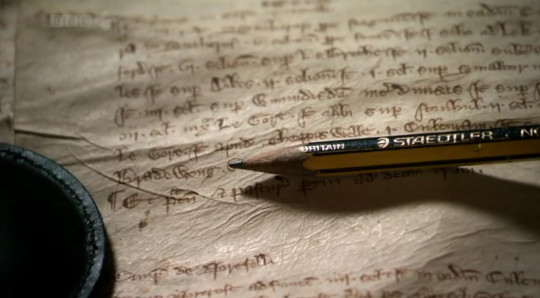
More exciting Noris spotting from Sean: The 6-part series from the BBC called The Story of England by Michael Wood features Staedtler pencils in several shots. Here’s a photo from this series, featuring a Welsh-made Noris.
Germany, 2012
To celebrate 350 years of Bleiweißsteftmacherhandwerk the Franconian and Bavarian regional news reported live from Staedtler’s factory on 25 September 2012. The reports were only a few minutes long.
UK, 2011
Outnumbered (British TV series)
There is a very small chance that this is a Fox Essentials copy, but I think it’s a Noris – The Fox Essentials has a white eraser.
UK, 2012
Quartet (British film)
I haven’t watched this film, but Sean was kind enough to tell me about it and to send me this screenshot.
The Bletchley Circle (British TV series)
Comrade John from the Pencil Revolution sent this screenshot from The Bletchley Circle, a murder mystery set in the famous1 Bletchley Park in 1952. I’m not sure though they would have used a Noris in H there2 – Staedtler took the Royal Sovereign Group over in the 1970s, so the code breakers would have been more likely to use Wolff’s Royal Sovereign.
UK/USA, 2012
Episodes (British TV series)
In Episodes Sean Lincoln (played by Stephen Mangan2 ) is using a Stadtler Noris in the USA, even though it isn’t officially on sale in the USA. The character must have brought it from the UK, the desk is full of Noris pencils ..or, in the real world, this scene might have been filmed in the UK.
UK 2012
Shaun the Sheep is using a Noris. Who would have thought. Yes, it is a cartoon version of a Noris, but it is unmistakably a Noris. Nice!
The England and Wales Cricket Board’s “ECB.tv” interviews fast bowler Mark Wood after the team’s match against Pakistan A. The reporter has tucked an end dipped Noris HB (by the looks of the dip’s colour) behind his ear.