You might have seen this already on my Instagram account, but I thought I also post this picture here, too: Last week I got my Sapelo Penvelope from The Pen Addict’s 2017 Kickstarter.
It looks absolutely beautiful.
Unfortunately customs weren’t kind (again), so after adding postage, fees etc, the $30 Sapelo was $62 by the time it landed on my door.
Other had similar fees to pay:
Just got my little customs charge card this morning… £13.94 sighhhhhh
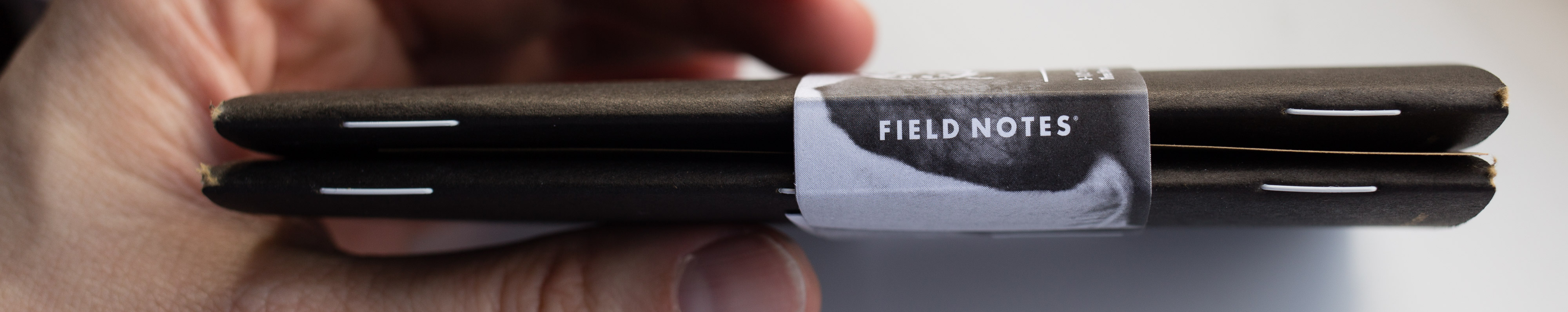
I think I read about the Ingersoll version of the Field Notes notebooks in the past, but I only really paid attention to them after Jinnie retweeted a tweet from ROY . Tempting. I had a quick look on the web, but wasn’t able to find out what paper is being used for these ..and ordered anyway. BTW, Ingersoll is a watch company.
£9.95 or $9.95?
I can’t tell you what I paid yet. I’ll need to wait for the credit card bill. When I ordered it first said £9.95, then $9.95. the price has since been raised to £10. I then got an email telling me I got charged £8.29. I guess there’s a glitch in their online system.
£8.29?
The notebooks only took a few days to arrive. Here’s a little video.
Well, it turns out the paper in the Ingersoll is nearly the same as the paper in the original Field Notes: Finch Paper Opaque, but instead of 50#T “Bright White” it’s 60#T “Bright White” (Update:Mark Cohen let me know that this is the same paper as used in the Shenandoah notebooks). I think I like all other Field Notes papers I know more than the Finch Opaque, so this came as a bit of a disappointment.
Overall this is more or less a black version of the Original Field Notes, but the staples are white, the paper is thicker and also seems whiter and less yellow than Original. I am not sure whether I am imagining this, whether this is down to age, whether the paper change over time or whether this is down to ‘natural’ tolerances (both papers are called “Bright White” after all, so the same name implies they are the same colour.
There’s one way to find out: Check and compare the papers. As usual, I use R to do that (R is free). For a change I show you the commands I use.
To test it I followed the usual procedure explained here: The pencil lead used has a nominal diameter of 0.7mm and an actual diameter of 0.68mm (more info about nominal vs actual diameters can be found here). This is equivalent to a surface area of 0.36mm². A force of 1.5N is used, which, in this case, is equivalent to 4.17 MegaPascals for this surface area.
I convert the sample to numbers using this function.
vioplot is like the original violplot, but is not so demanding when it comes to how data is formatted [1]After comments on Facebook from Logan Lay and others I have changed to colour of the violin plots from the default magenta to green..
As you can see the 60#T Ingersoll paper is whiter as the violin plot starts higher (Y axis top is white, bottom is black), but lead leaves a darker line. This is so different for a paper that you’d expect to be more similar that I wanted to take a new sample in an old Original Field Notes with 50#T Finch Opaque paper. In the plot labelled as “Opaque 2”.
In the next plot this new sample is labelled “Opaque 2”.
Mean and quartiles of the new sample on old 50#T paper were more similar to the original sample than to the Ingersoll 60#T paper sample, but the tails are much longer, meaning that there is a small number of lighter and darker values at the extreme ends of the sample.
Top to Bottom (all Finch): Ingersoll 60#T, Original 50#T, Fine (Left is dark, right is light)
Why is that? I could think of many reasons. Hot candidates for the inconsistency (other than the paper) are the scanner (the bulb’s performance, differences after software updates), the way the pressure is applied or the consistency of the lead.
In the end, independent of which 50#T sample you look at, the 60#T paper used in the Ingersoll notebook still seems to be able to produce a darker line.
Let’s check whether there is a statistically significant difference between the different samples.
The Tukey test puts into numbers what could already be seen earlier: the difference between the two 50#T samples’ means is quite small, even though they look different. The difference when comparing the Opaque 1 and the Opaque 2 sample to the Ingersoll sample is bigger (diff > 0.1).
When comparing the different papers with each other p is always so small that it is displayed as 0, so the differences between the different papers are significant. This doesn’t come as a surprise as the are different samples after all and as far as I understand Tukey isn’t really made to check whether the similarity between samples is coincidence or not.
A colleague (thanks Tatjana) showed me this way of visualising the difference:
The big question is: Can you create closer samples from the same paper if you have good enough equipment? …or is that just impossible, because the lead is not consistent and each sheet of paper is slightly different. I guess there is room to improve, but not with my simple means.
White staples
I don’t really know much about statistics. I normally don’t use statistics for my job, but have tried to learn R in the last years. If you have found any mistakes I would be happy if you let me know so that I can improve.
The Field Notes Utility has the same three colours as a Staedtler Noris
As far as I remember there’s one episode of The Pen Addict podcast where Myke, living in the UK like me, got his Field Notes subscription before Brad. Usually, though, it takes a bit longer for a subscription delivery to hit this side of the pond – but in the end (about two weeks later than most) the 34th quarterly edition ‘Utility’ hit my letterbox.
My Utility corners are much better than my Cherry Graph corners
The spine? A small tear, not even worth mentioning.
Some small marks
Instead, some of the covers were a bit dirty, something brown or dark red on front and back. With that bright colour and surface you can see marks more easily on this edition ..but hey, they’re gonna get dirty anyway with use, so that’s not really worth mentioning either. I only mention it because the issue of build quality was brought up in the Lead Fast review, so I report back that overall my Utilities arrived in great condition.
Graphite on Paper
Let’s have a look at the paper used: Mohawk Via Vellum 70#T “Pure White” paper with “Get-It-Done Gray” soy-based Saphira ink.
Mohawk Via Vellum (Open in new tab to read labels)
To test it I followed the usual procedure explained here: The pencil lead used has a nominal diameter of 0.7mm and an actual diameter of 0.68mm (more info about nominal vs actual diameters can be found here). This is equivalent to a surface area of 0.36mm². A force of 1.5N is used, which, in this case, is equivalent to 4.17 MegaPascals for this surface area.
As you can see in the image above I also had a look at the blank paper this time. You can see the “Pure White” and “Get-It-Done Gray” brightness coming in at around 2.9 and 2.5 respectively. 3.0 would be a perfect white, at the top of the y-axis. Lower values, toward the bottom of the y-axis, represent darker colours.
I then measured how dark the line on the paper is.
Mohawk Via Vellum compared (Open in new tab to read labels)
The Mohawk Via Vellum paper produces much darker lines than any of the other papers used in Field Notes I have tested so far.
A quick explanation: the wider a violin plot the more measurements of that shade of grey there are (white at the top, black at the bottom). The top of a violin plot represents the whitest shade of grey measured in a sample, the bottom of a violin plot represents the darkest shade measured. The lower the violin plot is placed the darker the line the lead produced on this paper. The higher the starting point at the top of a violin plot the whiter the lightest spots measured, which usually means the higher the starting point the whiter the paper. The Black Ice post contains a video with more explanations.
To see more information about the violin plots from this blog post please open the images in a new tab, you can then read the labels which are rather small when the images are unenlarged and formatted for this blog post.
I haven’t looked at point retention at all. More out of lack of time rather than lack of interest. You might very well think that there’s a causal relationship between darkness and point retention, but I couldn’t possibly comment as this wasn’t measured and is not what this violin plot is about. One thing to mention though, if you use a thin lead mechanical pencil (0.2mm, 0.3mm) the (undetermined) abrasiveness of the paper doesn’t make much difference as you are usually writing without rotating the pencil which will form a chisel point very soon, but your line on the paper will still be thin thanks to the thin lead.
The Utility (second from top) is thicker than other Field Notes
What does this mean?
What it means for you depends on what kind of pencils or leads you use, how you write or how you want your lines to be.
I prefer to write small to get more onto a page, so I love mechanical pencils with 0.2mm and 0.3mm leads as well as pencil sharpeners that produce points with acute angles and slightly harder pencil, like F, just so that the fine point lasts for a few words [1]By the way, this is not reflected in the labels of the plots, I had to write big there so that it’s easy to read..
I’m quite excited and think this might become one of my favourite Field Notes editions. A great choice of paper and finally a metric ruler. I have often wished that the ruler printed in all Field Notes had metric labels, too.
I just opened one of my Field Notes and the first page was completely torn out‽
How did that happen? I’ve always treated it well.
Any attempts at explaining what might have happened are welcome.
Malicious attempts by a third party and folding the page front cover to back cover can be ruled out. Like I said, this notebook was always treated well, that makes this so mysterious.
Here’s a look at the “Bright White” Finch Fine Smooth 70# text paper found in the new Field Notes Black Ice.
As in previous blog posts I have created violin plots of graphite samples on the different papers.
To read under what conditions the graphite is put on the paper please read the explanation in Lunatic Paper or other blog posts.
The samples and their violin plots
Colour base paper shift
Previous samples were automatically adjusted by the scanner, so the violin plots were all closer together than they should have been, i.e. the base colour of the paper didn’t make a big difference.
This has now been changed, explanation in the video, so the results are more objective, but also feel more difficult to compare.
Conclusion
The finch Fine paper used in the Black Ice Field Notes is great, nearly as good as the Boise paper in the County Fair editions. For my purposes, i.e. writing with pencils, it is miles better than the Finch Opaque paper used in the original Field Notes.
One small issue with the Black Ice though: the paper at the bottom of some of my notebooks was ripped, see photo. Even though the shrinkwrapping was intact this might have happened in transport as my Field Notes calendar was also damaged in transport.