paper comparison

Field Notes Utility’s amazing Mohawk paper

The Field Notes Utility has the same three colours as a Staedtler Noris

As far as I remember there’s one episode of The Pen Addict podcast where Myke, living in the UK like me, got his Field Notes subscription before Brad. Usually, though, it takes a bit longer for a subscription delivery to hit this side of the pond – but in the end (about two weeks later than most) the 34th quarterly edition ‘Utility’ hit my letterbox.

Overall Build Quality

Lead Fast’s review of the Utility edition mentions poorly cut notebook corners and splits at the bottom of the spine. Well, I must have been lucky: My corners look good, no problems at all, while some other Field Notes of mine, like the Cherry Graph notebooks I bought from Fred Aldous, are cut in a poorly fashion.

My Utility corners are much better than my Cherry Graph corners

The spine? A small tear, not even worth mentioning.

Some small marks

Instead, some of the covers were a bit dirty, something brown or dark red on front and back. With that bright colour and surface you can see marks more easily on this edition ..but hey, they’re gonna get dirty anyway with use, so that’s not really worth mentioning either. I only mention it because the issue of build quality was brought up in the Lead Fast review, so I report back that overall my Utilities arrived in great condition.

Graphite on Paper

Let’s have a look at the paper used: Mohawk Via Vellum 70#T “Pure White” paper with “Get-It-Done Gray” soy-based Saphira ink.
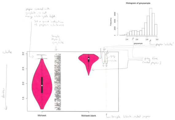
Mohawk Via Vellum (Open in new tab to read labels)

To test it I followed the usual procedure explained here: The pencil lead used has a nominal diameter of 0.7mm and an actual diameter of 0.68mm (more info about nominal vs actual diameters can be found here). This is equivalent to a surface area of 0.36mm². A force of 1.5N is used, which, in this case, is equivalent to 4.17 MegaPascals for this surface area.

As you can see in the image above I also had a look at the blank paper this time. You can see the “Pure White” and “Get-It-Done Gray” brightness coming in at around 2.9 and 2.5 respectively. 3.0 would be a perfect white, at the top of the y-axis. Lower values, toward the bottom of the y-axis, represent darker colours.

I then measured how dark the line on the paper is.

Mohawk Via Vellum compared (Open in new tab to read labels)

The Mohawk Via Vellum paper produces much darker lines than any of the other papers used in Field Notes I have tested so far.

A quick explanation: the wider a violin plot the more measurements of that shade of grey there are (white at the top, black at the bottom). The top of a violin plot represents the whitest shade of grey measured in a sample, the bottom of a violin plot represents the darkest shade measured. The lower the violin plot is placed the darker the line the lead produced on this paper. The higher the starting point at the top of a violin plot the whiter the lightest spots measured, which usually means the higher the starting point the whiter the paper. The Black Ice post contains a video with more explanations.

To see more information about the violin plots from this blog post please open the images in a new tab, you can then read the labels which are rather small when the images are unenlarged and formatted for this blog post.

I haven’t looked at point retention at all. More out of lack of time rather than lack of interest. You might very well think that there’s a causal relationship between darkness and point retention, but I couldn’t possibly comment as this wasn’t measured and is not what this violin plot is about. One thing to mention though, if you use a thin lead mechanical pencil (0.2mm, 0.3mm) the (undetermined) abrasiveness of the paper doesn’t make much difference as you are usually writing without rotating the pencil which will form a chisel point very soon, but your line on the paper will still be thin thanks to the thin lead.

The Utility (second from top) is thicker than other Field Notes

What does this mean?

What it means for you depends on what kind of pencils or leads you use, how you write or how you want your lines to be.

I prefer to write small to get more onto a page, so I love mechanical pencils with 0.2mm and 0.3mm leads as well as pencil sharpeners that produce points with acute angles and slightly harder pencil, like F, just so that the fine point lasts for a few words [1]By the way, this is not reflected in the labels of the plots, I had to write big there so that it’s easy to read..

When the Palomino Blackwing came out Sean send me a few. I took them to a meeting at work and writing with them was literally pointless as they didn’t hold their point for my style of writing for more than one word.  I haven’t really used them since as they are too soft for my writing. The fact that the company just stole Sean’s work and, as far as I know, hasn’t apologised to this day hasn’t helped to convince me to try other Blackwings either. Hmm, someone powerful doing whatever they want to normal people like you and me, where have I seen that recently. Anyway, the point here is that for me this paper is great, maybe because I don’t write using soft pencils anyway. At Pencil Revolution HQ, where soft pencils are more common, it’s a different matter and only some pencils are working well on this paper as explained in a blog post.

Conclusion

I’m quite excited and think this might become one of my favourite Field Notes editions. A great choice of paper and finally a metric ruler. I have often wished that the ruler printed in all Field Notes had metric labels, too.


References

References
1 By the way, this is not reflected in the labels of the plots, I had to write big there so that it’s easy to read.

Field Notes Utility’s amazing Mohawk paper Read More »

Lunatic Paper


lunarcoverThe next Field Notes edition, Black Ice, has already been announced, so posting this Lunacy review end of November means I’m a bit late to the party, but anyway: here’s a quick look at the paper used in the Lunacy edition, Domtar Earth Choice and a comparison with the best and the worst Field Notes paper I have used so far.


The Boise Paper (County Fair)

The Boise Offset Smooth 50#T “Whitewash” can be found in the Field Notes County Fair edition [1]More about this paper can be found in this blog post.


The Finch Paper (Original)

The Finch Paper Opaque Smooth 60#T “Bright White” that can be found in the original Field Notes was a disappointment. Graphite is quite light on this paper – I guess it would make good paper for soft leads, though. Ink, from fountain pens and even from gel pens, get sucked into the paper and is happy to bleed easily through the page …unless you have a very dry pen.

The new Black Ice edition will use Finch paper again, but this time “Bright White” Finch Fine Smooth 70# text paper. The description on Finch’s website sounds as if Finch Fine is better paper than Finch Opaque, but the information on the website is written for people printing on these papers, not handwriting on these papers, so for me, it remains to be seen whether Fine is better than Opaque. If you own the America the BeautifulFrost Gray or DDC Orange editions you have used Finch Fine in a different colour so you might be able to judge whether it is better for handwriting, drawing etc.


The Domtar Paper (Lunacy)

So here’s the ‘new’ Domtar paper. According to their website it’s “the largest family of environmentally responsible papers ever assembled” (not the most environmentally responsible papers ever assembled).

Looking at the Domtar website I think Domtar Earth Choice “Gray” 60#T with “Moondust Gray” must be the Earth Choice Colors Opaque Text, but I’m not 100% sure.

Looking at this Paper weights table I guess the 60# weight used for this paper must be equivalent to 90g/m².

domtar


The Test

The paper is tested using the same parameters as in previous paper tests and explained here. In short: The pencil lead used has a nominal diameter of 0.7mm and an actual diameter of 0.68mm (more info about nominal vs actual  diameters can be found here). This is equivalent to a surface area of 0.36mm². A force of 1.5N is used, which, in this case, is equivalent to 4.17 MegaPascals for this surface area.

3fns
Left to Right: Boise, Domtar, Finch

The violin plots show how dark the pencil marks left on the paper are. The general idea is that darker marks are easier to read and are therefore better. Darker marks result is violin plots that are lower positioned and black values would be low (near 0 on the y-axis (left)), while light marks are towards the top.

The Outcome

Well, it’s grey paper, so there’s no surprise when we see that the violin plot shows that Domtar’s ‘violin’ doesn’t get anywhere near the white value reached by Boise or Finch paper. If you look closely you can also see that the Boise paper is not as white as the Finch paper.

If you look closely at the marks left by graphite you can see that the paper will ‘shine’ through the line written on the paper as the roughness of the paper means that graphite isn’t left evenly on the mark left. This is where the paper colour for the test can be ‘picked up’ by the violin plot.

The Domtar paper doesn’t take graphite as well as Boise (County Fair) paper, but certainly better than Finch (Original/Kraft) paper. Because of the lower starting point, due to the greyness of the paper, overall ‘contrast’ isn’t however much better than the Finch paper.

I am happy to say that the Domtar paper behaves much better with ink than the Finch paper.

For pencils, there is better paper out there, e.g. Atoma, Banditapple or Silvine, but the paper quality is not the main attraction of the Field Notes anyway.

A violin plot comparing Boise, Domtar and Finch paper

The Links

If you like to read more about the Field Notes Lunacy edition have a look at Ed JelleyFountain Pen Follies,  OfficeSupplyGeek or Pens and Junk. For anything Field Notes related please visit Three Staples.

Update 25 Nov 2016: I just finished listening to The Pen Addict Podcast #232, where Brad and Myke give further insights into the paper used for different Field Notes. The question about Field Notes paper starts at 1:10:10. 


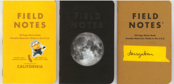
In case you wonder about how I use the Field Notes in the photo: The yellow County Fair contains notes from medical visits from our son, the Lunacy one isn’t being used yet, and in the Original one, labelled ‘Ausgaben’, I try to follow Sola’s example and try to keep notes of money spent.

Lunatic Paper Read More »

William Hannah’s dotted grid paper

William Hannah paper

A few weeks ago Scribble sent me a sample paper pack containing paper sheets from many different companies, all carefully prepared (‘hole punched’ and the corners rounded) so that they can be used in Atoma, William Hannah or similar disc bound notebooks.

On more than one occasion I have stated how good Atoma’s paper is. It is basically in a class of its own – but with United Inkdom having a closer look at William Hannah’s notebook I thought it might be worth having a closer look at the paper that comes with the William Hannah notebook – different sheets of W.H. paper were part of Scribbles sample paper pack.

Printed on consumer equipment?

Let me start by saying that the William Hannah paper is rather unusual, at least the dot grid version is: It contains printer steganography. The best reason for this I could come up with is that the paper is prepared (cut, punched and the corners rounded) in very small batches. So small that consumer printing equipment might have been used to print the dot grid pattern. That would explain the yellow dots from the printer steganography as well as the fact that the purple used for the purple dots is made up of red and blue areas, i.e. the colour is mixed. [1]I assume that if you would do this big style you would use the colour you want to use instead of mixing it in your printer. The dots are also reflective, like colour laser printed documents, unlike inkjet printer printed documents.

Depending on your screen the yellow dots might or might not be easy to see
Depending on your screen the yellow dots in the picture above might or might not be easy to see

Regarding the printer steganography: you can certainly see repeating patterns. I don’t have the time at the moment or I would try to decode the pattern using the EFF’s instructions.

Paper quality

I find the paper to be of good, but not exceptional quality. In terms of darkness and roughness, it seems a tiny bit worse than the good Boise Offset Smooth 50#T “Whitewash” white paper you can find in the Field Notes County Fair edition, but it is certainly no match for Atoma’s paper.

If I had a William Hannah notebook I’d be happy with the paper that comes with it, just to keep things simple.  It is good paper, but depending on how happy you are to go the extra mile it might be worth experimenting with refills from other brands.

Violin plot comparing William Hannah paper with previously tested paper

The violin plot was done using the same parameters (1.5 Newton force, etc) as the paper comparison in this blog post.

You can read more about William Hannah at United Inkdom and Scribble’s blog.

Atoma’s ruitertassen notebook, which is similar to William Hannah’s notebook can be seen in a previous blog post.

UPDATE: A year after this blog post I met David Round, the man behind William Hannah at the Northern Pen Show.

References

References
1 I assume that if you would do this big style you would use the colour you want to use instead of mixing it in your printer.

William Hannah’s dotted grid paper Read More »