Field Notes

Handicraft with Bleistift VIII – the Memo Book Leather Pouch


In the previous handicraft blog post I followed Gunther’s instructions and made a leather case for the Pollux. This was easier than I thought. Putting the case together would have been very fast if it wasn’t for getting the needle through the holes in the leather, when sewing different patches together. That took quite a while.

Exited by the fact that the material wasn’t to expensive while the outcome was quite usable I thought I try to make another ‘leather item’, but this time something bigger.

I even found a use for the Staedtler compass(?) with two metal points, that I got in the past as part of an offer

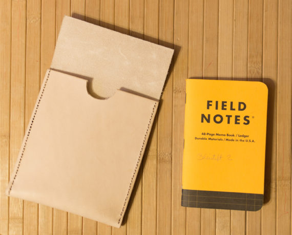
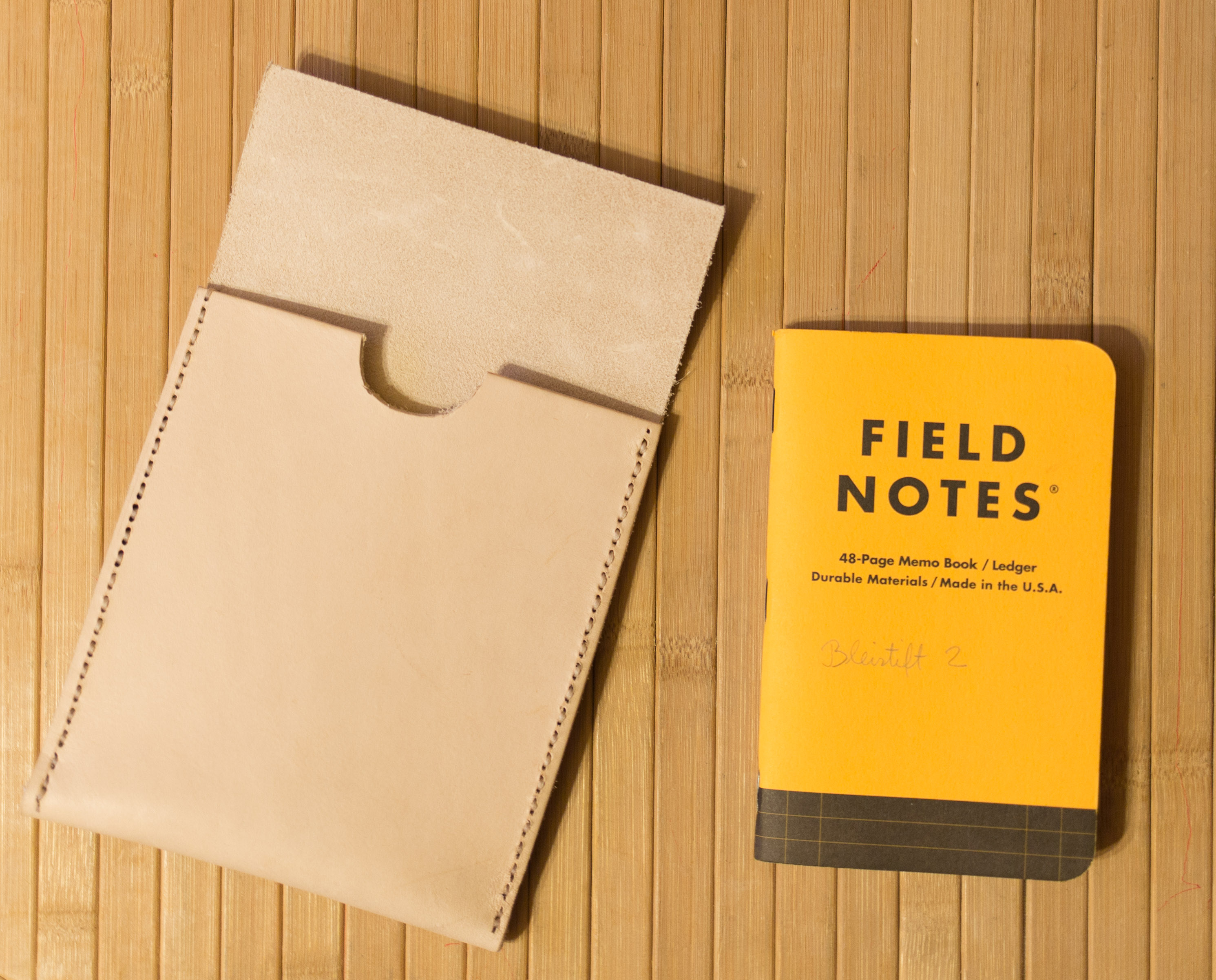
One of the leather items I am using frequently is a Rustico Field Notes leather cover. It’s great, but doesn’t hold as many Field Notes memo books as I have in use [1]I have different Field Notes memo books for different purposes – so another, bigger case/pouch would be quite useful to me.

USPS leather pouch (image © cor3y721)

Field Notes Pony Express (image © Field Notes)

There is an official Field Notes leather pouch, called Pony Express, but by the time it is imported into the UK it is rather expensive (>£80). This pouch is based on a leather pouch from the United States Postal Service.


Trying to make a similar case seemed like a good idea. The choice was to either make a very similar pouch to the USPS or FN version (using modern language I would call it ‘portrait mode’) or to do a ‘landscape version’ with slits in the back so that it can be easily attached to a belt.

I went for the ‘portrait’ version, mainly because it seemed cheaper to get a piece of leather to fit this version, but also because I thought it would be rather unlikely that i would carry the ‘landcsape’ version on my belt. The size of leather I needed was just a bit bigger than one I saw on eBay, but luckily eBay seller leatherandstuff-shop was happy to accommodate me: size-wise the closest patch of leather they sell is 30cm x 30cm, but they were happy to accommodate me and send me 35cm x 25cm for the same price (I need 35cm length for the pouch to work).

As the length, not the width, of the patch needed was the issue I had more material than needed and just cut the leather I bought in half, meaning that for the £11.95 I spent I can make a second pouch.

Once I got to the stage where I had to get the needle through the holes things got very slow again [2]Despite Craig Charles cheering me up in the background, even more so because this time I used thicker leather (officially 3mm, but actually 4mm thick), so getting the needle through the holes was just too difficult. To speed things up I went to the garage and got my variable-speed rotary tool (i.e. a no name Dremel copy) to enlarge the holes. Thanks to this tool enlarging/making the holes was very fast and getting the needle (and the thick thread) through was easy, but I’m not sure whether this is a recommended way of making holes. I don’t know much about working with leather, so who knows, maybe these kind of holes will rip out easily, unlike traditionally made holes. The point I want to make is: it worked for me, but this might or might not be a good way of doing it, I don’t know. It was however an easy way of doing it.

After I finished sewing the pouch together I was trying to get it into shape: instead of being very flat I want it to bulge out in the middle part, to make it easy to put the memo books in and to take them out, especially because the leather is so thick and inflexible.

I read that you can mould leather when it’s wet, so I held the case under a water tap. I then put a plastic bag insert in, made from cut up packaging material, but because I didn’t trust the insert to be completely water and condensation proof I didn’t dare to put my real Field Notes memo books in. Instead I filled it with paper of the same size as Field Notes memo books.

Afterwards the sides of the case were clamped down, so that only the middle part gets bulged out, not the whole case. This setup dried overnight and the case was nearly ready, I used some leather balm after the water torture and then I just had to wait a few more days for the push button for the flap to arrive, two were £1.79. Attaching it was slightly messy, just because I didn’t have the right tools, but in the end it all worked out.

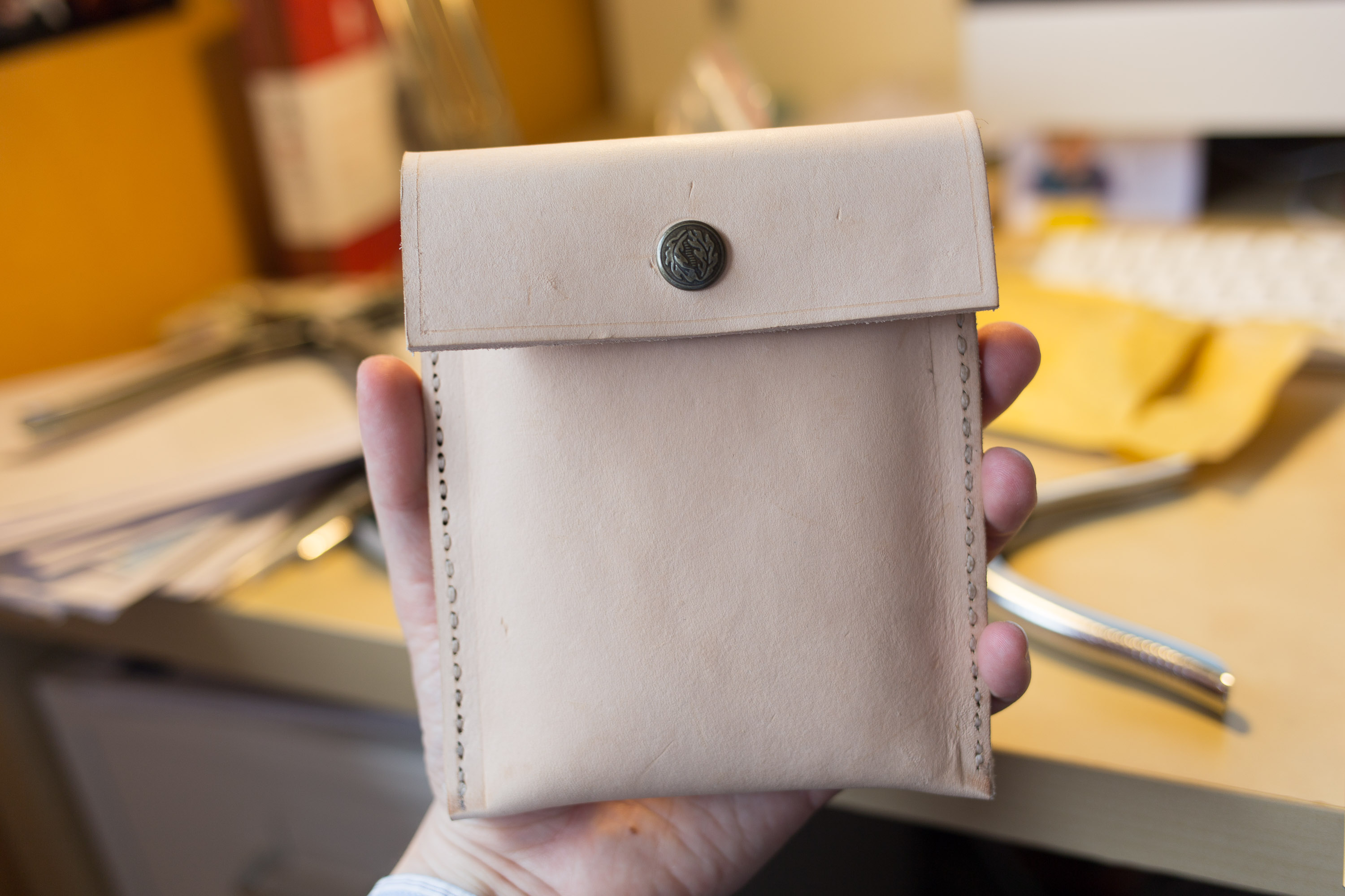
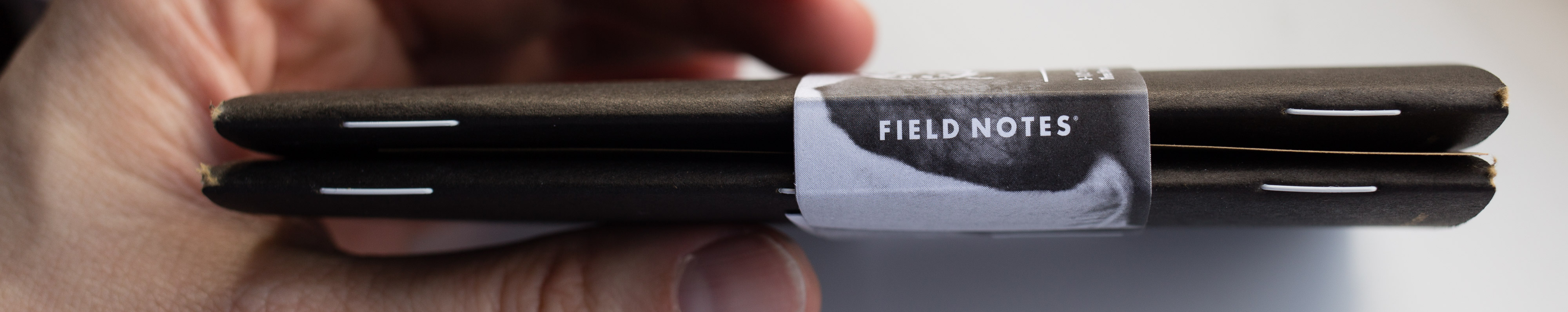
..and here is my finished case. I have been using it for over a month now. It still has a strong leather smell, not sure when that will go away, but it is very sturdy and practical.

References

References
1 I have different Field Notes memo books for different purposes
2 Despite Craig Charles cheering me up in the background

Handicraft with Bleistift VIII – the Memo Book Leather Pouch Read More »

Field Notes Bonus Subscriber Shipment 2017 Surprise

I just got my Field Notes Bonus Subscriber Shipment.
Funnily enough [1]..but of course it’s no coincidence, it’s the time of the year it is very much linked to my blog post from earlier this month – but see for yourself.

It’s an essay writing exam, or competition ?, You have until end of June to submit your essay about an event that happened to you in elementary or high school. Prizes are 2x 250 customised FN memo books, 2x the Pretty Much Everything book, 2x a year’s subscription to the Quarterly Edition.

For comparison, here’s the exam book my employer is using, photo from my previous blog post.

Treasury tags are usually much longer than needed, so the connection is quite loose, but the length of the bars mean that the tag won’t fall out unexpectetdly

References

References
1 ..but of course it’s no coincidence, it’s the time of the year

Field Notes Bonus Subscriber Shipment 2017 Surprise Read More »

How I use notebooks

After listening to last week’s Pen Addict podcast I thought I should really spend some time finding out more about bullet journalling. I have of course heard about it in the past, but never spend the time to learn about it.

The podcast made me think about how I use notebooks now and how I used to use them.

The Kompagnon image from my 2011 blog post
The index in a Field Notes Lunacy memo book

I used to think that I use them like everyone else, but I remember that the post about my Brunnen Kompagnon once had a pingback from a Russian website and when I used Google Translate back then, to see what it is about I saw that they commented that I use a specific system [1]which I wasn’t aware of. I just checked the pingback again, it’s mentioning a system called ‘superfocus’ – well, something else to read up on another day.

Well, here is how I used notebooks today

I usually leave the first page blank so that I can then create an index – I don’t always create the index,though. The picture on the right shows an example. I write what’s on the page and draw a line to the right. I will then mark the corresponding page at that spot to make it easy to access.


In terms of Hobonichi use: I will tick off tasks I have done. If I haven’t done a task I won’t tick it off or I will put a cross in the box. I only cross the date out (in the image below the 10 for 10th January) once all tasks are dealt with, but I do sometimes move tasks to a future date, indicated by putting an arrow to the right in the box.

By the way, I never got an English Hobonichi explanation with my orders, probably because I ordered the ‘avec’ version, which is only available in Japanese. When I ordered the Hobonichi cover on discount, mentioned in my last blog post, I got an English language explanation. Turns out their system is so well designed and intuitive that I used it the right way, i.e. using the space left of the vertical line on a page for appointments and the space on the right for notes (unless the appointments need too much space).


References

References
1 which I wasn’t aware of

How I use notebooks Read More »

The Field Notes x Ingersoll notebooks

I think I read about the Ingersoll version of the Field Notes notebooks in the past, but I only really paid attention to them after Jinnie retweeted a tweet from ROY . Tempting. I had a quick look on the web, but wasn’t  able to find out what paper is being used for these ..and ordered anyway. BTW, Ingersoll is a watch company.

£9.95 or $9.95?

I can’t tell you what I paid yet. I’ll need to wait for the credit card bill. When I ordered it first said £9.95, then $9.95. the price has since been raised to £10. I then got an email telling me I got charged £8.29. I guess there’s a glitch in their online system.

£8.29?

The notebooks only took a few days to arrive. Here’s a little video.

Well, it turns out the paper in the Ingersoll is nearly the same as the paper in the original Field Notes: Finch Paper Opaque, but instead of 50#T “Bright White” it’s 60#T “Bright White” (Update: Mark Cohen let me know that this is the same paper as used in the Shenandoah notebooks). I think I like all other Field Notes papers I know more than the Finch Opaque, so this came as a bit of a disappointment.

Overall this is more or less a black version of the Original Field Notes, but the staples are white, the paper is thicker and also seems whiter and less yellow than Original. I am not sure whether I am imagining this, whether this is down to age, whether the paper change over time or whether this is down to ‘natural’ tolerances (both papers are called “Bright White” after all, so the same name implies they are the same colour.

There’s one way to find out: Check and compare the papers. As usual, I use R to do that (R is free). For a change I show you the commands I use.

To test it I followed the usual procedure explained here: The pencil lead used has a nominal diameter of 0.7mm and an actual diameter of 0.68mm (more info about nominal vs actual diameters can be found here). This is equivalent to a surface area of 0.36mm². A force of 1.5N is used, which, in this case, is equivalent to 4.17 MegaPascals for this surface area.

I convert the sample to numbers using this function.

greylist <- function(filename) {
 coloursample <- readTIFF(filename)
 greysample <- coloursample[,,1]+coloursample[,,2]+coloursample[,,3]
 greysample <- matrix(greysample, nrow = 1)
 #listsample <- as.list(greysample)
 #csvfilename = paste (filename, ".csv")
 #write.table(greysample, file = csvfilename, row.names=FALSE, col.names=FALSE, sep=)
 return(greysample)
}

I then put them together

data <- do.call(rbind, Map(data.frame, Mohawk=fnmohawk, Boise=fnboise, Finch_Fine=fnfinchfs, Finch_Opaque=fnfinchos,Finch_Inger=fnfinchinger, Domtar=fndomtar ))

and produce a violinplot

 vioplot2(data, names=c(  "Mohawk", "Boise", "Finch Fine",  "Finch Opaque", "F. Opaque Ing.", "Domtar"), col = "green")

vioplot is like the original violplot, but is not so demanding when it comes to how data is formatted [1]After comments on Facebook from Logan Lay and others I have changed to colour of the violin plots from the default magenta to green..

As you can see the 60#T Ingersoll paper is whiter as the violin plot starts higher (Y axis top is white, bottom is black), but lead leaves a darker line. This is so different for a paper that you’d expect to be more similar that I wanted to take a new sample in an old Original Field Notes with 50#T Finch Opaque paper. In the plot labelled as “Opaque 2”.

In the next plot this new sample is labelled “Opaque 2”.

Mean and quartiles of the new sample on old 50#T paper were more similar to the original sample than to the Ingersoll 60#T paper sample, but the tails are much longer, meaning that there is a small number of lighter and darker values at the extreme ends of the sample.

Top to Bottom (all Finch): Ingersoll 60#T, Original 50#T, Fine (Left is dark, right is light)

Why is that? I could think of many reasons. Hot candidates for the inconsistency (other than the paper) are the scanner (the bulb’s performance, differences after software updates), the way the pressure is applied or the consistency of the lead.

In the end, independent of which 50#T sample you look at, the 60#T paper used in the Ingersoll notebook still seems to be able to produce a darker line.

Let’s check whether there is a statistically significant difference between the different samples.

> TukeyHSD(results, conf.level = 0.95)
 Tukey multiple comparisons of means
 95% family-wise confidence level

Fit: aov(formula = darkness ~ paper, data = opaquecomparison)

$paper
                    diff        lwr         upr         p adj
 Opaque 1-Ingersoll  0.13578841  0.13236496  0.13921186  0
 Opaque 2-Ingersoll  0.10241369  0.09899024  0.10583715  0
 Opaque 2-Opaque 1  -0.03337472 -0.03679817 -0.02995127  0

The Tukey test puts into numbers what could already be seen earlier: the difference between the two 50#T samples’ means is quite small, even though they look different. The difference when comparing the Opaque 1 and the Opaque 2 sample to the Ingersoll sample is bigger (diff > 0.1).

When comparing the different papers with each other p is always so small that it is displayed as 0, so the differences between the different papers are significant. This doesn’t come as a surprise as the are different samples after all and as far as I understand Tukey isn’t really made to check whether the similarity between samples is coincidence or not.

A colleague (thanks Tatjana) showed me this way of visualising the difference:

> pl <- TukeyHSD(results, conf.level = 0.95)
> plot (pl)
Plot of the Tukey difference


The big question is: Can you create closer samples from the same paper if you have good enough equipment? …or is that just impossible, because the lead is not consistent and each sheet of paper is slightly different. I guess there is room to improve, but not with my simple means.

White staples

I don’t really know much about statistics. I normally don’t use statistics for my job, but have tried to learn R in the last years. If you have found any mistakes I would be happy if you let me know so that I can improve.

References

References
1 After comments on Facebook from Logan Lay and others I have changed to colour of the violin plots from the default magenta to green.

The Field Notes x Ingersoll notebooks Read More »

Field Notes Utility’s amazing Mohawk paper

The Field Notes Utility has the same three colours as a Staedtler Noris

As far as I remember there’s one episode of The Pen Addict podcast where Myke, living in the UK like me, got his Field Notes subscription before Brad. Usually, though, it takes a bit longer for a subscription delivery to hit this side of the pond – but in the end (about two weeks later than most) the 34th quarterly edition ‘Utility’ hit my letterbox.

Overall Build Quality

Lead Fast’s review of the Utility edition mentions poorly cut notebook corners and splits at the bottom of the spine. Well, I must have been lucky: My corners look good, no problems at all, while some other Field Notes of mine, like the Cherry Graph notebooks I bought from Fred Aldous, are cut in a poorly fashion.

My Utility corners are much better than my Cherry Graph corners

The spine? A small tear, not even worth mentioning.

Some small marks

Instead, some of the covers were a bit dirty, something brown or dark red on front and back. With that bright colour and surface you can see marks more easily on this edition ..but hey, they’re gonna get dirty anyway with use, so that’s not really worth mentioning either. I only mention it because the issue of build quality was brought up in the Lead Fast review, so I report back that overall my Utilities arrived in great condition.

Graphite on Paper

Let’s have a look at the paper used: Mohawk Via Vellum 70#T “Pure White” paper with “Get-It-Done Gray” soy-based Saphira ink.

Mohawk Via Vellum (Open in new tab to read labels)

To test it I followed the usual procedure explained here: The pencil lead used has a nominal diameter of 0.7mm and an actual diameter of 0.68mm (more info about nominal vs actual diameters can be found here). This is equivalent to a surface area of 0.36mm². A force of 1.5N is used, which, in this case, is equivalent to 4.17 MegaPascals for this surface area.

As you can see in the image above I also had a look at the blank paper this time. You can see the “Pure White” and “Get-It-Done Gray” brightness coming in at around 2.9 and 2.5 respectively. 3.0 would be a perfect white, at the top of the y-axis. Lower values, toward the bottom of the y-axis, represent darker colours.

I then measured how dark the line on the paper is.

Mohawk Via Vellum compared (Open in new tab to read labels)

The Mohawk Via Vellum paper produces much darker lines than any of the other papers used in Field Notes I have tested so far.

A quick explanation: the wider a violin plot the more measurements of that shade of grey there are (white at the top, black at the bottom). The top of a violin plot represents the whitest shade of grey measured in a sample, the bottom of a violin plot represents the darkest shade measured. The lower the violin plot is placed the darker the line the lead produced on this paper. The higher the starting point at the top of a violin plot the whiter the lightest spots measured, which usually means the higher the starting point the whiter the paper. The Black Ice post contains a video with more explanations.

To see more information about the violin plots from this blog post please open the images in a new tab, you can then read the labels which are rather small when the images are unenlarged and formatted for this blog post.

I haven’t looked at point retention at all. More out of lack of time rather than lack of interest. You might very well think that there’s a causal relationship between darkness and point retention, but I couldn’t possibly comment as this wasn’t measured and is not what this violin plot is about. One thing to mention though, if you use a thin lead mechanical pencil (0.2mm, 0.3mm) the (undetermined) abrasiveness of the paper doesn’t make much difference as you are usually writing without rotating the pencil which will form a chisel point very soon, but your line on the paper will still be thin thanks to the thin lead.

The Utility (second from top) is thicker than other Field Notes

What does this mean?

What it means for you depends on what kind of pencils or leads you use, how you write or how you want your lines to be.

I prefer to write small to get more onto a page, so I love mechanical pencils with 0.2mm and 0.3mm leads as well as pencil sharpeners that produce points with acute angles and slightly harder pencil, like F, just so that the fine point lasts for a few words [1]By the way, this is not reflected in the labels of the plots, I had to write big there so that it’s easy to read..

When the Palomino Blackwing came out Sean send me a few. I took them to a meeting at work and writing with them was literally pointless as they didn’t hold their point for my style of writing for more than one word.  I haven’t really used them since as they are too soft for my writing. The fact that the company just stole Sean’s work and, as far as I know, hasn’t apologised to this day hasn’t helped to convince me to try other Blackwings either. Hmm, someone powerful doing whatever they want to normal people like you and me, where have I seen that recently. Anyway, the point here is that for me this paper is great, maybe because I don’t write using soft pencils anyway. At Pencil Revolution HQ, where soft pencils are more common, it’s a different matter and only some pencils are working well on this paper as explained in a blog post.

Conclusion

I’m quite excited and think this might become one of my favourite Field Notes editions. A great choice of paper and finally a metric ruler. I have often wished that the ruler printed in all Field Notes had metric labels, too.


References

References
1 By the way, this is not reflected in the labels of the plots, I had to write big there so that it’s easy to read.

Field Notes Utility’s amazing Mohawk paper Read More »