

I think I read about the Ingersoll version of the Field Notes notebooks in the past, but I only really paid attention to them after Jinnie retweeted a tweet from ROY . Tempting. I had a quick look on the web, but wasn’t able to find out what paper is being used for these ..and ordered anyway. BTW, Ingersoll is a watch company.

I can’t tell you what I paid yet. I’ll need to wait for the credit card bill. When I ordered it first said £9.95, then $9.95. the price has since been raised to £10. I then got an email telling me I got charged £8.29. I guess there’s a glitch in their online system.

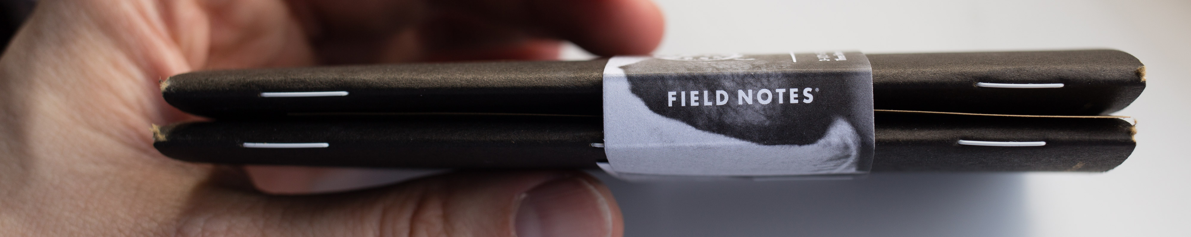
The notebooks only took a few days to arrive. Here’s a little video.
Well, it turns out the paper in the Ingersoll is nearly the same as the paper in the original Field Notes: Finch Paper Opaque, but instead of 50#T “Bright White” it’s 60#T “Bright White” (Update: Mark Cohen let me know that this is the same paper as used in the Shenandoah notebooks). I think I like all other Field Notes papers I know more than the Finch Opaque, so this came as a bit of a disappointment.
Overall this is more or less a black version of the Original Field Notes, but the staples are white, the paper is thicker and also seems whiter and less yellow than Original. I am not sure whether I am imagining this, whether this is down to age, whether the paper change over time or whether this is down to ‘natural’ tolerances (both papers are called “Bright White” after all, so the same name implies they are the same colour.
There’s one way to find out: Check and compare the papers. As usual, I use R to do that (R is free). For a change I show you the commands I use.
To test it I followed the usual procedure explained here: The pencil lead used has a nominal diameter of 0.7mm and an actual diameter of 0.68mm (more info about nominal vs actual diameters can be found here). This is equivalent to a surface area of 0.36mm². A force of 1.5N is used, which, in this case, is equivalent to 4.17 MegaPascals for this surface area.
I convert the sample to numbers using this function.
greylist <- function(filename) {
 coloursample <- readTIFF(filename)
 greysample <- coloursample[,,1]+coloursample[,,2]+coloursample[,,3]
 greysample <- matrix(greysample, nrow = 1)
 #listsample <- as.list(greysample)
 #csvfilename = paste (filename, ".csv")
 #write.table(greysample, file = csvfilename, row.names=FALSE, col.names=FALSE, sep=)
 return(greysample)
}
I then put them together
data <- do.call(rbind, Map(data.frame, Mohawk=fnmohawk, Boise=fnboise, Finch_Fine=fnfinchfs, Finch_Opaque=fnfinchos,Finch_Inger=fnfinchinger, Domtar=fndomtar ))
and produce a violinplot
vioplot2(data, names=c( "Mohawk", "Boise", "Finch Fine", "Finch Opaque", "F. Opaque Ing.", "Domtar"), col = "green")
vioplot is like the original violplot, but is not so demanding when it comes to how data is formatted [1]After comments on Facebook from Logan Lay and others I have changed to colour of the violin plots from the default magenta to green..

As you can see the 60#T Ingersoll paper is whiter as the violin plot starts higher (Y axis top is white, bottom is black), but lead leaves a darker line. This is so different for a paper that you’d expect to be more similar that I wanted to take a new sample in an old Original Field Notes with 50#T Finch Opaque paper. In the plot labelled as “Opaque 2”.
In the next plot this new sample is labelled “Opaque 2”.
Mean and quartiles of the new sample on old 50#T paper were more similar to the original sample than to the Ingersoll 60#T paper sample, but the tails are much longer, meaning that there is a small number of lighter and darker values at the extreme ends of the sample.

Why is that? I could think of many reasons. Hot candidates for the inconsistency (other than the paper) are the scanner (the bulb’s performance, differences after software updates), the way the pressure is applied or the consistency of the lead.

In the end, independent of which 50#T sample you look at, the 60#T paper used in the Ingersoll notebook still seems to be able to produce a darker line.
Let’s check whether there is a statistically significant difference between the different samples.
> TukeyHSD(results, conf.level = 0.95)
 Tukey multiple comparisons of means
 95% family-wise confidence level

Fit: aov(formula = darkness ~ paper, data = opaquecomparison)

$paper
                    diff        lwr         upr         p adj
 Opaque 1-Ingersoll  0.13578841  0.13236496  0.13921186  0
 Opaque 2-Ingersoll  0.10241369  0.09899024  0.10583715  0
 Opaque 2-Opaque 1  -0.03337472 -0.03679817 -0.02995127  0
The Tukey test puts into numbers what could already be seen earlier: the difference between the two 50#T samples’ means is quite small, even though they look different. The difference when comparing the Opaque 1 and the Opaque 2 sample to the Ingersoll sample is bigger (diff > 0.1).
When comparing the different papers with each other p is always so small that it is displayed as 0, so the differences between the different papers are significant. This doesn’t come as a surprise as the are different samples after all and as far as I understand Tukey isn’t really made to check whether the similarity between samples is coincidence or not.
A colleague (thanks Tatjana) showed me this way of visualising the difference:
> pl <- TukeyHSD(results, conf.level = 0.95)
> plot (pl)

The big question is: Can you create closer samples from the same paper if you have good enough equipment? …or is that just impossible, because the lead is not consistent and each sheet of paper is slightly different. I guess there is room to improve, but not with my simple means.
I don’t really know much about statistics. I normally don’t use statistics for my job, but have tried to learn R in the last years. If you have found any mistakes I would be happy if you let me know so that I can improve.
References
| ↑1 | After comments on Facebook from Logan Lay and others I have changed to colour of the violin plots from the default magenta to green. |
|---|
Pingback: Web Finds – 30 March 2017 « Travellers Notebook Times