By Type

A weekend in Shropshire

To celebrate my 40th birthday we spend the weekend in Shropshire …and of course I couldn’t resist buying more stationery.


A dower house form the 1820s, between Weston-under-Redcastle and Hodnet
A dower house from the 1820s, between Weston-under-Redcastle and Hodnet

Independent stationery shops

What a nice weekend it was – and I found an independent stationery shop in Shrewsbury – what a nice surprise. I hardly ever come across independent pen shops these days. The one where I live closed down and one in the town where I’m from closed down, too [1]There still one left in my home town, but it’s more of a post office / news agent / bit of everything shop.. I’d like to visit the Pen Company one day, but it’s several hours away. What’s left nearby is either focusing on art supplies or is part of a chain, which usually means that staff are not really excited about pens.

After buying some souvenir stationery in Shrewsbury Abbey I discovered Write Here. First: stocking up on Koh-I-Noor 1500 pencils – and then a fitting eraser from Koh-I-Noor as well.

Sheep in the country side
Sheep in the countryside

Koh-I-Noor

In the 18th century Jospeh Hardtmuth started the pencil factory in Austria that would become Koh-I-Noor. Koh-I Noor is the name of a famous diamond. I seem to remember reading somewhere, probably in Petroski’s book, there were several pencils named after diamonds because diamonds and graphite both consist of carbon. In the 19th century manufacturing then moved to Bohemia, to Budweis in what is now the Czech Republic.

The Koh-I-Noor 1500, the pencil I bought,  started being produced in 1889 [2]see Koh-I-Noor Hardtmuth’s history.. After WWII the factory, in what was then Czechoslovakia, was nationalised and Joseph Hardtmuth’s descendants started manufacturing in Austria again. A few years ago the Austrian ‘branch’ of the company went bankrupt and was taken over by Cretacolor, but the Czech ‘branch’ of the company does still exist under the Koh-I-Noor Hardtmuth name.

I have previously bought new old stock Koh-I-Noor 1500s in Shanghai and in my home town, but these are one of my few new ones. Too bad Write Here didn’t have HB and F (yes, you can get the 1500 in F), so I went for the B and H, which I’ve been using all of this week so far.

The shop window of Write Here

Write Here

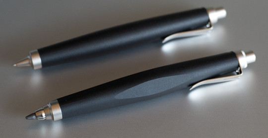
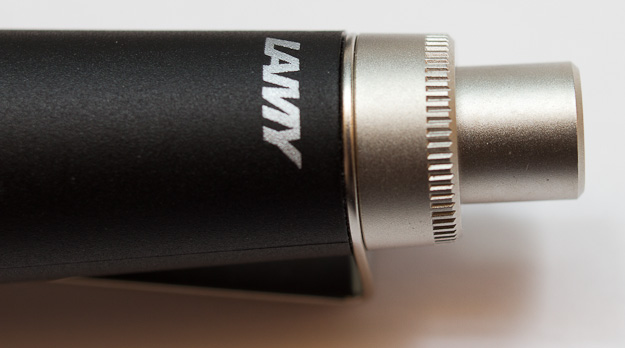
Later that day I went back to Write Here, asking whether they have any fountain pens with flexible nibs. I’ve been looking for a nice fountain pen with a flexible nib for a long time now. My Lamy 2000 with an M nib and some of my Pelikan M200 nibs in F are quite flexible, but the line at its thinnest is too wide for me. Noodler’s nibs are nice and flexible, but when using any of my different Noodler fountain pens I usually end up having dirty hands because they spill ink after a while.

Pens in the shop
Pens in the shop

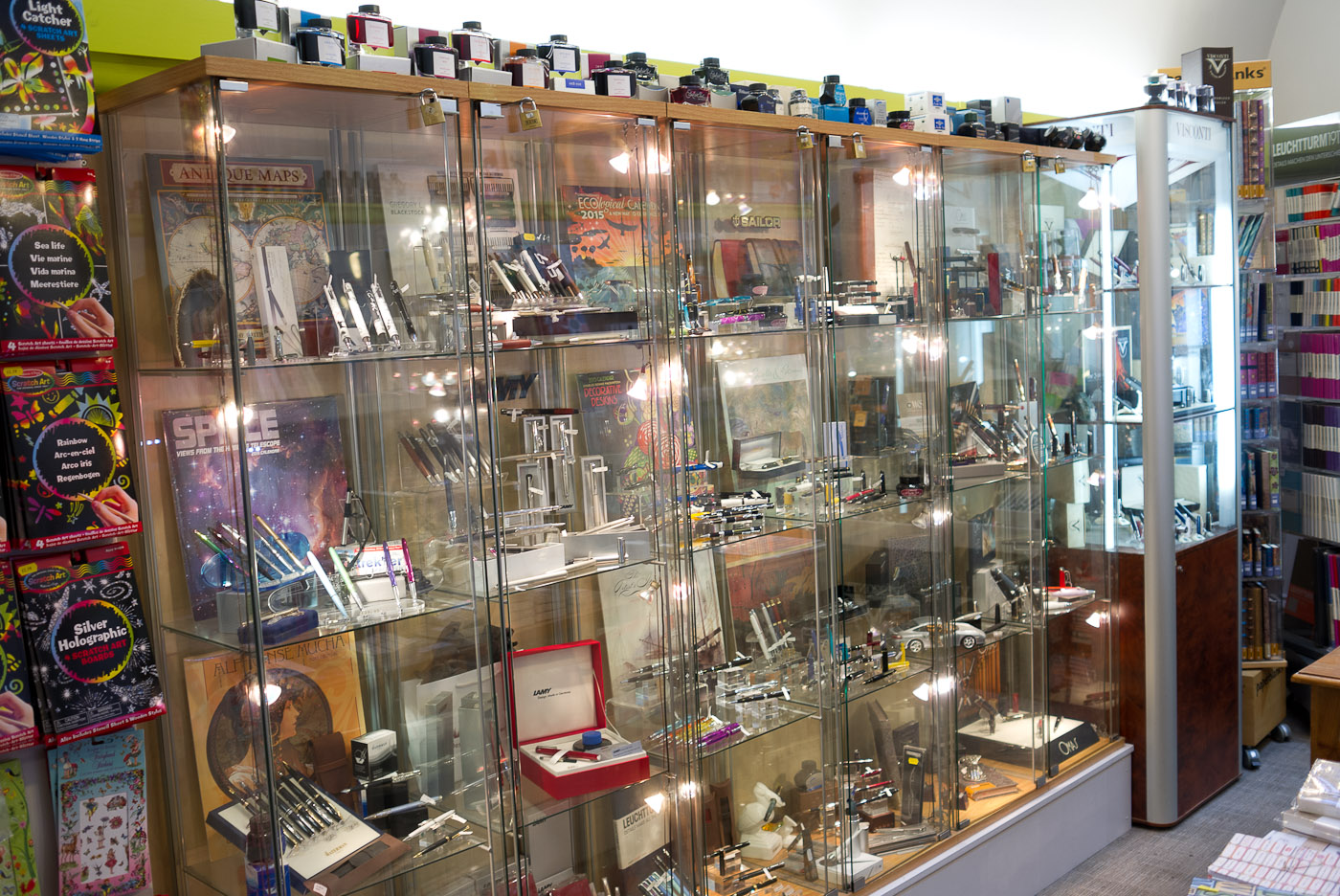
After asking for a pen with a flexible nib it took the owner of the shop a second to think about my request before taking a fountain pen out of his jacket and telling me to try it. What a nice, flexible nib that was. It was a fountain pen from Omas. I knew about Omas, but I never tried one before. When I started writing there was some feathering, but when I tried it on another paper the pen wrote smooth while still producing crisp lines. Unfortunately the pen was far too expensive for me. It turned out that this shop is also the distributor for Omas in the UK and I was told that very soon a cheaper pen with this nib will be released. I say cheaper, but it is still a £300 pen, which would make it more expensive than the most expensive pen I own.

Stationery bought in Shrewsbury

Pen and ink

Shrewsbury
Shrewsbury

I then bought the Monteverde Tool fountain pen – more in my price range, and the owner of the shop told me about Sailor’s pigment ink which contains nano pigments, so it doesn’t clog up the fountain pen.

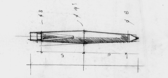
I’m still not sure what to think about the fountain pen. It seems to skip quite a bit (using the cartridge that came with it), I hope that will get better over time. I also wonder why the scales on the pen incluse 1/200 metre and 1/300 metre. I have seen 1/x inch scales, but 1/x metre scales are certainly not very common and don’t seem to make much sense to me. Is this how imperial users imagine the metric system to work?

The ink can behave very well when used on good paper, but when I use it to fill in forms at work it feathers quite a bit. I think time will tell whether I like this ink, but so far I don’t think I’ll buy another bottle.

References

References
1 There still one left in my home town, but it’s more of a post office / news agent / bit of everything shop.
2 see Koh-I-Noor Hardtmuth’s history.

A weekend in Shropshire Read More »

Nessie!

On the day of the Scottish referendum: Nessie!
Nessie pins
I bought these push pins from Tesco in July 2014. They were on offer – I think Tesco was trying to get rid of their SUCK UK products to make space for their own products. I only paid £3 (~$4.90; €3.80). The official price seems to be £7.50.
Nessie pinsEach pack contains six heads, six tails and twelve middle bits of Nessie.

These push pins are designed by Duncan Shotton, the creator of the rainbow pencils.

I don’t have a notice board any more, so I’m  not sure yet how to use these funny push pins.


Mole pins

You can also get mole pins (see photos) and disguise pins (which contain sunglasses, hats and moustaches).

Mole pins


Price: July 2014

Exchange rates: September 2014

Nessie! Read More »

nu: Tough Paper

nu:'s tough paperI’m not a big fan of spiral bound notebooks or notepads. Spiral binding will usually put me off buying a notepad, but in the case of the spiral bound, Chinese made nu: tough paper I couldn’t resist.

I saw this notebook in the supermarket run by my employer’s /my university’s students’ union and the words “paper made from stone” managed to grab my interest at first sight.


Material

The paper is made from 80% ground limestone / chalk and 20% HDPE (many plastic bottles are made from HDPE) and promises to be water-proof, wipeable, tough, durable and, to my surprise, recyclable and biodegradable [1]I don’t know much about plastic, so I would very much appreciate if someone could explain biodegradable in the context of HDPE. A quick look on the Internet seems to suggest that you can make … Continue reading


nu: Tough Paper
In case you wonder, the Kaweco was filled with non erasable ink from Diamine.


How does the paper behave?

..with pencils

Compared to normal paper the pencil line left on this ‘stone paper’ feels much darker . The line also feels wider. Applying less pressure when writing will also produce a fairly dark line, more so than writing with less pressure on normal paper. I suspect this behaviour is caused by a rougher paper surface. You can certainly feel more friction when moving a finger across the ‘stone paper’, compared to normal paper.

How does the ‘stone paper’ compare to similar products? The lines left on this paper are also darker than those a pencil would leave on paper from a Rite in the Rain notepad. Altogether, this paper produces an unusual, but pleasant pencil writing experience.

Left: Rite in the Rain, Right: nu: Tough Paper

..with fountain pens

Let’s stick to the similar Rite in the Rain notepad for a moment. It’s pretty useless when you want to use it with a fountain pen. The ink just stays on the surface of the paper, it might even form tiny droplets …until it eventually dries. Because the ink didn’t really penetrate the top layer of the paper the colour of the writing is usually quite light. The behaviour of fountain pens and ink on nu:’s tough paper is quite different. The written text even looks very similar to text written on a normal piece of paper, with two differences:

  • there is an absence of visible texture on the ‘stone paper’, in my opinion this does influence the look of ink more than the look of graphite
  • the moment your fountain pen is a wet writer, even if only to a very small degree, the ink will take a really long time to dry.

On the above image you can see text written by a Kaweco Sport with an EF nib. The cartridge was empty and the pen was therefore an extremely  dry writer. Drying took a few seconds. The lines made by the Pentel Tradio on the other hand, not a wet writer when I compare it to some of my other fountain pens, took just under 10 minutes to dry. On normal paper the Tradio‘s lines only take a few seconds to dry.

Left: Rite in the Rain, Right: nu: Tough Paper


How strong it the paper?

The paper seems to cope better with ‘bad conditions’, like wetness and physical impact. When trying the tear it nu:’s tough paper does behave rather unusual. Unlike the Rite in the Rain paper, which provides a similar ripping experience to traditional paper, ripping the tough paper feels a bit like ripping thin sheets of plastic. This is probably cause by the HDPE content. Normal paper usually rips in such a way that a sheet of paper lying horizontally will not be separated by a clear vertical line. Where the traditional paper is separated one half of the torn paper might contain more of the top layer of the paper, while the other half of the paper might contain more of the bottom layer of the torn paper. The tough paper however seems to stretch a bit where you tear, then separate clearly, while the stretched part curls slightly. It feels rather plasticy.

nu: Tough Paper
Left: Rite in the Rain, Right: nu: Tough Paper


Conclusion

Altogether a nice notepad. It’s an interesting novelty and I’m sure I’ll enjoy using it, but I’m not sure I’ll buy more once the novelty effect has worn off.

I paid £2.50 for this notepad. It’s spiral bound, has a tough cover and back, and has 160 sheets of paper.


In 2013 Wired published an interesting article about ‘stone paper’.

I bought the Pentel Tradio in 2013 at Müller Markt in Volkach. As far as I remember it was extremely cheap (<€10).

References

References
1 I don’t know much about plastic, so I would very much appreciate if someone could explain biodegradable in the context of HDPE. A quick look on the Internet seems to suggest that you can make HDPE biodegradable by changing the recipe slightly. On a different note: biodegradable plastic reminds me of Dave’s biodegradable pencil test.

nu: Tough Paper Read More »

Restoring a grenade

…the sharpener called grenade, not a real grenade.

Or should that be ‘How not to restore a grenade’? – you’ll see why.

The age and the name of this sharpener even fit with the current 100th anniversary of Britain’s involvement in WWI, which is being commemorated on a national and on a local level – with local museums and libraries in and around Preston (where I live) taking part.

The grenade sharpener design has been around since 1847 [1]see Lexikaliker: Granate and is still being sold today. I got a modern one, which Lexikaliker got me five years ago when I wasn’t able to get one in the UK.

Before cleaning
Before cleaning

Cleaning

A few days ago I also got my hands on an old version – I was lucky enough to get one for a good price.

First task: clean it. I bought the metal polish used during a previous trip to Germany, after a tip from Lexikaliker on how to clean old brass.

Old Grenade
Before cleaning

Problem

Unfortunately something went quite wrong. There was a band of oxidisation after I left the sharpener in the metal polish over night. It now looks as if there’s a dent where this band was. Brass is missing in this dent, which is difficult to see on the photos, but quite obvious in reality.

After cleaning
After cleaning. Look between the R and the A to see the problem.

I have two ideas as to what might have caused this.

  1. The brass composition was different where this band /dent is, so the polish could ‘erode’ the material there. This explanation seems unlikely.
  2. I shouldn’t have but the blade and the screw in the same polish. Maybe the metal somehow reacted with the polish which made it ‘corrode’ the brass.

Ok. I got to live with my mistake now, but if I ever get another chance I will keep the blade and screw separate.

Next problem: The blade. It seems slightly too short to cut into the wood. I’ll talk about that another time.

After cleaning
After cleaning. The problem is visible on this side, too.


References

References
1 see Lexikaliker: Granate

Restoring a grenade Read More »

Lamy scribble

This is my second blog post about pencils that The Pen Company sent to me [1]They send pens to several bloggers. You don’t have to pay for the pens, but are expected to write a blog post about the pens.. The original blog post can be found on their blog.


Me and Lamy, Lamy and I

You might not have guessed, because of the lack of Lamy posts on Bleistift, but Lamy is one if the stationery brands I feel strongly connected to. It all started about 1985 when I got my first Lamy Safari fountain pen. From that point onwards I only used Safari fountain pens in school. After I left school I didn’t use fountain pens on a daily basis any more and temporarily lost my link to Lamy. I did buy the occasional Lamy pen, though, until finally, in 2008, I rediscovered Lamy as one of my favourite brands after I got a Lamy 2000 fountain pen.

Lamy scribbles
The 0.7 mm version (top) and the 3.15 mm version (bottom) of the Lamy scribble.


Volker Albus, architect and designer: Just think of his Scribble writing set for Lamy. Seldom have the central functions and haptic requirements of such a twist action pen been translated so precisely and at the same time unmistakably into an aesthetic vocabulary.
Studio Hannes Wettstein (2011, p. 151)

Lamy and pencils

I was quite excited when Lamy’s wood cased pencils came out in 2010, even though, for my taste, they are a bit too soft for daily use. I have also bought a few of their mechanical pencils and I have been tempted on several occasions to buy a Lamy 2000 or  Lamy scribble mechanical pencil. So, naturally, I was very excited when I received two Lamy scribble pencils from The Pen Company, the Lamy scribble 0,7  [2]Germany, like most European, African and South American countries, adopted the comma as their decimal mark. Mechanical pencil and the Lamy scribble 3,15 Mechanical pencil. Because of its width I’d actually call the 3.15 mm version a lead holder, but I’ll go with the official name here, according to which it is a mechanical pencil.


The design – the process

First computer designs and prototypes of the scribble were created in 1997 by Swiss designer Hannes Wettstein, one of Switzerland’s most important designers [3]see NZZ: Suche nach den Archetypen von morgen, 7 July 2008. This was followed by two more prototype series in 1998 that lead to the final drawings in 1999. I’ll write more about the design later in this blog post. Overall, the development time of the scribble took less than two years.

Scribble 0.7
Lamy scribble 0.7 mm cap


The design – the colours

The current version of the scribble features what I tend to see as a classic colour combination: black and silver. It is a colour combination that I associate with simple design that follows functionality. Interestingly enough many of the great black and silver products I can think of feature a similar distribution between the two colours: lots of black and a bit of silver – and they also try to avoid unnecessary design elements that don’t contribute to the products function.

Black and Silver
Black and Silver (Braun, Lamy 2000, 2x Lamy scribble, Leica – unfortunately I couldn’t fit an iMac into this picture as well)

Another version of the scribble was available until 2010. Instead of fittings with a palladium finish it featured fittings in black chrome [4]I’d like to thank Lamy’s Marco Achenbach for this information..


Hannes Wettstein's early sketch of the scribble
Hannes Wettstein’s early sketch of the scribble


The design – the shape

The bulge in the middle of the short shaft makes SCRIBBLE a highly ergonomic tool. Its ergonomic quality is further enhanced by the flat surfaces, which are cut into the shaft. These flats also prevent the pen from rolling away.
Studio Hannes Wettstein (2011, p. 222)

With 10 mm – 13 mm [5]depending on where you hold this pen diameter the grip section of the scribble certainly has a wider than average diameter. I read in the past that wider grips on pens relieve writing stress and fatigue. I have to emphasise that I didn’t see any such claim from Lamy or Studio Hannes Wettstein, but after having used the scribble for a while I found that writing with another mechanical pencil with a much narrower grip felt much less comfortable, compared to the scribble. Even though the grip section is quite wide the tip is rather slim. This makes it possible to write using with a more acute angle.


Lamy scribble 0.7
Lamy scribble 0.7


The design – awards

It doesn’t come as a big surprise that such an excellent pencil won several awards.

In 2001 the scribble won the Design Plus award in Frankfurt and in 2002it won the  if award in Hanover.


Lamy scibble 0.7
Lamy scibble 0.7


The 0.7 mm version

The 0.7 mm version can hold up to 6 leads (if you wiggle the pen a bit to get them all in). It also features a small eraser under the cap that comes with a pin / clean out rod. Each click will advance the lead by about 0.9mm, which is suitable for a 0.7 mm lead.


One of the grooves on the body of the 3.15 mm version


The 3.15 mm version

The 3.15 mm version has three grooves along the body of the pen. I first thought they are there to support rotating the pen to use up the lead evenly, but they are not close enough to the tip for this, so I assume the grooves are there to visually distinguish the 3.15 mm version from the 0.7 mm version version of the pen. The pen comes with a 4B lead. a bit soft for my taste and unfortunately Lamy only sells refills in 4B, but you can get harder leads from other manufacturers. I assume that slightly thinner leads, like Caran d’Ache’s 3 mm leads will also fit. As far as I know Lamy does not offer a suitable sharpener. So far I have sharpened the lead using a KUM Automatic Long Point sharpener.


Scribble 3.15
Lamy scribble 3.15


Clip and mechanism

Both pens feature a sheet metal clip that can be removed. With 0.65 mm the sheet metal clip is thicker than that of your average pen. Most clips are bent on the corners to give the illusion of volume, but the scribble‘s clip is really that thick. According to Simon Husslein from Studio Hannes Wettstein designing and producing this clip was quite a challenge. I certainly believe that as I was not able to find another pen in my collection with such a thick sheet metal clip.

The lead holding mechanism seems to come from Schmidt. It is featured on page 12 of their catalogue – it’s the second mechanism from the left. The mechanism works very well, but my exposure to lead holders is limited, so I can’t really compare it.

There is also a ball point version available. This seems to be an afterthought that was designed in December 2000. The body is based on the 0.7 mm version body, the one without the grooves.

Lamy scribble 3.15
Lamy scribble 3.15

Hannes Wettstein post scribble

Hannes Wettstein and his studio later also went on to develop the studio for Lamy, which makes him one of the few select designers who designed more than one pen for Lamy. Hannes Wettstein died in 2008, but his design lives on. Current products by Studio Hannes Wettstein are created by Simon Husslein and Stephan Hürlemann and are very close to Wettstein’s design DNA. Look at this Braun watch for example.


Lamy scribble 3.15 mm and 0.7 mm version

Conclusion

It didn’t take long for these two mechanical pencils to become my current favourites. There are other pencils that I like for their design, but I love the scribble because it’s so comfortable to hold (the grip diameter is surprisingly comfortable and the weight distribution is very good, too) and looks so good. It’s just a shame there’s no 0.5 mm version available, but my understanding is that as users of the scribble Hannes Wettstein had architects and designers in mind who want to liberally put their drawing lines on a blank canvas. A thin line just isn’t suitable for that purpose.


I’s like to thank Simon Husslein from Studio Hannes Wettstein for answering all my questions about the scribble patiently. All the information about the design process came from Mr Husslein.

You can find more information about the Lamy scribble at Pencil Revolution, Jack the Scribbler (ballpoint version) and Dave’s Mechanical Pencils.

Only slightly related: There’s a great article on the Fountain Pen Network: Lamy 2000 and the Origins of “Lamy Design”

The quotes in this blog post have been taken from the following book:
Studio Hannes Wettstein. Seeking Archetypes. 2011. Lars Müller Publishers, Zürich.

References

References
1 They send pens to several bloggers. You don’t have to pay for the pens, but are expected to write a blog post about the pens.
2 Germany, like most European, African and South American countries, adopted the comma as their decimal mark.
3 see NZZ: Suche nach den Archetypen von morgen, 7 July 2008
4 I’d like to thank Lamy’s Marco Achenbach for this information.
5 depending on where you hold this pen

Lamy scribble Read More »