Just a few things I want to mention. I think there was something else I wanted to add, but I forgot…
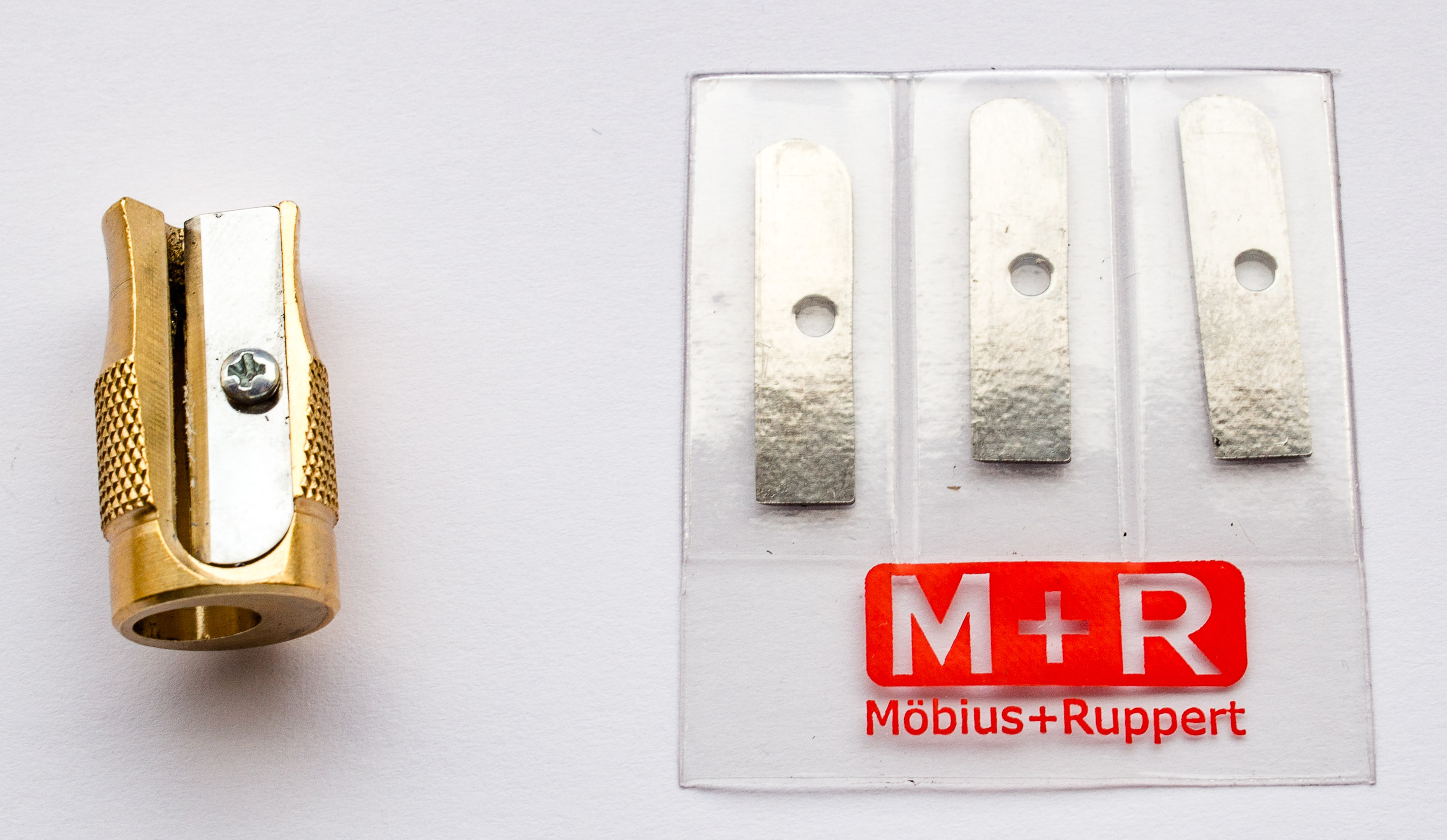
Pollux spare blades
Thanks to Gunther from the Lexikaliker blog I got a set of spare blades for my Pollux when I met him last month at Insights X. Thank you!
Pollux spare blades
Royal Mail’s 17th century pencil
Royal Mail’s Great Fire of London Special Stamps feature a 17th century pencil. I don’t have the stamp, but I have the postcard with the same picture, so I thought I show you this pencil (the red one on the left), together with a similar pencil – the one from Staedtler’s historic pencil kit. Petroski (1989, p. 47) [1]Petroski, H. (1989) The Pencil writes that by 1610 black lead was used by artists and others to fit into their wooden pencil cases ..so a pencil being used in the planning of the reconstruction of London in 1666 seems realistic.
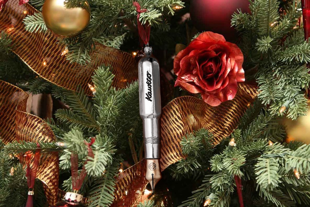
The photo of the Kaweco Tree Ornament has been taken from the Massdrop offer of this product. I believe that showing the photo in this blog post falls under “fair dealing” as described by the UK Copyright service.
When Scribble offered me to send some Kaweco inks for testing I was quite excited.
My wife and I have, between us, a few Kaweco fountain pens and ink cartridges and in 2012 it got even ‘worse’ when Cultpens had an offer where you could get a free Kaweco Twist and Out Cartridge Dispenser, that offer involved buying even more cartridges.
..but recently I started assuming that the Kaweco inks have some special properties, based this sentence Cultpens had in their description of Kaweco inks:
The colours and character of these inks is very reminiscent of the long-discontinued rotring inks.
..so Scribble’s offer was very much appreciated.
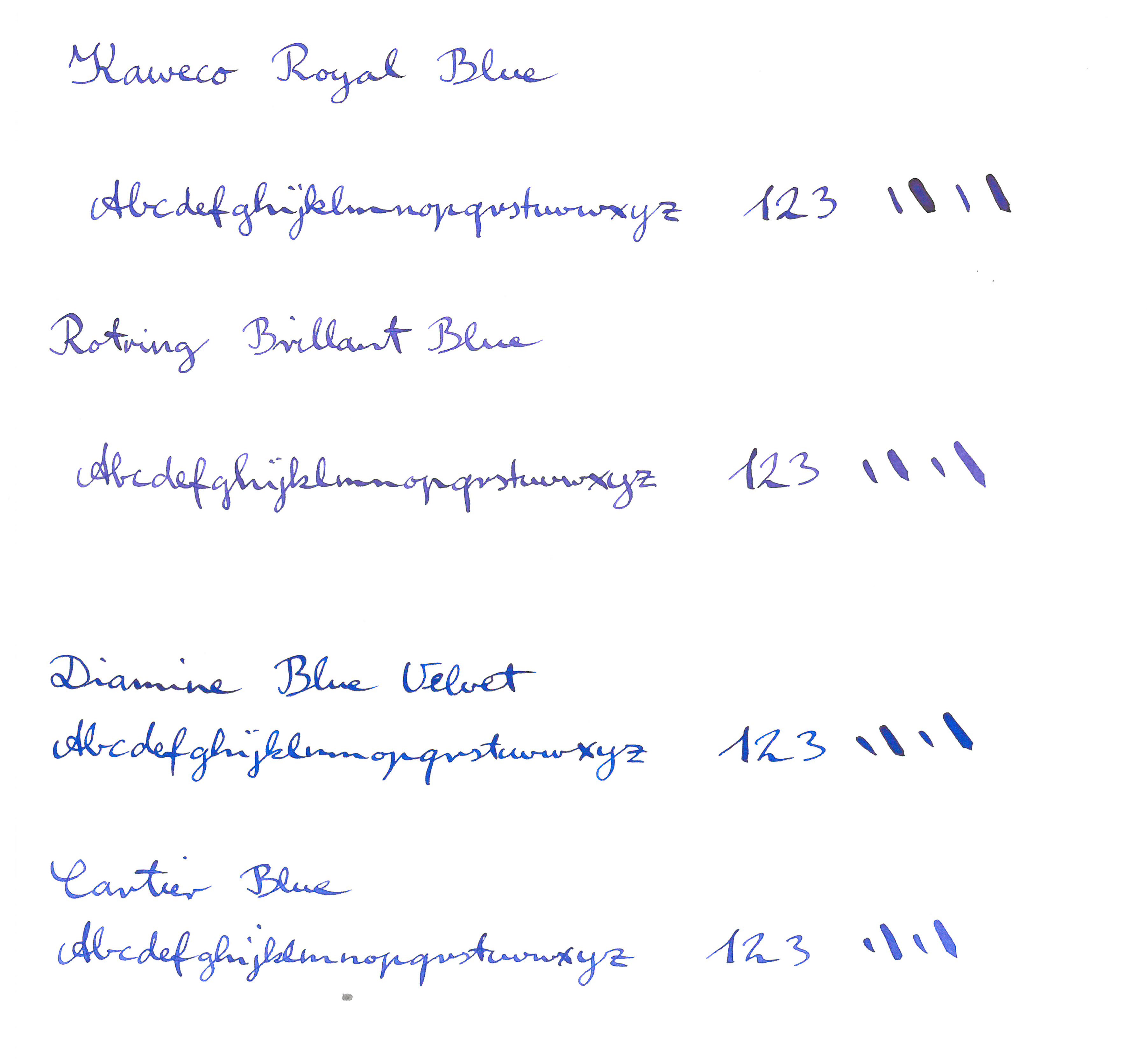
Scribble’s sample and my other blues
Well, Cultpens has now removed this sentence from their web site, but nevertheless, I was intrigued. What are those colours and characteristics? They’d have to be somehow special to be worth mentioning. I wouldn’t be surprised if neither Rotring nor Kaweco make/made their own inks, so maybe all of these inks are made by a third party, probably a German company, so are these inks maybe even identical?
Luckily I still had some NOS Rotring ink (even unopened) from many years ago. These are pretty hard to come by these days. I only found one on eBay USA and one on eBay in Europe.
I didn’t know what to expect from the Kaweco and Rotring ink, so the whole thing was more exploratory and I didn’t have any hypotheses, mainly because I wasn’t even sure what Rotring’s magic ink properties are supposed to be.
To find out more I thought I compare the Kaweco and the Rotring blue to some other blues. Unfortunately I didn’t have what I would think of as the standard blue, Pelikan’s royal blue, at home. I also didn’t have Lamy’s blue. I guess after writing with these for more than a decade when I was in school I wanted to try some other inks and never stocked up one them again.
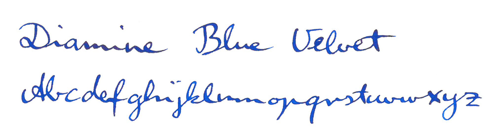
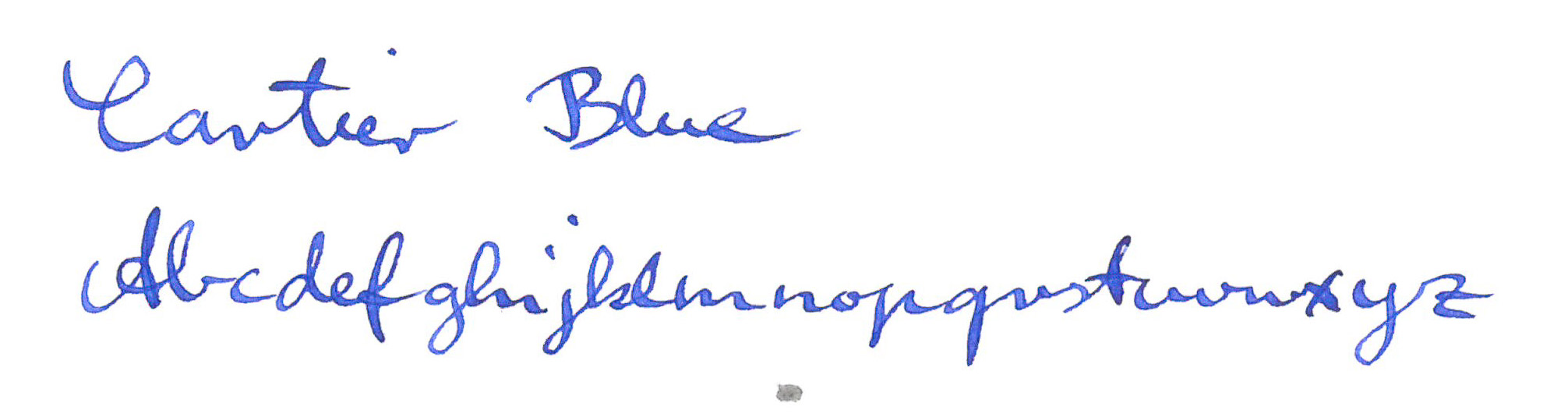
For comparison, additional to the Kaweco and Rotring, I picked Diamine’s Blue Velvet (one of the 150 years anniversary ink) and Cartier Blue (or should that be must de Cartier, as written on the ink bottle?).
Well, I wasn’t disappointed, but as I mentioned, I didn’t have any expectations either. The Kaweco Royal Blue is definitely a different ink than the Rotring Brillant Blue, also called Ultramarine. To be honest, there are so many languages on the box, I am not sure whether Ultramarine is supposed to be the English name for this ink or the ink in another language, but I have seen people call this ink Ultramarine on the web, so it might help identifying this ink.
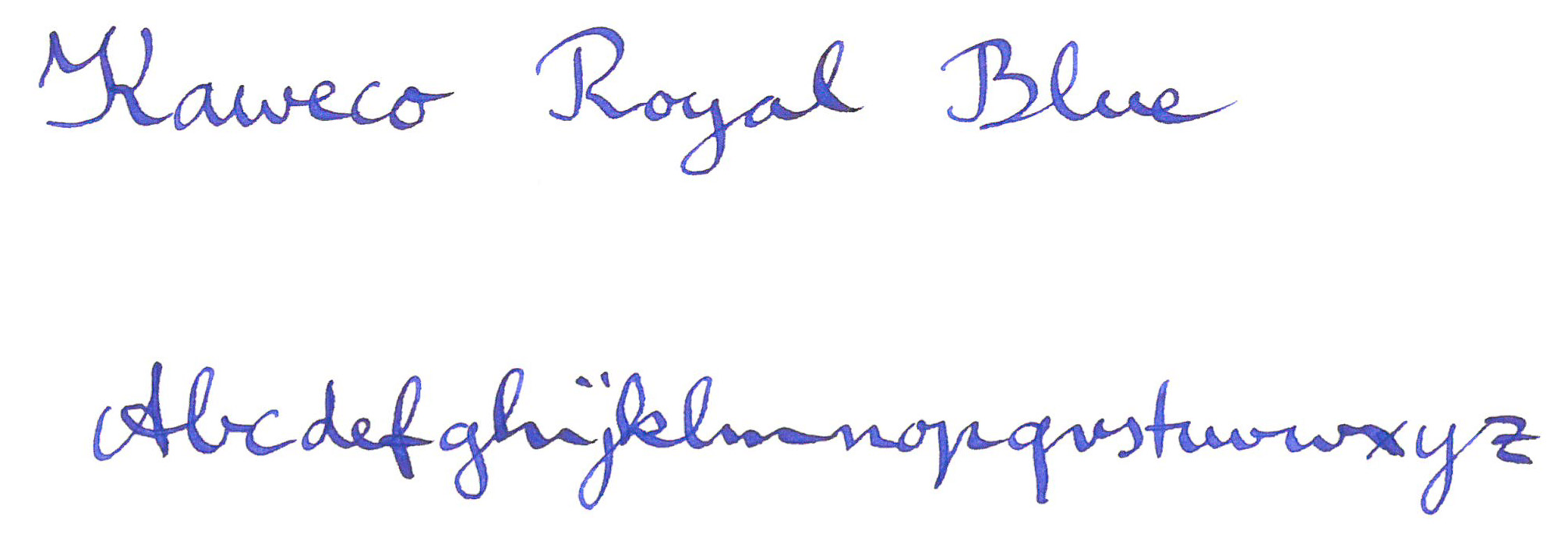
The Kaweco Blue is stronger and less red than the Rotring Brillant Blue. Have a look.
The Rotring is the least blue and most red ink in this comparison. It is however still a proper blue ink.
The Diamine Blue Velvet is strong and dark and certainly happier and less serious than the Kaweco (oh my, this is getting very subjective now).
The Cartier Blue is probably the most reserved and modest of the bunch.
Well – I am still not clear about these properties of the Rotring and the Kaweco that Cultpens hinted at without going into any details.
Maybe some water can help to solve the mystery?
No. I’m still not any closer to finding out what these properties are. Well, it doesn’t matter though. They are all nice blues. I wonder which one I should try next in a fountain pen…
By the way, I used a dip pen with a Brause No 361 nib (Shangching calls this nib the blue pumpkin), to make it easier to control ink cross contamination. This results in much more ink being out on the paper than with your average fountain pen.
When I asked if they have any new products they showed me their new diary system.
Please open in a new tab to see the images in high resolution. They come with holder for business cards etc.
Platinum
Also at Insights X was Platinum.
The brought some of their posh fountain pens along, including some with Urushi lacquer.
When I asked about mechanical pencils they showed me their OLEeNU+ but weren’t able to give me more information (there clearly was a language barrier, even though they brought a staff who spoke English). The normal OLEeNU (not the plus version presented at the stand) uses the lead up to the last 0.5mm, similar to the Staedtler Integrity mentioned here and reviewed here. It also has a spring to help prevent lead breakage and a sliding ‘sleeve’. The staff from the Platinum counter told me that the OLEeNU+ doesn’t have a sliding sleeve, though.
Stabilo
Stabilo presented some new products at Insights X, too. In terms of non-pencil products I liked their pastel coloured pens – the pastel Boss markers looked really good (not sure how it looks on paper though).
The touch smart pencil
In terms of pencils I found their touch smart pencil very innovative. Their ‘touch-screen function adapter’, the red item in the photo above, makes a normal pencil touch screen ready. You touch the screen with the pencil point, but through the clear plastic. It will then register on touch screens. I wonder whether it will work better than existing touch screen technologies, which often need a lot of force to work.
Other companies
Unfortunately I didn’t have time to visit the Clairefontaine/Exacompta/Quo Vadis, Koh-I-Noor, KUM or any of the other companies. What a shame.