Freshly re-inked: My Super5 fountain pen in green (Dublin) is now part of my current pen rotation. The other two currently inked pens include the Lamy 2000 with an EF nib and the re-release of the Parker 51 in Teal with an F nib.
Coincidentally coinciding with Chinese New Year: a new addition to my Pelikan flock.
I couldn’t resist CultPen’s Pelikan discount offer and bought the ‘Traditional M120’. Upon arrival I filled it with Diamine Prussian Blue.
When I showed it to my wife, who usually loves Pelikan (except that blue M205 demonstrator I got in 2009), she compared the looks of the M120 to a Super5 and commented on the price.
When I ordered the M120 I didn’t think of the Super5 at all. Now that I made the connection it is so clear. Yes, they are similar, but putting them next to each other you realise how similar they are.
The colour of the M120 is beautiful, but the Super5 colours are beautiful as well. Pelikan and Super5 managed to find special colours that are the opposite of boring.
The Super5 is much cheaper, so unlike the Pelikan you don’t mind using it all the time. You don’t feel you have to protect it from scratches and the bad world out there. It takes cartridges – unlike the Pelikan which is a piston filler which always feels more high end. The Super5 is also special in a way: it is available without an Iridium point which makes for a nice and different writing experience.
Happy New Year of the Mouse to all Bleistift Readers. Enjoy your pens.
I’m currently using my Super5 with the 0.7 nib a lot, but I made one mistake: I filled a Faber-Castell converter with the Aurora Blue-Black ink without checking first whether it fits. Well, the converter is too long to fit, but luckily you can remove the end caps of the new Super5 fountain pens [1]The purpose of this: So that you can create different colour combinations, e.g. a white pen with a red end cap, etc. ..so I have been using the Super5 without the end cap for the last weeks.
The new Super5 without the end cap
Somehow the Super5’s 0.7 nib makes me write quite differently: the writing is a bit bigger with letters being more condensed, not as tall. Well, it makes for an interesting change.
I can’t complain about the paper I’m using either. It’s from one of Rad and Hungry’s old subscription boxes, the Swedish one from maybe five years ago. Excellent paper!
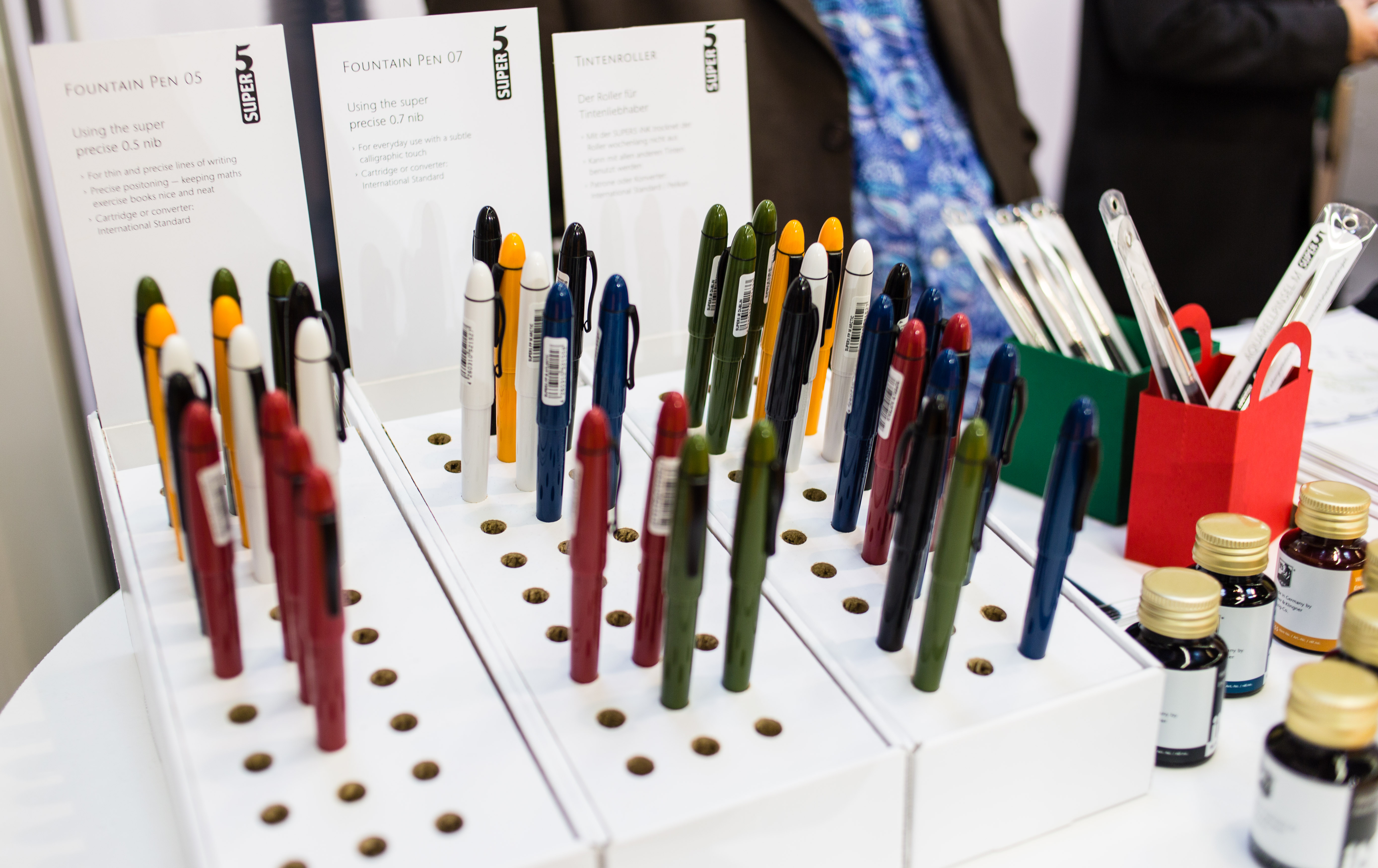
Super5 presented their new fountain pens, the 07 and the B) at Insights X. They belong to Papierlabor / Format from Darmstadt in Hesse (not to be mixed up with Austrian paper manufacturer Format Werk).
Additionally to the 0.5mm nibs they now also sell 0.7mm nibs, M nibs (1.0mm) and B nibs (1.5mm).
Like the 05, the 07 version has no iridium point – that’s what gives the Super5 the very different writing experience and style. The M and B versions do have iridium points, though.
Robert Neumann, the man behind the Super5 fountain pen.
Some sources on the Internet suggest that there is no iridium in fountain pens’ iridium points, e.g. this article, but when I asked at the stand about this I was told that there is in fact iridium in the iridium point of the nibs.
Also available at the stand were Super5/Papierlabor’s waterproof inks, their ink cleaner concentrate and their new brush with soft synthetic fibres.
Super5 fountain pens
When you see the new fountain pen colours on a screen they look good, but in reality they look absolutely amazing! Especially the blue and green versions, but also the yellow one look just so good to me.
Robert Neumann, the man behind the Super5 fountain pen, also told me about the flex nib verison of the fountain pen they are working on, together with JoWo. I love flex nibs, so I am definitely looking forward to their new fountain pen.
Super5 ink
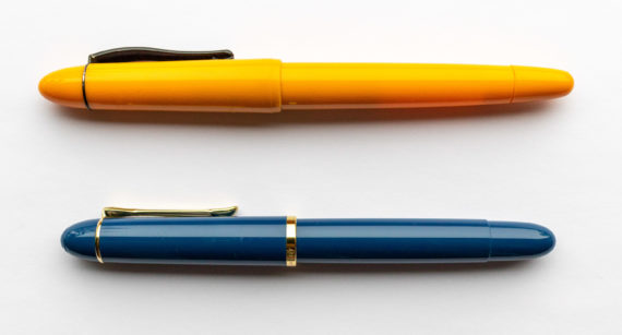
By the way, the new pen bodies don’t have the logo printed on the body anymore. Instead they are embossed. I preferred the old look, not only because on the new body you can see on the outside where the thread is, but everyone has a different taste.
Top: the old Super5 body with the printed logo Bottom: the new body with the embossed logo
You might remember my leaky Super5. Luckily I got it swapped for another one.