Staedtler’s Noris the pencil I have written about most in this blog [1]Have a quick search here for Noris to see some of the blog posts about this pencil.. No wonder, it is my favourite after all.
A Noris picture from a previous blog post to liven up this blog post
That’s why I am especially happy to hear that there will be a high-tech, digital Noris, the Noris digital stylus for the Samsung Galaxy Tab S3, as reported today on several web pages (Sam Mobile, The Verge, AnandTech). I won’t be getting one, as I had some less than stellar experience with Samsung in the past, but I am nevertheless happy that the Noris gets the attention it deserves by being adopted and adapted by one of the big players in the mobile industry.
The Noris digital will be available in classic Noris yellow and in Noris eco green. The exciting bit is that the Noris digital is made from Wopex material, just like the Noris eco.
The Noris eco in five grades – an image from an old blog post to make this one less boring
To look at the pencil being used in mainstream media over time have a look at the Noris in the Wild page.
The analogue Noris in comparison (an image from an old blog post to make this one less boring)
The name Noris is linked to the city of Nuremberg, where Staedtler is based. Staedtler has used the name Noris as a trademark since 1901, but the black and yellow striped look has only been used since the 1950s. Recently Staedtler has started rebranding their Wopex pencils as the Noris eco, with black and green stripes, similar to the original Noris. Looks like the latest addition to the series is the digital Noris. You can find out more about the Noris in this Stationery Wiki.
Please don’t sharpen the digital Noris with the Staedtler 501 180 sharpener you can see below, it’s only for the Noris eco (Wopex material).
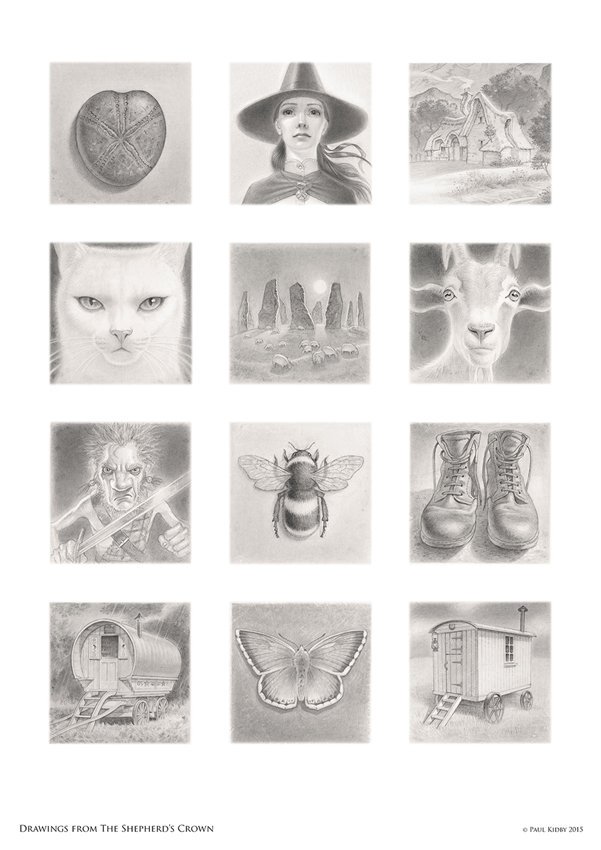
It’s time for another Traces of Graphite blog post. All the previous blog posts in this series were Disney themed (Barks, Rosa and Fecchi), but this time the blog post is Discworld themed.
Paul Kidby‘s very impressive pencil point from my previous blog post made me want to find out more about the pencils he is using to create his drawings.
Luckily Paul was kind enough to answer my questions. Here is a little insight into his pencil use.
Bleistift Blog:
Thank you very much for agreeing to answer these questions.
Could you please introduce yourself and your work and tell us where people might have seen your work?
Paul Kidby:
Hello, my name is Paul Kidby and I am an illustrator based in the UK. I am best known for being the writer Terry Pratchett’s artist of choice to illustrate his best selling Discworld series.
In the Terry Pratchett documentary, you can be seen with a hand-sharpened Castell 9000 with an impressive pencil point. Could you tell us which pencils and lead grades you use and how you use them? What other tools do you use to create your incredibly detailed work?
Paul Kidby:
When I draw I use Faber Castell 9000 series in lead grades 3B, 2B, B, HB, F, H 2H, 3H, 4H. My favourite is F & H. I don’t use 3B & 2B & B very often because it can make my work go smudgy – so I save them for areas where it needs to be very dark.
I also use Derwent stumps for blending and Faber Castell perfection 7056 pencil erasers which I can sharpen to take out accurate highlights in my drawing. I sharpen my pencils with a Swann-Morton DS2902 scalpel with 10A surgical blades, I then sand the pencil point using a Derwent sanding block.
I draw on a white smooth surface – eitherSchoellershammer illustration board or Bristol Board.
Bleistift Blog:
That is great. Thank you very much! Could you please explain to non-artists why you sharpen the pencil to such a long point? Is it so that you have more control over the pencil, or does it help to see the drawing better, e.g. the pencil doesn’t cover the view of the image so much?
Paul Kidby:
I sharpen to a long point because it gives me better control.
I would like to thank Paul Kidby for answering my questions.
With the colouring book craze of recent years going on his Discworld colouring book seems like a great idea (Paul Kidby’s shop (signed artist’s edition), Amazon US, AmazonUK).
One last bit of information : Paul Kidby also told me that he is inspired by the delicate pencil work of Ingres from the early 1800’s.
Jean-Auguste-Dominique Ingres: Mme Victor Baltard and Her Daughter, Paule, 1836
If you don’t like gory pictures look away, we have a broken Staedtler Noris coming up.
Today: a Noris I came across in a Clarks store. Clarks is a British shoe shop chain. My guess is that they are the biggest shoe shop chain in the UK, but I could be wrong.
The Noris, which can be seen on the poster and which seems to be used by a worker in the shoe factory is broken, the end bit is partly split off – yes, I know, you just walk into a shoe store, don’t expect anything bad and then you are confronted with a broken Noris ..without warning!
The EAN code seems to indicate that this poor butchered Staedtler Noris has a B lead.
I was still writing blog posts about my trip to Germany when Insights X and other things happened, so I never finished the blog posts about my time in Germany. Here’s my conclusion with a short post about pencils made from linden (lime) wood:
I had a great time – and it’s all Gunther’s ‘fault’: I never heard of tree top paths until I read about them on his blog. Well, recently a tree top path opened near my old home town and remembering Gunther’s blog post I couldn’t resist and visited.
A panorama shot from my phone. Excuse the panorama stitching mistakes.
As you can see in this table with information the Wood Database European linden wood is quite a bit harder than other wood used for making pencils (Brasswood is American linden wood), so I am not surprised that this isn’t a common wood for pencils. At least not anymore. As described in Gunther’s blog post it was common in the 17th century. The average dried weight of European linden wood is a bit higher than other wood as is the Janka Hardness [1]The amount of pounds-force (lbf) or newtons (N) required to imbed a .444″ (11.28 mm) diameter steel ball into the wood to half the ball’s diameter – see … Continue reading. I assume you could treat the wood to change the hardness, but my assumption is that trying to influence the hardness too much wouldn’t be economical.
These pencils were made by Staedtler. As far as I know they use Bavarian graphite, but the clay is from another German state. With the wood being from Lower Franconia this is a nearly 100% Bavarian pencil.
Here’s a video from the Bavarian State Forestry (in German) showing how these are made – from cutting the tree to the finished pencil. Interesting fact: in the video a Staedtler employee explains that they can get 2,000 – 10,000 pencils out of one tree.
Well, they made 100,000 pencils like this. Now there are a few less left as I couldn’t resist and bought a handful in the tree top path’s souvenir shop.
The amount of pounds-force (lbf) or newtons (N) required to imbed a .444″ (11.28 mm) diameter steel ball into the wood to half the ball’s diameter – see http://www.wood-database.com/wood-articles/janka-hardness/
There were a few great blog posts about Faber-Castell’s Perfect Pencil on Sean’s (retired) Pencils and Music blog and the (also retired) Pencil Talk blog had a whole series of blog posts about the different versions.
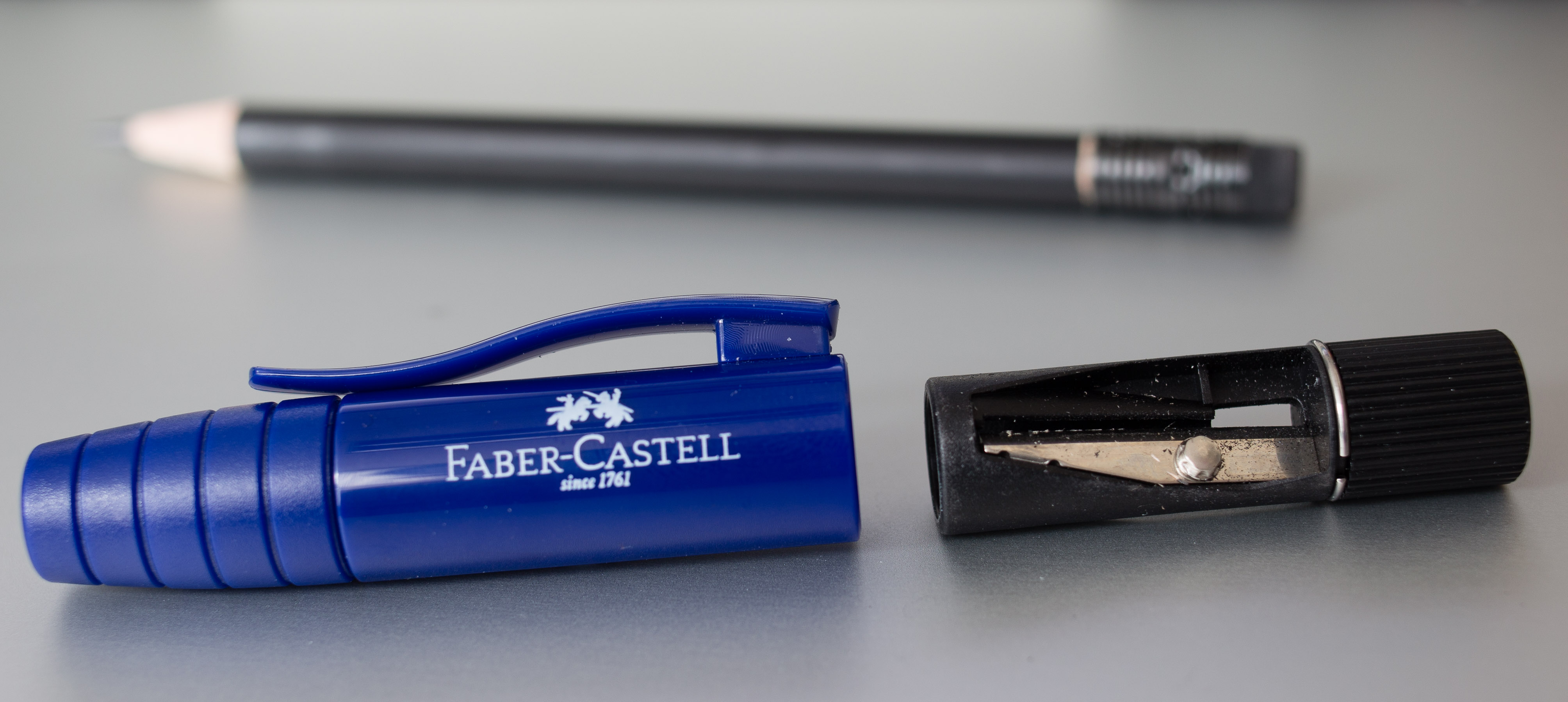
I have used Faber-Castell’s Perfect Pencil for quite a few years now and have mentioned it a few times on this blog, but I thought the blog posts I have don’t pay adequate tribute to this great pencil, so here is a closer look (I don’t dare to call it a review) at the cheapest version available.
The Perfect Pencil II
Officially called the Perfect Pencil II, but sometimes called the Perfect Pencil junior (for example at Cult Pens while The Journal Shop calls it Perfect Pencil II) this pencil was released in 2007. There are different colours available (blue, red, black, blackberry – the article number starts with 18 29, followed by another number for the colour) and this pencil can be bought for £3 (~$3.95; €3.55) or less. I bought mine in Shanghai and I think I paid the equivalent of £2 or less.
Like the more expensive perfect pencils it can be used as
a cap to protect the pencil point, making the pencil pocket safe
as an extender to write more comfortable with short pencils
and it features a built-in sharpener.
It is best to be used with eraser tipped pencils and official refills are shorter than normal so that the perfect pencil fits in shirt pockets etc.
It’s not bad looking, but for my taste the Castell version is much better looking ..and less bulky, but also a few times more expensive, so more of a problem when you lose it (I lost mine after a few years of use).
The Perfect Pencil’s history
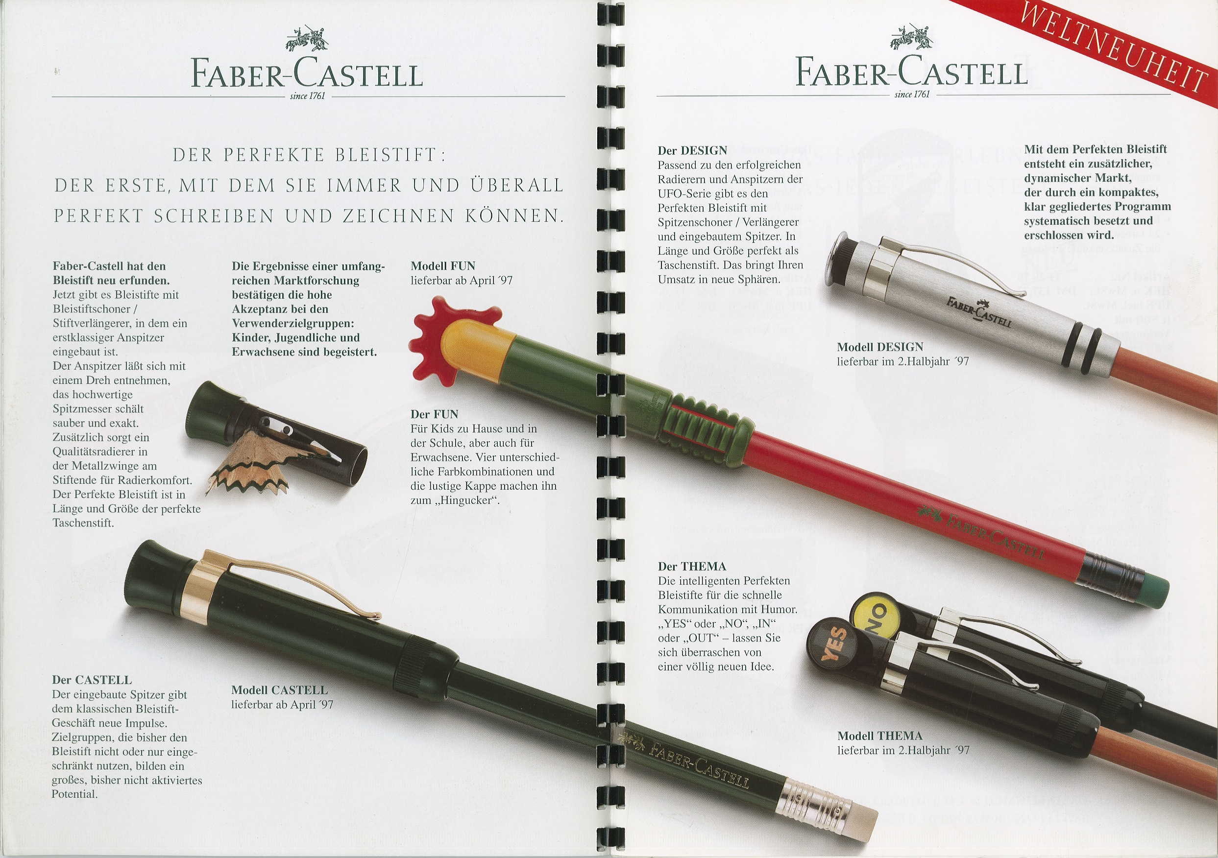
The first perfect pencil, the brainchild of Anton-Wolfgang Graf von Faber-Castell, was part of the Graf von Faber-Castell line and came out in 1993. Back then the eraser was in the extender.
1997 Faber-Castell released more affordable perfect pencils (the Castell and Design versions are still available) and a year later the posh Graf von Faber-Castell perfect pencil changed to the more familiar version with the eraser under a small cap.
The perfect pencil line in 1997A very simple perfect pencil time line
Here’s a video where I look at the Perfect Pencil II.
I suggest you click on it to open it in YouTube, you then get a higher resolution and you can play it with a higher speed on most devices (I like 1.5x). This video also looks at how products in China are marked (origin and date) and shows Shangching‘s Tomoe River notebook I use for diagrams in this blog.
Other manufacturers have released similar products.
If you want to move up to a more expensive version I recommend the Castell version, which can be bought for under £10 (~$13.15; €11.80). I have previously looked at the black edition of the Castell Perfect Pencil.
There is also the more direct successor available, the Perfect Pencil III, bulkier, but with a built-in waste box. The cheapest seller I found in the UK so far is the Journal Shop where it sells for £3.95.
If you like to read more about the perfect pencil: Here are more Perfect Pencils at other blogs