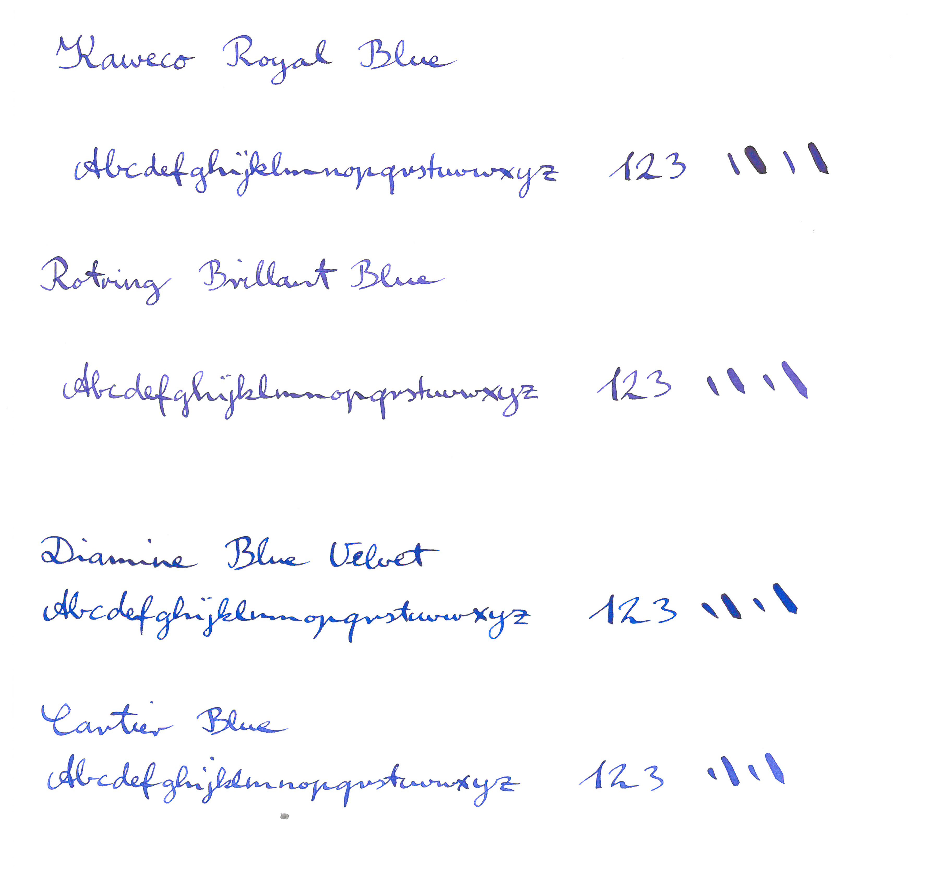
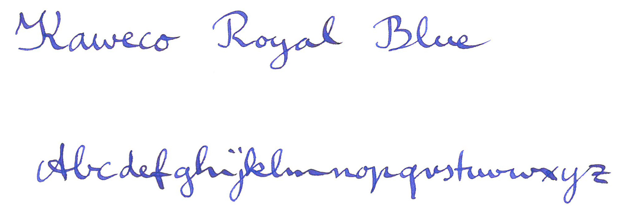
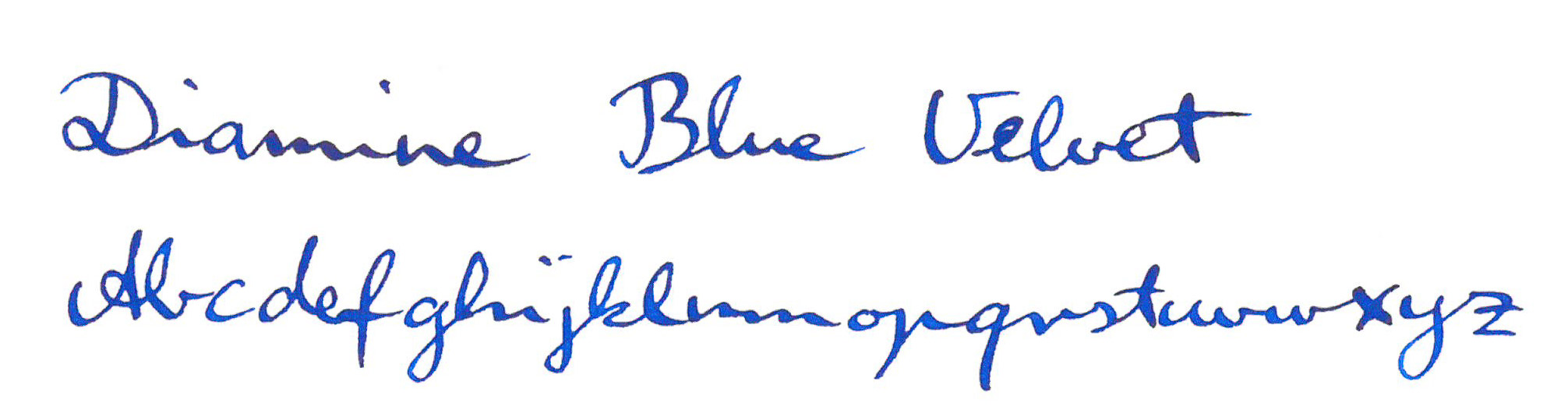
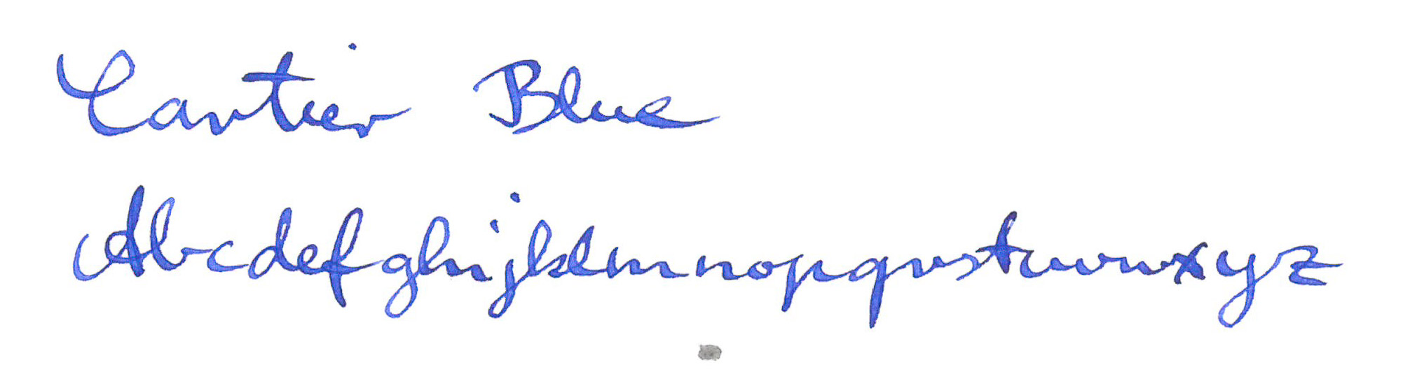
By Type

Lunatic Paper


lunarcoverThe next Field Notes edition, Black Ice, has already been announced, so posting this Lunacy review end of November means I’m a bit late to the party, but anyway: here’s a quick look at the paper used in the Lunacy edition, Domtar Earth Choice and a comparison with the best and the worst Field Notes paper I have used so far.


The Boise Paper (County Fair)

The Boise Offset Smooth 50#T “Whitewash” can be found in the Field Notes County Fair edition [1]More about this paper can be found in this blog post.


The Finch Paper (Original)

The Finch Paper Opaque Smooth 60#T “Bright White” that can be found in the original Field Notes was a disappointment. Graphite is quite light on this paper – I guess it would make good paper for soft leads, though. Ink, from fountain pens and even from gel pens, get sucked into the paper and is happy to bleed easily through the page …unless you have a very dry pen.

The new Black Ice edition will use Finch paper again, but this time “Bright White” Finch Fine Smooth 70# text paper. The description on Finch’s website sounds as if Finch Fine is better paper than Finch Opaque, but the information on the website is written for people printing on these papers, not handwriting on these papers, so for me, it remains to be seen whether Fine is better than Opaque. If you own the America the BeautifulFrost Gray or DDC Orange editions you have used Finch Fine in a different colour so you might be able to judge whether it is better for handwriting, drawing etc.


The Domtar Paper (Lunacy)

So here’s the ‘new’ Domtar paper. According to their website it’s “the largest family of environmentally responsible papers ever assembled” (not the most environmentally responsible papers ever assembled).

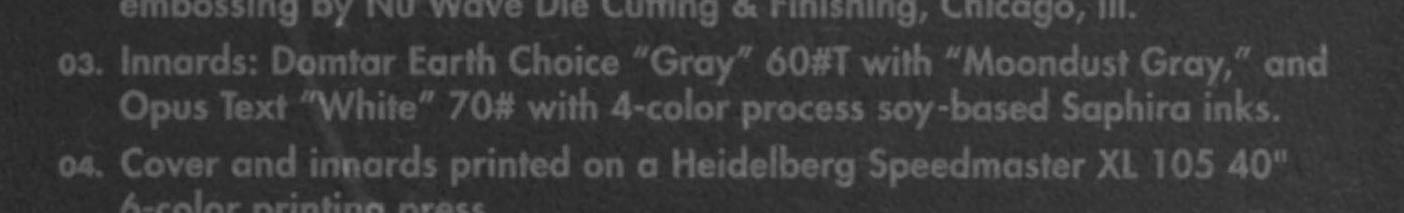
Looking at the Domtar website I think Domtar Earth Choice “Gray” 60#T with “Moondust Gray” must be the Earth Choice Colors Opaque Text, but I’m not 100% sure.

Looking at this Paper weights table I guess the 60# weight used for this paper must be equivalent to 90g/m².

domtar


The Test

The paper is tested using the same parameters as in previous paper tests and explained here. In short: The pencil lead used has a nominal diameter of 0.7mm and an actual diameter of 0.68mm (more info about nominal vs actual  diameters can be found here). This is equivalent to a surface area of 0.36mm². A force of 1.5N is used, which, in this case, is equivalent to 4.17 MegaPascals for this surface area.

3fns
Left to Right: Boise, Domtar, Finch

The violin plots show how dark the pencil marks left on the paper are. The general idea is that darker marks are easier to read and are therefore better. Darker marks result is violin plots that are lower positioned and black values would be low (near 0 on the y-axis (left)), while light marks are towards the top.

The Outcome

Well, it’s grey paper, so there’s no surprise when we see that the violin plot shows that Domtar’s ‘violin’ doesn’t get anywhere near the white value reached by Boise or Finch paper. If you look closely you can also see that the Boise paper is not as white as the Finch paper.

If you look closely at the marks left by graphite you can see that the paper will ‘shine’ through the line written on the paper as the roughness of the paper means that graphite isn’t left evenly on the mark left. This is where the paper colour for the test can be ‘picked up’ by the violin plot.

The Domtar paper doesn’t take graphite as well as Boise (County Fair) paper, but certainly better than Finch (Original/Kraft) paper. Because of the lower starting point, due to the greyness of the paper, overall ‘contrast’ isn’t however much better than the Finch paper.

I am happy to say that the Domtar paper behaves much better with ink than the Finch paper.

For pencils, there is better paper out there, e.g. Atoma, Banditapple or Silvine, but the paper quality is not the main attraction of the Field Notes anyway.

A violin plot comparing Boise, Domtar and Finch paper

The Links

If you like to read more about the Field Notes Lunacy edition have a look at Ed JelleyFountain Pen Follies,  OfficeSupplyGeek or Pens and Junk. For anything Field Notes related please visit Three Staples.

Update 25 Nov 2016: I just finished listening to The Pen Addict Podcast #232, where Brad and Myke give further insights into the paper used for different Field Notes. The question about Field Notes paper starts at 1:10:10. 


In case you wonder about how I use the Field Notes in the photo: The yellow County Fair contains notes from medical visits from our son, the Lunacy one isn’t being used yet, and in the Original one, labelled ‘Ausgaben’, I try to follow Sola’s example and try to keep notes of money spent.

Lunatic Paper Read More »

Tree Top Path & Linden Pencils

I was still writing blog posts about my trip to Germany when Insights X and other things happened, so I never finished the blog posts about my time in Germany. Here’s my conclusion with a short post about pencils made from linden (lime) wood:

I had a great time – and it’s all Gunther’s ‘fault’: I never heard of tree top paths until I read about them on his blog. Well, recently a tree top path opened near my old home town and remembering Gunther’s blog post I couldn’t resist and visited.

A panorama shot from my phone. Excuse the panorama stitching mistakes.

Unlike the tree top path Gunther visited, this one, the Baumwipfelpfad Steigerwald, opens up towards the top, so it looks a bit like a tornado. When I was there the weather was great (nearly 30°C (>85°F)) and everyone liked it. After the walk (which took quite a while) I had a look in the little souvenir shop and was more than excited to see the linden wood (lime wood) pencils from the Bavarian State Forestry that Gunther mentioned in a blog post.

WoodAverage Dried WeightJanka Hardness
Incense Cedar385 kg/m32090 N
Jelutong450 kg/m31740 N
Basswood415 kg/m31824 N
European Lime535 kg/m33100 N

As you can see in this table with information the Wood Database European linden wood is quite a bit harder than other wood used for making pencils (Brasswood is American linden wood), so I am not surprised that this isn’t a common wood for pencils. At least not anymore. As described in Gunther’s blog post it was common in the 17th century. The average dried weight of European linden wood is a bit higher than other wood as is the Janka Hardness [1]The amount of pounds-force (lbf) or newtons (N) required to imbed a .444″ (11.28 mm) diameter steel ball into the wood to half the ball’s diameter – see … Continue reading. I assume you could treat the wood to change the hardness, but my assumption is that trying to influence the hardness too much wouldn’t be economical.

These pencils were made by Staedtler. As far as I know they use Bavarian graphite, but the clay is from another German state. With the wood being from Lower Franconia this is a nearly 100% Bavarian pencil.

Bavarian Linden Pencils

Here’s a video from the Bavarian State Forestry (in German) showing how these are made – from cutting the tree to the finished pencil. Interesting fact: in the video a Staedtler employee explains that they can get 2,000 – 10,000 pencils out of one tree.

Well, they made 100,000 pencils like this. Now there are a few less left as I couldn’t resist and bought a handful in the tree top path’s souvenir shop.


You can read more about the company where the wood is cut into slats in another blog post from Gunther.


References

References
1 The amount of pounds-force (lbf) or newtons (N) required to imbed a .444″ (11.28 mm) diameter steel ball into the wood to half the ball’s diameter – see http://www.wood-database.com/wood-articles/janka-hardness/

Tree Top Path & Linden Pencils Read More »

Kaweco’s Royal Blue and other blues

When Scribble offered me to send some Kaweco inks for testing I was quite excited.

My wife and I have, between us, a few Kaweco fountain pens and ink cartridges and in 2012 it got even ‘worse’ when Cultpens had an offer where you could get a free Kaweco Twist and Out Cartridge Dispenser, that offer involved buying even more cartridges.

..but  recently I started assuming that the Kaweco inks have some special properties, based this sentence Cultpens had in their description of Kaweco inks:

The colours and character of these inks is very reminiscent of the long-discontinued rotring inks.

..so Scribble’s offer was very much appreciated.

Scribble's sample and my other blues
Scribble’s sample and my other blues

Well, Cultpens has now removed this sentence from their web site, but nevertheless, I was intrigued. What are those colours and characteristics? They’d have to be somehow special to be worth mentioning. I wouldn’t be surprised if neither Rotring nor Kaweco make/made their own inks, so maybe all of these inks are made by a third party, probably a German company, so are these inks maybe even identical?

Luckily I still had some NOS Rotring ink (even unopened) from many years ago. These are pretty hard to come by these days. I only found one on eBay USA and one on eBay in Europe.

I didn’t know what to expect from the Kaweco and Rotring ink, so the whole thing was more exploratory and I didn’t have any hypotheses, mainly because I wasn’t even sure what Rotring’s magic ink properties are supposed to be.

To find out more I thought I compare the Kaweco and the Rotring blue to some other blues. Unfortunately I didn’t have what I would think of as the standard blue, Pelikan’s royal blue, at home. I also didn’t have Lamy’s blue. I guess after writing with these for more than a decade when I was in school I wanted to try some other inks and never stocked up one them again.

For comparison, additional to the Kaweco and Rotring, I picked Diamine’s Blue Velvet (one of the 150 years anniversary ink) and Cartier Blue (or should that be must de Cartier, as written on the ink bottle?).

Blue ink comparison Kaweco Rotring Diamine Cartier


Well, I wasn’t disappointed, but as I mentioned, I didn’t have any expectations either. The Kaweco Royal Blue is definitely a different ink than the Rotring Brillant Blue, also called Ultramarine. To be honest, there are so many languages on the box, I am not sure whether Ultramarine is supposed to be the English name for this ink or the ink in another language, but I have seen people call this ink Ultramarine on the web, so it might help identifying this ink.

Blue ink comparison Kaweco Rotring Diamine Cartier

The Kaweco Blue is stronger and less red than the Rotring Brillant Blue. Have a look.

Blue ink comparison Kaweco Rotring Diamine Cartier

The Rotring is the least blue and most red ink in this comparison. It is however still a proper blue ink.

Blue ink comparison Kaweco Rotring Diamine Cartier

The Diamine Blue Velvet is strong and dark and certainly happier and less serious than the Kaweco (oh my, this is getting very subjective now).

Blue ink comparison Kaweco Rotring Diamine Cartier

The Cartier Blue is probably the most reserved and modest of the bunch.

Well – I am still not clear about these properties of the Rotring and the Kaweco that Cultpens hinted at without going into any details.

Maybe some water can help to solve the mystery?

Blue ink comparison Kaweco Rotring Diamine Cartier

No. I’m still not any closer to finding out what these properties are. Well, it doesn’t matter though. They are all nice blues. I wonder which one I should try next in a fountain pen…

By the way, I used a dip pen with a Brause No 361 nib (Shangching calls this nib the blue pumpkin), to make it easier to control ink cross contamination. This results in much more ink being out on the paper than with your average fountain pen.

Kaweco’s Royal Blue and other blues Read More »

Handicraft with Bleistift VI – High tech pencil sharpening: Sharpening a pencil with a hard disk

Today: a short video with some high tech pencil sharpening, showing how to sharpen a pencil with a hard disk. It’s Handicraft with Bleistift VI.

..you could use a similar set up for grinding fountain pen nibs.

It might be worth making a backup of the contents of your hard disk before converting it into a pencil sharpener.

Handicraft with Bleistift VI – High tech pencil sharpening: Sharpening a pencil with a hard disk Read More »

Staedtler at Insights X 2016

Welcome to the first of two articles about Staedtler at the Insights X 2016. This one is looking at one of the great minds working at Staedtler: Helmut Hufnagl.

Helmut Hufnagl
Helmut Hufnagl

Helmut Hufnagl loves to solve problems.

Wopex pencils have a different material, so sharpeners don’t work well with them?

No problem, Mr Hufnagl comes up with a Wopex optimised handheld sharpener as well as the crank sharpener 501 180.

Normal rulers are created for right-handed people, so left handed people might struggle with them?

No problem, Mr Hufnagl comes up with new rulers that are equally suited for right and left handed users.

Sharpeners make a mess in the pencil case?

No problem, Mr Hufnagl comes up with a sharpener that won’t leave bits of wood and graphite all over the pencil case anymore.

For 2017 he also came up with a new set of compasses that convey the idea of geometry through basic geometric forms and that convey the idea of colour through a special paint and a new set of metallic coloured sharpeners.

..but the best one is yet to come and it reminds me of a story I read many years ago about Adi Dassler, the boss of a German sports shoes and clothing manufacturer, who is also from the Nuremberg area. Not only did he equip Jesse Owens who went on to win four gold medals, he once watched the Olympic Games on his telly from his home in Bavaria and noticed that one of the athletes at the Olympic Games in Montreal 1976 was running unevenly. He advised over the phone how to adjust the shoes and Alberto Juantorena, the athlete we saw on telly, went on to win two medals.

Well, Mr Hufnagl’s story is quite similar. He spotted a problem in another part of the world when he was reading an article in Wall Street Journal about his favourite designer, Giorgetto Giugiaro, the man who designed the original VW Golf, the DeLorean (Back to the Future), the Lotus Esprit (James Bond – The Spy Who Loved me) and many many more.

In the article in WSJ Mr Giugiaro wrote:

I can’t live without my blue Staedtler pencils. I use the pencils with the hardest lead when I have to draw the most precise contours, and softer leads for drawing shadows or for 3-D effects. When I draw one-to-one scale figurines, I prefer charcoal pencils and chalks.

Mr Giugiaro's lead holder
Mr Giugiaro’s lead holder (Image © Wall Street Journal)

The article also features a photo of Mr Giugiaro’s Staedtler ‘pencil’ – it has a beige mark, presumably to indicate which type of lead is in the lead holder. This is where Mr Hufnagl realised that it is easy to help Mr Giugiaro and others by introducing a lead hardness indicator. This was the birth of a classic with a new twist, the Mars technico 780C with a lead hardness indicator that can bet set to 4H, 2H, H, HB, B, 2B, 4B, red and blue by twisting the clip. I find it amazing how a simple idea can improve a tool that has been around for decades. The special black edition of this lead holder, pictured here, is being released at the same time as the traditional blue version gets the lead grade indicator update.

Staedtler Mars technico

The new lead hardness or lead grade indicator is probably especially useful if you don’t use Staedtler leads. If you buy the original leads each different grade is supplied with a different colour replacement push button (they are however only push buttons, the lead holder comes with a more useful push button that doubles as a pointer/sharpener). This is not being mentioned on the Staedtler web site, but you can find this information in the comments on Dave’s Mechanical Pencils, on the Cult Pens web site or in Pen Paper Pencil’s review of the lead holder.

Staedtler Mars technico

Mr Hufnagl is changing his role within Staedtler, he stopped working as a Product Manager in the area of sharpeners and technical drawing and has started his new role as Head of Trade Marketing. I hope he will still have an opportunity to develop new products in his new role.

Staedtler Mars technico

Google also lists a patent with his name on.

I believe that showing the image from the Wall Street Journal in this blog post falls under “fair dealing” as described by the UK Copyright service.

Staedtler at Insights X 2016 Read More »