Made in USA

Kronenheft

Kronenheft, Morning Glory pencils (with point protectors) and Noodler’s X-Feather ink

Back from Germany, I am going to try another four-in-one blog post. I did not take part in the Faber-Castell factory tour mentioned in one of the previous comments because of a bereavement – which resulted in a very different trip than planned. I hope to take part in one of their factory tours in December and hope to find the time to visit Staedtler’s shop in Nuremberg, too.

This is going to be a four-in-one blog post because I want to speed things up as there are so many things I want to write about but I do not write enough blog posts – so the queue gets longer and longer. The low number [1]i.e. one of comments on the previous four-in-one blog post about the Black n’ Red polynote does however make me think that writing about multiple items in one blog post does not give each individual item the attention it deserves, so I might switch back to one or two items per post…

…but today another (the last?) many-in-one blog post.

Kronenheft

The Kronenheft must be one of the most understated notepads available. I bought mine at Antiquariat Daniel Osthoff in August 2010. I mentioned this shop and some of the papers they sell in my blog post about the OHTO Super Clip. The Kronenheft notepad has been on the market for many years and is distributed by Carta Pura. It measures 15 cm x 10 cm and features a 290 g/m² Preßspanersatzkarton cover, an “imitation particle board” traditionally used, amongst other things, for book covers. It is a sturdy material made from wood pulp. The paper of this pad is 80 g/m² Salzer Werkdruck paper from Austrian paper manufacturer Salzer. Even though paper has been manufactured in Salzer’s town since 1469 and at the their mill, Obere Papiermühle, since 1579, the history of Salzer is slightly younger as the founder Kaspar Salzer did not have his own paper mill until 1798. Even though the 80 g/m² Salzer Werkdruck paper is not their best paper it is very good with a great feel and texture and a slightly creme-coloured tint.

Carta Pura, the distributor, sells this notepad in twelve different colours for € 7 each. You can also get a refill (40 sheets) for € 3. I paid less, but I am not sure how much exactly. FontShop used to sell them for a good price, but when I check recently I could not find it in their online shop any more.

The crown (German: Krone) in the Kronenheft

Morning Glory

This is the second appearance of a Morning Glory pencil at Bleistift. The first appearance was last month, when I wrote about RAD AND HUNGRY’s STMT X Korea kit. This time I used a much older Morning Glory pencil that my wife bought about ten years ago, the morning glory No. 33322-45229 HB. You would think that such a long product number can definitely point to one specific type of pencil, but there are actually different versions of the morning glory No. 33322-45229 HB pencil, with different colours printed on the pencil, but with the same product number.

The pencil itself writes very well. It could be a bit smoother, but it is by no means a scratchy pencil.

Pelikan M100

Since today is Star Wars day (May the Fourth be with you) I have to include the Pelikan M100, too. I cannot look at this pen without thinking of Stormtroopers and am convinced that if Stormtroopers had fountain pens  this Pelikan M100 would be standard issue! It is a great fountain pen and all of its parts are either white or black, even the nib is black. The piston mechanism does not feel as smooth as it does with a Pelikan M200 or a Souverän, but when this fountain pen was released in 1987 it was not an expensive pen so it is no surprise that the piston mechanism is not on the same level. The nib however is excellent for a steel nib and is quite flexible, too.

If Stormtroopers had fountain pens this Pelikan M100 would be standard issue. Here you can see the M100 camouflaged between other black and white items.

Noodler’s X-Feather ink

The ink used in the M100 is Noodler’s X-Feather ink, a black ink that is bulletproof, i.e. resistant to bleach, chemicals, light, etc. I have used this ink for years and am very happy with it. There is only one disadvantage I noticed. If you use it in a wet writer and use paper that does not absorb ink easily (e.g. post cards) it can happen that a layer on top of the ink does not ‘dry’ completely. In this case it can smudge or smear, even days after the text has been written. Under normal circumstances this is however not really a problem.

Conclusion

The Kronenheft is just great, but with its price tag I am not sure I will use it often. It copes well with ink (no bleeding though) and pencil and has a nice colour and texture.


You can find another photo of the Kronenheft in my previous blog post Wooden Letter Rack with Draw.

You can find English blog posts about Carta Pura at bloesem travel and at snowflakes & blackvampires.

Noodler’s X-Feather ink has also been used in my previous blog post Carrefour Bloc-notes.

I’d like to thank Ms Schwamborn from Carta Pura for additional information about the Kronenheft.

In case you wonder where my Cherry G80-3000LSC went: the photos show my wife’s desk, which is very similar – except the keyboard.

References

References
1 i.e. one

Kronenheft Read More »

Black n’ Red polynote A7 plain

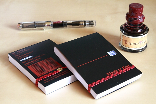
Last week I bought Black n’ Red’s pocket-sized, i.e. A7, polynote in my local Tesco’s. The polynote is a reporter notebook that flips open at the top and features a polypropylene cover and an elastic band. I bought it because it was half prize, only 60p (97¢; 68c), and because I was quite happy with my previous Black n’ Red purchase, a hard cover Black n’ Red recycled notebook.

Black n’ Red recycled hard cover notebook

My previous Red n’ Black purchase, the recycled notebook is really nice. Unlike the US version reviewed at Office Supply Geek it features British and European maps and information. I only paid £ 3.50 in my university’s library, but the price is probably either subsidised or they do not earn any money from this notebook as I have never seen anywhere else for a similar price. I have used this notebook for several months, but have only used pencils in this notebook, so I cannot comment on the suitability of the paper for fountain pens. It does however feel like good quality paper. I did contact Hamelin / Oxford brands with some questions about the paper, probably about a year ago, but unfortunately I never received a reply.

Back to the polynote

There seems to be a ruled version, too, but I bought the plain version. It contains 192 pages of 90 g/m² Optik Paper. The polypropylene cover seems durable and robust and can be wiped easily if dirty. The polynote does also contain a page with reference information, similar to the one found in the recycled notebook, but this time restricted to metric / imperial conversion tables. There is no danger that pages would fall out by mistake, but they can be removed easily if you wish to do so. The paper has a high quality feel to it and is more opaque than other 90 g/m² paper I have used in the past.

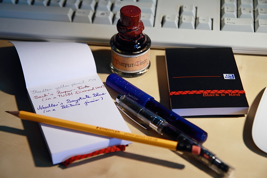
As you can see in the first photo I tried a pencil and two fountain pen inks on the paper.Erasing the graphite works well. The paper feels extremely smooth when erasing, but seems to retain more of a dent where the graphite was than other paper. This means you can see or guess the writing because of the slight indentation. Both inks worked well on the paper and did not bleed through the page.

Bach’s Purpur-Tinte

I bought the ink used with the TWSBI Diamond 530 at Eberbach Abbey, where some scenes of the film “The Name of the Rose” were filmed. This ink is from a small ink manufacturer called “Bach’s Tinten” (Bach’s inks). I have an iron gall ink from the same manufacturer, which is absolutely fantastic when used with a dip pen. Unfortunately, I was not able to find out more about the manufacturer of this ink. All I know is that it seems to be sold in some German museums and other tourist attractions. If you know more about this ink, please let me know.

TWSBI Diamond 530

I used Bach’s Purpur (purple) ink in my brand new TWSBI Diamond 530, which I bought from The Writing Desk for £36.79 (~$59.35; €41.75). TWSBI, originally an OEM manufacturer, make mechanical pencils, too. You can read more about their history and the meaning of their name at Okami Whatever. I first thought about buying this pen from the TWSBI ebay store, where it is slightly cheaper than in the UK, but the price is just above the threshold for VAT and customs (and therefore handling) charges, so buying it from The Writing Desk was the better option. The pen is quite big and made for fountain pen geeks: it is a demonstrator that can be disassembled and even comes with sililcon grease and the wrench needed for disassembly. As far as I know it is using a Schmidt nib, but a limited edition pen with a Bock nib will be released if there are enough orders. The pen is great and offers fantastic value for money. When it comes to fountain pens I am a fan of Pelikan, a Malaysian owned writing instrument manufacturer headquartered in Switzerland with manufacturing facilities on several continents, so – naturally – I compare the diamond 530 with Pelikan fountain pens and I have to say that the Diamond 530 is very big in comparison – much bigger than, for example, a Pelikan Souverän M600.  I do own a few fountain pens from manufacturers other than Pelikan and quality-wise the TWSBI is certainly one of the better ones, especially for this price.

Noodler’s Baystate Blue

Noodler’s, from Massachusetts, “the smallest ink company in the world with the largest color selection” is, without a shadow of a doubt, my favourite ink company. I do like inks from other companies too, but Noodler’s is my overall favourite. Baystate Blue is a very unusual ink, unusual in its rebellious colour and the high, i.e. alkaline, pH value. You can read more about it on Noodler’s web site. The first time I saw this intense ink on paper it reminded me of a pen I got in the late 1970s / early 1980s. At that time Pepsi ran a big marketing campaign worldwide – and in Germany, too: “Mach den Pepsi Test” (Take the Pepsi Challenge) [1]At that time RC Cola and Afri Cola were still commonly available in Germany. Afterwards you got a “I took the Pepsi Challenge” pen. As far as I remember it was a Staedtler pen and looked like a Lumocolor with a yellow body and with a Pepsi logo and reference to the Pepsi test printed on it. As far as I remember it  had a colour very close to Noodler’s Baystate Blue …and I completely forgot about this pen until Baystate Blue reminded me of this pen and this unusual colour. It’s not really my favourite colour, maybe because it is a bit too unconventional, but it might actually look quite good with a fine nib. I will try that out after I used up the Baystate Blue in my Pelikano junior.

Conclusion

The Black n’ Red polynote is a great little reporter notebook. I think I might carry one with me in the future. There is a plain and a ruled version, both probably ref. number M67072. The robust covers makes it a notebook you can carry around with you all the time and the current half price offer is really good, but even if you pay the full price it offers good value for money and nice smooth and unusually soft (maybe even a bit too soft) paper.


Prices and exchange rates: March 2011

You can find a review of Noodler’s Baystate Blue at Without ink.

Office Supply Geek has a great review of the TWSBI DIamond 530.

References

References
1 At that time RC Cola and Afri Cola were still commonly available in Germany

Black n’ Red polynote A7 plain Read More »

Palomino Blackwing

I was quite excited when I received some of the new Palomino Blackwings yesterday. I sharpened one in my Deli 0635 pencil sharpener and took it to the office. Later that day I tried the Palomino Blackwing out, writing a word or two and was amazed: The pencil was incredibly smooth, very dark and did not smear as much as expected from such a soft pencil. In the afternoon I took it to a meeting to take some notes, but when I tried to use it in a real life situation I became disillusioned pretty fast. I found it necessary to constantly rotate the pencil to keep the point from becoming too wide. I usually use very few pressure and in this case, too, I used very few pressure (this type of pressure and angle normally does not even make the Kuru Toga engine revolve), still the point was just eroding away more and more.

T-Prime and Palomino BW. More in common than the eraser colour.
The 602 after one line

This behaviour is very different to a Blackwing 602, which will keep the point for much longer. The Palomino Blackwing did actually remind me of another pencil I like, the TiTi T-Prime B (previously mentioned here). Both are very dark, very soft, the Palomino Blackwing even more so, but both are not pencils I would like to pick up when I have to write something, just because they use up so fast that they need constant sharpening.

The Palomino BW after one line

Please do no think that this is supposed to be an objective review. Without specialist equipment to replicate the same conditions this is obviously not possible, e.g. applying the same pressure. (In a previous blog post Lexikaliker mentioned two devices that would do just that, the Elcometer 501 and 3086). Despite my unscientific approach: the thickness of the lines in the beginning and the end should give an indication of what I tried to describe. The pencils were sharpened using a Möbius + Ruppert’s grenade. The paper is from Rhodia (Bloc Rhodia Nº 13).

The 602 keeps a finer point longer

The Palomino Blackwing is a great pencil, one of the smoothest pencils I have ever used …I just find it too impractical for writing small text (my lower-case letters are usually 2mm (1/16″) high). It might be better suited for other tasks, such as drawing or writing large letters, where you need a thicker line. Who knows, the Palomino Blackwing might still become a success story despite this problem, maybe it will be the new Moleskine. Moleskine’s paper does not seem to be the best for fountain pens, but we all know how popular it is today. I was told that in Chinese fairy tales the beautiful girl is usually ‘a bit ill’, which is supposed to make her even more ‘precious’. This reminds me of Moleskine and the Palomino Blackwing.


  • I would like to thank Sean for the Blackwings.
  • I would like to thank Kent for the TiTi T-Prime B.
  • The Blackwing 602 used in this comparison is the version with U.S.A. printed on the body, but without the black stripe on the ferrule.
  • I referred to the Elcometer and a blog post from Lexikaliker. These devices move a pencil over a surface under a fixed pressure and angle to the surface. The purpose of these tests, scratch hardness tests (Wolff-Willborn tests) is actually to determine the resistance of coating materials or lacquers to scratch effects on the surface, not to test the pencils themselves.

Palomino Blackwing Read More »

Graphite screensaver

Look who made it into Amazon’s “screensaver” for the latest Kindle. Fittingly, the advertising shows the Kindle with a pencil next to it, the colour of the case is “graphite” and most screensaver images look like pencil drawings.

I would like to thank Sean for the Blackwing 602 used in this photo.

You can find more information about John Steinbeck and his relation to the Blackwing at the Blackwing pages and at Palimpsest.

Graphite screensaver Read More »

Sanford Artgum eraser

One of the blog posts I plan to do in the next few days (or weeks) is about my favourite eraser. I have no doubt about which eraser is my absolute favourite, but there are a few other erasers that are very nice to use, too. One of these is the Sanford Design Artgum art eraser/cleaner, model number 73030, an eraser I already mentioned in a previous post that could easily be my favourite if it would smear a little bit less and erase a bit better. Although this last statement did not sound very good, the eraser is not as bad as this sounds. I admit that it will smear first when you start to erase, but if you keep erasing the smeared lead will be removed, as will be any traces of the writings or drawings you tried to erase in the first place. Why do I like it? …because it is very soft and crumbly. From all the erasers I know it is the one with the most comfortable feel to it.

This eraser was originally called the Eberhard Faber Design Artgum eraser/cleaner. Its name changed when Faber-Castell bought EF and it changed again when Sanford took over.

The Artgum eraser is available in two sizes and I bought mine, the bigger one, from Granthams, a local shop that is also selling stationery over the Internet. Their current price is £1.22(~$1.92, ~€1.43), which is a good price for Europe. Manufactum sells them for more than three times this price. On the other hand £1.22 is expensive compared to the price you pay in America. I have seen a pack of two fo these erasers from a US web site for 69¢.


Links:

Sanford Artgum eraser Read More »