If blog posts had soundtracks this post would play Billy Ocean’s “When the Going Gets Tough, the Tough Get Going” in the background [1]Please hum along if you like. I assume that won’t infringe any copyright..
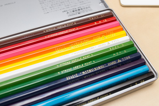
Today: a follow up of last year’s Noris colour wear and tear blog post, but this time I will compare the Staedtler Noris colour to another ‘hard’ coloured pencil: the Mitsubishi 7700.
Lexikaliker suggested that I should try the Mitsubishi 7700 after reading my first blog post about the Noris colour. He had previously suggested good coloured leads, I think it was after talking about redcircle leads, but knowing that I use coloured leads and pencils for writing he thought the Mitsubishi 7700 coloured pencils might be suitable as they are advertised as ‘hard’.

Mitsubishi 7700 and the price rise
I ordered my Mitsubishi 7700 in February 2015 and received them in March 2015. Back then I paid £9.82 (~$14.10; €12.90). You might have read in the news about what happened next, Lexikaliker covered this, too: End of last year Mitsubishi/uni decided to stop producing some of the 7700’s colours and prices have gone up a lot since then. Reminds me of what happened not long before that, when Hagomoro Bungu went out of business and people started hoarding their chalk [2]At the time of writing a box of this chalk sells for £168.05 on Amazon.. Well, the Mitsubishi 7700 has now more than doubled in price and the Amazon seller I bought from is currently selling a set of 12 Mitsubishi 7700 for £21.14 (~£30.30; €27.70). I wouldn’t be surprised if prices will rise even further.
Comparison
So let’s have a look at how the two toughies, the Mitsubishi 7700 and the Noris colour. I will compare the red and the (light) blue pencils. Since you are reading a stationery blog I won’t go into much detail, but would just like to point out that the Noris colour is an extruded pencil, so it is manufactured in very different way to other coloured pencils and that will probably also mean that it will have different properties, too.
The setup
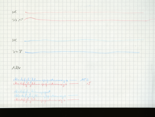
First I looked at how dark/colour intense the line is that these pencils leave on paper. To do that I sharpened the pencils so that the point of both pencils is a conical frustum (a cone without the top). Both pencils’ points/frustum’s had the same top radii. This was achieve by sharpening with a Deli 0668 where I ‘dialled’ the point adjuster back. I then used a force of 1.8 N [3]With less force the lines would have been quite light. You do need to use quite a bit of force when you want to write with coloured pencils. and a speed of 25 mm/s to move the pencils across the paper [4]Actually, the pencil was stationary ;^) and I moved the paper.. The pencil had an angle of 90°, so axial pen force = normal pen force. The paper was from a Brunnen – Der grüne Block, which I have used many times before on this blog.
Darkness/Colour intensity
As mentioned before I compared red and blue. As my Mitsubishi 7700 set has far fewer colours than my Noris colour set I picked a colour from the Mitsubishi set and then tried to find the closest corresponding match form the Noris set, based on the colour of the pencil’s body more than based on the colour of the point.
Measuring colour intensity seems to be more complicated than expected, at least for someone like me who doesn’t know what he’s doing. I scanned the paper on my scanner with 2400 dpi, turning off all auto settings I could find and used the ‘linear’ settings for the colours. I then looked at the file with a graphics editor. The HSB values used for my Pilot neox Graphite blog post don’t seem useful here and only looking at the red and blue values alone seems slightly unfair as a different shade of red or blue might actually be darker for the eye but contain less red or blue, but it’s the best I got for now.
Visually the lines left by the Mitsubishi 7700 look darker than those from the Noris colour, but lets see whether we can measure this. I looked at a 150 pixel * 25 pixel area from each line to look at the histogram.
Come on you reds [5]No, I don’t follow football, but couldn’t resist.
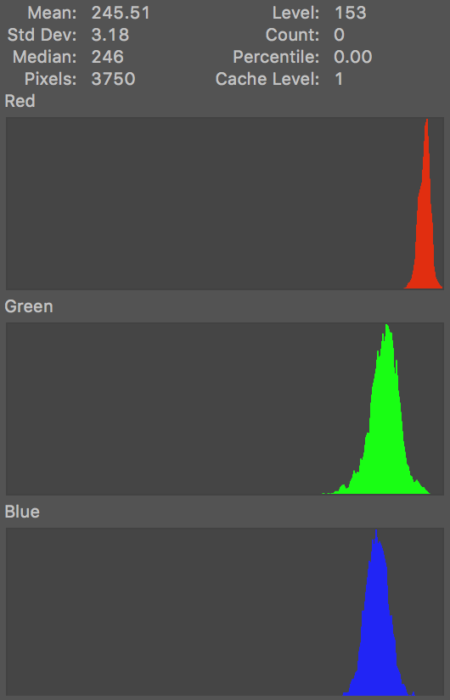
Let’s compare the reds. The numbers at the top are for the red channel only. Lower numbers mean it’s darker, but the numbers are purely based on the red channel, so a shade of red that is different to the RGB red will provide numbers that should be used with caution.
Good that there’s no publication bias at Bleistift. Quite boringly the numbers confirm how it looks like anyway: the Mitsubishi creates a darker shade of red on the paper (…at least when used with 1.8 N and an angle of 90° while moving along the paper with 25 mm/s. The pencils will behave differently under different conditions).
| Mitsubishi 7700 #15 Red | Noris colour, a similar shade of red |
Sample: |
Sample: |
Come on you blues [6]No, I really don’t watch football.
Next up: the blues. I compared Mitsubishi’s #8 Light Blue to the closest Noris colour match.
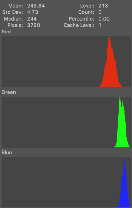
Again, the Mitsubishi looks darker, but this time the numbers seem to contradict how it looks like. They seem to indicate that the blue colour of the line left by the Noris colour is a slightly darker blue. I am not sure why this is. Maybe other find the Noris colour’s line to be of a darker blue? It could be down to the Noris being a closer match to the RGB blue or to the fact that something makes the human eye/brain perceive the #8 Light Blue as darker, even though it isn’t. This time the numbers are for the blue channel.
| Mitsubishi 7700 #8 Light Blue | Noris colour, a similar shade of red |
| Sample: |
Sample: |
Wear and tear
Let’s look at how hard these pencils really are. If they are to be used for writing they should keep their point as long as possible. For this I have done a similar test as in the Noris colour wear and tear blog post. I wrote a line of text with a freshly sharpened pencil, using the Deli 0635‘s 17° angle, while trying to keep writing angle and pressure constant.
Mitsubishi’s #15 (Red) started with a
- horizontal width of 0.3 mm and a
- diagonal width of 0.1 mm
and ended with a vertical width of 0.5 mm.
Mitsubishi’s #8 (Light Blue) started with a
- horizontal width of 0.3 mm and a
- diagonal width of 0.1 mm
and ended with a vertical width of 0.4 mm.
The Noris colour red started with a
- horizontal width of 0.3 mm and a
- diagonal width of 0.1 mm
and ended with a vertical width of 0.4 – 0.5 mm.
The Noris colour blue started with a
- horizontal width of 0.3 mm and a
- diagonal width of 0.2 mm
and ended with a vertical width of 0.4 mm.
The Noris colour seems to have kept the point slightly better, but the numbers indicate that for both brands the red pencil didn’t keep the point as well as the blue pencil. As this second test was not done using a measured force it might very well be that the actual pressure used was different.
The lines produced by constant force support the idea that the Noris colour keeps the point longer, but on the constant force lines it looks as of the blue pencils, especially the Mitsubishi, was worn down more.
Conclusion
Coloured pencil are nowhere near as good at keeping their point, so they are not great for writing (surprise, surprise), but some are better than other. The Noris colour keeps its point better, but the darker lines seem to indicate that the Mitsubishi 7700 is a better choise. It is a shame that the Noris colour pencils are not labelled by colour, that would have provided another way of selecting equivalent pencils to match the 7700’s colours. In the case of the Mitsubishi 7700 vs the Staetdler Noris colour you might just pick a darker shade of red or blue for the Noris colour and get similar levels of darkness as you do from the 7700.
I had fun writing this blog post, but I realise this is not everyone’s cup of tea – the DelGuard blog post with a pressure diagram wasn’t very popular at all, so I will try to limit these kind of blog posts in the future.

Prices: Dates as explained
Exchange rates: January 2016
As usual: open the images in a new tab/window to look at them in full resolution.
References
| ↑1 | Please hum along if you like. I assume that won’t infringe any copyright. |
|---|---|
| ↑2 | At the time of writing a box of this chalk sells for £168.05 on Amazon. |
| ↑3 | With less force the lines would have been quite light. You do need to use quite a bit of force when you want to write with coloured pencils. |
| ↑4 | Actually, the pencil was stationary ;^) and I moved the paper. |
| ↑5 | No, I don’t follow football, but couldn’t resist. |
| ↑6 | No, I really don’t watch football. |


I find this kind of scientific posts very interesting. The only problem is that I’m not able to evaluate visually your results, I can only read your article without seeing for example some macro shots.
When I compare different brand of color pencils, I evaluate the traces left on the paper, this is the most important thing (simple signs, and color fillings). So you could publish some – big – macro shots, which could allow us to see the results of your scientific test, in the same way that we could do it, and then add some data, in a concise and clear way (for example explaining the methodology at the bottom of the page, for those who are interested, which by the way should be the same for all the pencils tested).
Thanks 🙂 and good work
Wow, that’s very impressive – thank you for that detailed and informative review! And in following your conclusion I can say: I had fun reading this blog post, and it is my cup of tea 🙂 By the way, I wonder how the Staedtler Mars Lumochrom would compare to these colour pencils.
Thank you for your comments.
gianni, I posted a picture of the test sheet, but forgot that initially and only added it a few minutes after posting, so if you happened to look at the post in the first two or three minutes after publication you might not have seen it. I used PNG as the file format, so that JPEG artefacts don’t influence what you see. The heavily downsized PNG is > 4MB, the original is > 700MB, so I only provide the downsized version. I hope this is sufficient. You can see it in full resolution by opening it in a new tab/window.
The samples used for the histograms are published, though.
Methodology was the same for each pencil but different for the two tests.
Re Methodology, here’s the setup for the darkness/colour intensity test:
Sharpen pencils with same settings, scale on desk, paper sheet on scale, pencil in a sawed off plastic pipe, attach weight to reach 1.8 N (the Noris is much heavier so need different weights), hold pipe at 90° angle, move sheet away from under the pencil while trying to keep speed constant and checking the scale to make sure nothing went wrong.
Setup lead hardness test: sharpen pencils the same way, try to write with same angle, pressure, speed. I know, not great but the best I managed.
Not very scientific, just trying to write with the same angle.
Thanks and looking forward to reading more comments from you.
Lexikaliker, I’m happy you liked it. I also wonder how the Lumochroms compare. You and Sola mentioned the Lumochrom in the past. I don’t think I have any (and if I do because you sent me some I have just very seriously embarrassed myself). What a shame Staedtler doesn’t make the Lumochrom anymore…
I actually can’t stand tea, but I’ll take a cup of bleistif.memm.de any day!
Great post….
err…bleistift.memm.de rather.
Sean, thank you for your kind words. I hope I can refill your cup with more interesting bleistifts in the future.
I’m still waiting for my 7700 tin to arrive but as soon as I get it I will compare it to the Lumochrom. Yes, it is a real pity that the Lumochrom is no longer made – the lead was really something special!
Pingback: Just another pen ?!Blick über den Tellerrand vom 23. January 2016 - Just another pen ?!
Very interesting!
I’ve never used coloured pencils for writing (only ever for drawing, and in the case of watercolour pencils, painting), so this particular use case is both novel and interesting.
Harder leaded coloured pencils tend to be marketed these days as being suitable for artists to add fine detail &c (e.g. the Derwent Studio range (I think – the softer equivalent is the “Artist” pencil)), and I don’t think I’ve seen any contemporary manufacturer offer a “writing” colour pencil.