Pencil Sharpening on Conan
Pencil Sharpening on Conan…
Pencil Sharpening on Conan Read More »
It’s fountain pen day – time for another fountain pen related post.
The pen
This time: the Tachikawa fountain pen, model School G for Manga. It comes with an extremely fine nib which for line widths from 0.2 mm to 0.5 mm. If you think that’s fine – Tachikawa offers an even finer nib as well as version of this pen with sepia coloured ink. Just to help avoid confusion: Tachikawa also has a reputation for making very good flexible nibs for dip pens, one of them is called the G nib, but that’s a different nib. 
The price
I got my Tachikawa pen a few months ago from Fudepens, together with the Pentel Ain Click eraser I wrote about earlier this year and other products. As far as I know Fudepens is only selling the 0.2-0.5 mm version, which costs €7 (~$8.70; £5.50), not the versions with other nibs or ink colours.
The ink
The pen comes with a adivce on a little yellow piece of paper. One of the recommendations suggests using the pen at least once a week. The implication is the “special quick-dry ink” might otherwise clog up the feed. The ink is really black, similar to Indian ink, which is probably why it is easier to clog up the pen.
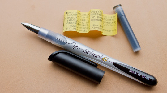
Writing & line width
As you might have expected – a fountain pen with such a fine nib is rather scratchy. As mentioned earlier the body of the pen suggests a line width of 0.2 mm to 0.5 mm, but when I writing without applying much pressure the line width is not even as wide as that I get from my Faber-Castell Ecco Pigment 0.1 mm fine liner pen. You can vary line width by applying more pressure, but you have to use quiet a bit of pressure (at least with the pen I got) to get a line of ~0.5 mm – so much pressure that you have to write slowly to control the line.
Conclusion
An interesting fountain pen if you want a very fine line. It does produce a very clear line that is easy to see, despite being so exceptionally thin, thanks to it’s blackness. In comparison other black pens, like the Faber-Castell Ecco Pigment 0.1 mm look grey-ish, even though that is not easy to see on my photo, where I compared them on a Black n’Red Polynote A7.
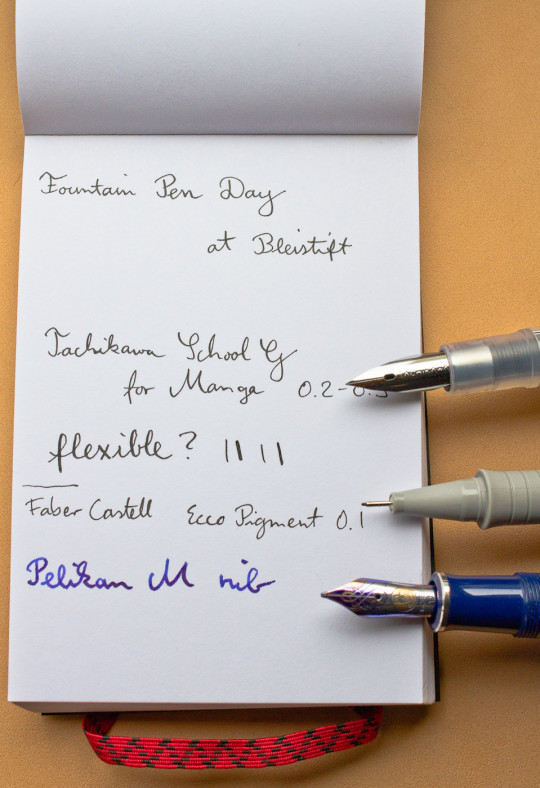
I would like to thank Fudepens.com for the Tachikawa School G for Manga fountain pen, which I got sent for free. I don’t think the fact that I didn’t pay for the pen influenced my opinion of this pen in any way.
Tachikawa School G for Manga 0.2 ~ 0.5 Read More »
Just a quick note – actually: two.
First: It looks as if Staedtler will release a new sharpener next year. What makes it really interesting is the article number: 501 180. The article number of their current rotary (i.e. hand crank) sharpener starts with 501. …and number 180 is associated with another, very nice product from Staedtler. 
Second: I came across this article: The coloured pencil’s 180th birthday – a Franconian invention used around the world. [1]With such a title I couldn’t resist displaying my Franconian pencil logo again.
Unfortunately the original article is in German, but here’s a link to the Bing translation and to the Google translation. The article talks about Johann Sebastian Staedtler’s coloured pencil breakthrough in 1834.
References
| ↑1 | With such a title I couldn’t resist displaying my Franconian pencil logo again. |
|---|
It’s the Koh-I-Noor’s 125th birthday this year! Congratulations!
This pencil just featured in Contrapuntalism’s latest blog post (last picture) and I also mentioned it in my previous blog post.
The colour

If you are not familiar with the Koh-I-Noor: this is the pencil that might be the reason there are so many yellow pencils around, especially in North America. Petroski mentions a story in his book that describes how the L. & C. Hardtmuth Company picked yellow as the colour for this pencil because the flag of the Austro-Hungarian Empire (the same as the flag of the Habsburg Monarchy) was black and yellow [1]in the comments of this blog post Rick has corrected this: the flag of the Austro-Hungarian Empire was not black and yellow. However, both the flag of the Austrian Empire and the flag of the Kingdom … Continue reading – “and since the graphite was black, the pencil had to be painted golden yellow” [2]see Henry Petroski: The pencil (1989), p. 161 in my UK edition of this book.
The glory of the past
Now before I go any further I have to to say that the two descendants of the original Koh-I-Noor share the heritage but not the pompousness of the original Koh-I-Noor. I fear they also don’t share the high quality of the old Koh-I-Noor pencils which were given “fourteen coats of golden-yellow lacquer, the ends of the pencils were sprayed with gold paint, lettering was applied in 16-carat gold leaf” [3]see Henry Petroski: The pencil 1989, p. 191 in my UK edition of this book or the effort made to protect it – a Manx cat and her offspring were protecting the store rooms of this pencil from mice [4]again p. 191.
The name
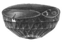
Such a luxurious pencil needs a fitting name. The Koh-I-Noor pencil was named after the Koh-I-Noor diamond, a diamond from India that was once the largest known diamond. This diamond is set in the crown of Queen Elizabeth [5]see Wikipedia (That’s Queen Elizabeth, the wife of King George VI – not Queen Elizabeth II, the current queen). You can admire the Koh-I-Noor diamond in the Tower of London.
The Koh-I-Noor on both sides of the Iron Curtain
It all started to go a bit pear shaped for the Koh-I-Noor pencil when, after WWII, companies in Czechoslovakia were nationalised. At that time there was no pencil production in Austria as earlier production was moved to Budweis – when the Austro-Hungarian Empire was still around. On the other side of the Iron Curtain the descendants of Joseph Hardtmuth, the founder of the company, managed to re-establish pencil production of the Koh-I-Noor in Upper Austria in 1950 [6]see the Ruling of the Federal Court (of Switzerland) 83 II 312, p. 317 and were also able to use the Hardtmuth and Koh-I-Noor trademarks. Much later, in 1996 production of the Austrian Koh-I-Noor pencils would move East to Austria’s state of Burgenland, an area which, in 1950, was in Austria’s Soviet-occupied zone [7]I’d like to thank Cretacolor’s Mr. Ellmauthaler for this information.
The real successor
Which of these companies is the ‘real’ Koh-I-Noor L. & C. Hardtmuth? It’s difficult to say even or especially in my very simplified version of the story. You could argue that the company in Budweis is the real successor. Pencils were made in the same factory as before the nationalisation. On the other hand you could also argue that the Western branch is the real successor. All seven shareholders as well as most senior staff flew Czechoslovakia when the company was nationalised [8]see the Ruling of the Federal Court (of Switzerland) 83 II 312, p. 316 and moved the company with them.

For me both companies are successors of the original manufacturer. The company in Budweis does still exist. As mentioned earlier the Austrian branch moved to Burgenland. Their pencils are still being produced there. You can get Austrian made Koh-I-Noors, but there has been a change in ownership so the Koh-I-Noor pencils are now being sold under the name Cretacolor. You won’t find the successor, the Cretacolor 150, on Cretacolor’s web site, because of the web site’s focus on artists, but the 150 is selling well, not only in Austria, but also in countries like China [9]I’d like to thank Cretacolor’s Mr. Ellmauthaler for this information.
The image of the Koh-I-Noor originates from the Nordisk familjebok. The copyright for this image has expired.
References
| ↑1 | in the comments of this blog post Rick has corrected this: the flag of the Austro-Hungarian Empire was not black and yellow. However, both the flag of the Austrian Empire and the flag of the Kingdom of Hungary were black and yellow |
|---|---|
| ↑2 | see Henry Petroski: The pencil (1989), p. 161 in my UK edition of this book |
| ↑3 | see Henry Petroski: The pencil 1989, p. 191 in my UK edition of this book |
| ↑4 | again p. 191 |
| ↑5 | see Wikipedia |
| ↑6 | see the Ruling of the Federal Court (of Switzerland) 83 II 312, p. 317 |
| ↑7, ↑9 | I’d like to thank Cretacolor’s Mr. Ellmauthaler for this information |
| ↑8 | see the Ruling of the Federal Court (of Switzerland) 83 II 312, p. 316 |
To celebrate my 40th birthday we spend the weekend in Shropshire …and of course I couldn’t resist buying more stationery.

Independent stationery shops
What a nice weekend it was – and I found an independent stationery shop in Shrewsbury – what a nice surprise. I hardly ever come across independent pen shops these days. The one where I live closed down and one in the town where I’m from closed down, too [1]There still one left in my home town, but it’s more of a post office / news agent / bit of everything shop.. I’d like to visit the Pen Company one day, but it’s several hours away. What’s left nearby is either focusing on art supplies or is part of a chain, which usually means that staff are not really excited about pens.
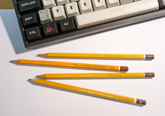
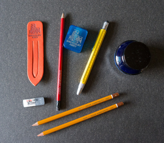
After buying some souvenir stationery in Shrewsbury Abbey I discovered Write Here. First: stocking up on Koh-I-Noor 1500 pencils – and then a fitting eraser from Koh-I-Noor as well.

Koh-I-Noor
In the 18th century Jospeh Hardtmuth started the pencil factory in Austria that would become Koh-I-Noor. Koh-I Noor is the name of a famous diamond. I seem to remember reading somewhere, probably in Petroski’s book, there were several pencils named after diamonds because diamonds and graphite both consist of carbon. In the 19th century manufacturing then moved to Bohemia, to Budweis in what is now the Czech Republic.
The Koh-I-Noor 1500, the pencil I bought, started being produced in 1889 [2]see Koh-I-Noor Hardtmuth’s history.. After WWII the factory, in what was then Czechoslovakia, was nationalised and Joseph Hardtmuth’s descendants started manufacturing in Austria again. A few years ago the Austrian ‘branch’ of the company went bankrupt and was taken over by Cretacolor, but the Czech ‘branch’ of the company does still exist under the Koh-I-Noor Hardtmuth name.
I have previously bought new old stock Koh-I-Noor 1500s in Shanghai and in my home town, but these are one of my few new ones. Too bad Write Here didn’t have HB and F (yes, you can get the 1500 in F), so I went for the B and H, which I’ve been using all of this week so far.

Write Here
Later that day I went back to Write Here, asking whether they have any fountain pens with flexible nibs. I’ve been looking for a nice fountain pen with a flexible nib for a long time now. My Lamy 2000 with an M nib and some of my Pelikan M200 nibs in F are quite flexible, but the line at its thinnest is too wide for me. Noodler’s nibs are nice and flexible, but when using any of my different Noodler fountain pens I usually end up having dirty hands because they spill ink after a while.
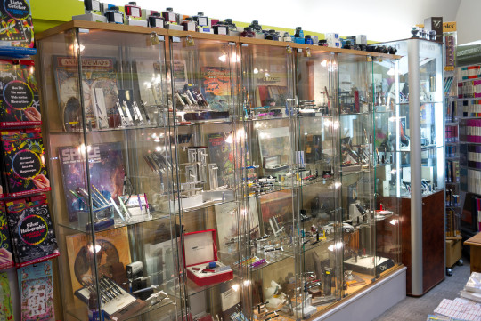
After asking for a pen with a flexible nib it took the owner of the shop a second to think about my request before taking a fountain pen out of his jacket and telling me to try it. What a nice, flexible nib that was. It was a fountain pen from Omas. I knew about Omas, but I never tried one before. When I started writing there was some feathering, but when I tried it on another paper the pen wrote smooth while still producing crisp lines. Unfortunately the pen was far too expensive for me. It turned out that this shop is also the distributor for Omas in the UK and I was told that very soon a cheaper pen with this nib will be released. I say cheaper, but it is still a £300 pen, which would make it more expensive than the most expensive pen I own.
Pen and ink

I then bought the Monteverde Tool fountain pen – more in my price range, and the owner of the shop told me about Sailor’s pigment ink which contains nano pigments, so it doesn’t clog up the fountain pen.
I’m still not sure what to think about the fountain pen. It seems to skip quite a bit (using the cartridge that came with it), I hope that will get better over time. I also wonder why the scales on the pen incluse 1/200 metre and 1/300 metre. I have seen 1/x inch scales, but 1/x metre scales are certainly not very common and don’t seem to make much sense to me. Is this how imperial users imagine the metric system to work?
The ink can behave very well when used on good paper, but when I use it to fill in forms at work it feathers quite a bit. I think time will tell whether I like this ink, but so far I don’t think I’ll buy another bottle.
References
| ↑1 | There still one left in my home town, but it’s more of a post office / news agent / bit of everything shop. |
|---|---|
| ↑2 | see Koh-I-Noor Hardtmuth’s history. |
A weekend in Shropshire Read More »