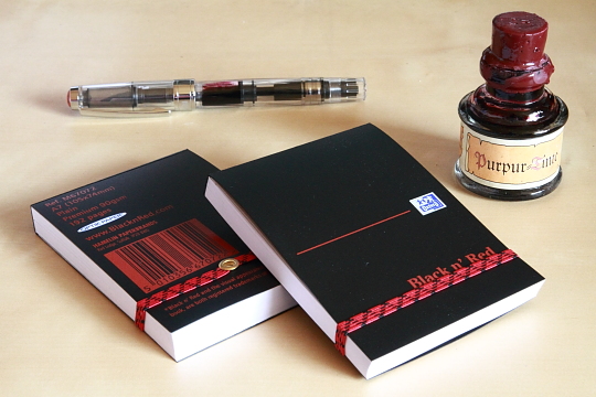
Last week I bought Black n’ Red’s pocket-sized, i.e. A7, polynote in my local Tesco’s. The polynote is a reporter notebook that flips open at the top and features a polypropylene cover and an elastic band. I bought it because it was half prize, only 60p (97¢; 68c), and because I was quite happy with my previous Black n’ Red purchase, a hard cover Black n’ Red recycled notebook.

Black n’ Red recycled hard cover notebook
My previous Red n’ Black purchase, the recycled notebook is really nice. Unlike the US version reviewed at Office Supply Geek it features British and European maps and information. I only paid £ 3.50 in my university’s library, but the price is probably either subsidised or they do not earn any money from this notebook as I have never seen anywhere else for a similar price. I have used this notebook for several months, but have only used pencils in this notebook, so I cannot comment on the suitability of the paper for fountain pens. It does however feel like good quality paper. I did contact Hamelin / Oxford brands with some questions about the paper, probably about a year ago, but unfortunately I never received a reply.
Back to the polynote
There seems to be a ruled version, too, but I bought the plain version. It contains 192 pages of 90 g/m² Optik Paper. The polypropylene cover seems durable and robust and can be wiped easily if dirty. The polynote does also contain a page with reference information, similar to the one found in the recycled notebook, but this time restricted to metric / imperial conversion tables. There is no danger that pages would fall out by mistake, but they can be removed easily if you wish to do so. The paper has a high quality feel to it and is more opaque than other 90 g/m² paper I have used in the past.
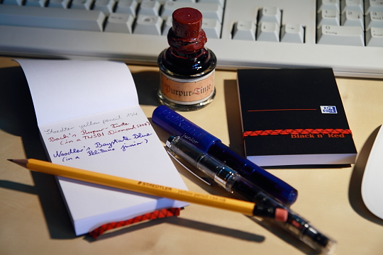
As you can see in the first photo I tried a pencil and two fountain pen inks on the paper.Erasing the graphite works well. The paper feels extremely smooth when erasing, but seems to retain more of a dent where the graphite was than other paper. This means you can see or guess the writing because of the slight indentation. Both inks worked well on the paper and did not bleed through the page.
Bach’s Purpur-Tinte
I bought the ink used with the TWSBI Diamond 530 at Eberbach Abbey, where some scenes of the film “The Name of the Rose” were filmed. This ink is from a small ink manufacturer called “Bach’s Tinten” (Bach’s inks). I have an iron gall ink from the same manufacturer, which is absolutely fantastic when used with a dip pen. Unfortunately, I was not able to find out more about the manufacturer of this ink. All I know is that it seems to be sold in some German museums and other tourist attractions. If you know more about this ink, please let me know.
TWSBI Diamond 530
I used Bach’s Purpur (purple) ink in my brand new TWSBI Diamond 530, which I bought from The Writing Desk for £36.79 (~$59.35; €41.75). TWSBI, originally an OEM manufacturer, make mechanical pencils, too. You can read more about their history and the meaning of their name at Okami Whatever. I first thought about buying this pen from the TWSBI ebay store, where it is slightly cheaper than in the UK, but the price is just above the threshold for VAT and customs (and therefore handling) charges, so buying it from The Writing Desk was the better option. The pen is quite big and made for fountain pen geeks: it is a demonstrator that can be disassembled and even comes with sililcon grease and the wrench needed for disassembly. As far as I know it is using a Schmidt nib, but a limited edition pen with a Bock nib will be released if there are enough orders. The pen is great and offers fantastic value for money. When it comes to fountain pens I am a fan of Pelikan, a Malaysian owned writing instrument manufacturer headquartered in Switzerland with manufacturing facilities on several continents, so – naturally – I compare the diamond 530 with Pelikan fountain pens and I have to say that the Diamond 530 is very big in comparison – much bigger than, for example, a Pelikan Souverän M600. I do own a few fountain pens from manufacturers other than Pelikan and quality-wise the TWSBI is certainly one of the better ones, especially for this price.
Noodler’s Baystate Blue
 Noodler’s, from Massachusetts, “the smallest ink company in the world with the largest color selection” is, without a shadow of a doubt, my favourite ink company. I do like inks from other companies too, but Noodler’s is my overall favourite. Baystate Blue is a very unusual ink, unusual in its rebellious colour and the high, i.e. alkaline, pH value. You can read more about it on Noodler’s web site. The first time I saw this intense ink on paper it reminded me of a pen I got in the late 1970s / early 1980s. At that time Pepsi ran a big marketing campaign worldwide – and in Germany, too: “Mach den Pepsi Test” (Take the Pepsi Challenge) . Afterwards you got a “I took the Pepsi Challenge” pen. As far as I remember it was a Staedtler pen and looked like a Lumocolor with a yellow body and with a Pepsi logo and reference to the Pepsi test printed on it. As far as I remember it had a colour very close to Noodler’s Baystate Blue …and I completely forgot about this pen until Baystate Blue reminded me of this pen and this unusual colour. It’s not really my favourite colour, maybe because it is a bit too unconventional, but it might actually look quite good with a fine nib. I will try that out after I used up the Baystate Blue in my Pelikano junior.

Conclusion
The Black n’ Red polynote is a great little reporter notebook. I think I might carry one with me in the future. There is a plain and a ruled version, both probably ref. number M67072. The robust covers makes it a notebook you can carry around with you all the time and the current half price offer is really good, but even if you pay the full price it offers good value for money and nice smooth and unusually soft (maybe even a bit too soft) paper.
Prices and exchange rates: March 2011
You can find a review of Noodler’s Baystate Blue at Without ink.
Office Supply Geek has a great review of the TWSBI DIamond 530.


