Today: a very exciting arrival: My Lamy Safari collection got company.
For several years I was hoping that Lamy would re-release their original Safari colours. I think this idea started to grow in me when Lamy re-released their Lime Green special edition from 2008 in 2011 (with some small differences).
My thought were along the lines of “If they can re-release lime green, why not savannah green, one of the two original colours…”
By the way, if you want to have a look at what is probably the most comprehensive list of special Safari editions on the web, head over to the Lamy Safari article on stationery.wiki.
There are many differences that make it easy to distinguish the original versions from the 2021 versions, so there isn’t much danger of this re-release causing too much confusion – instead it represents a homage to Lamy’s original colours.
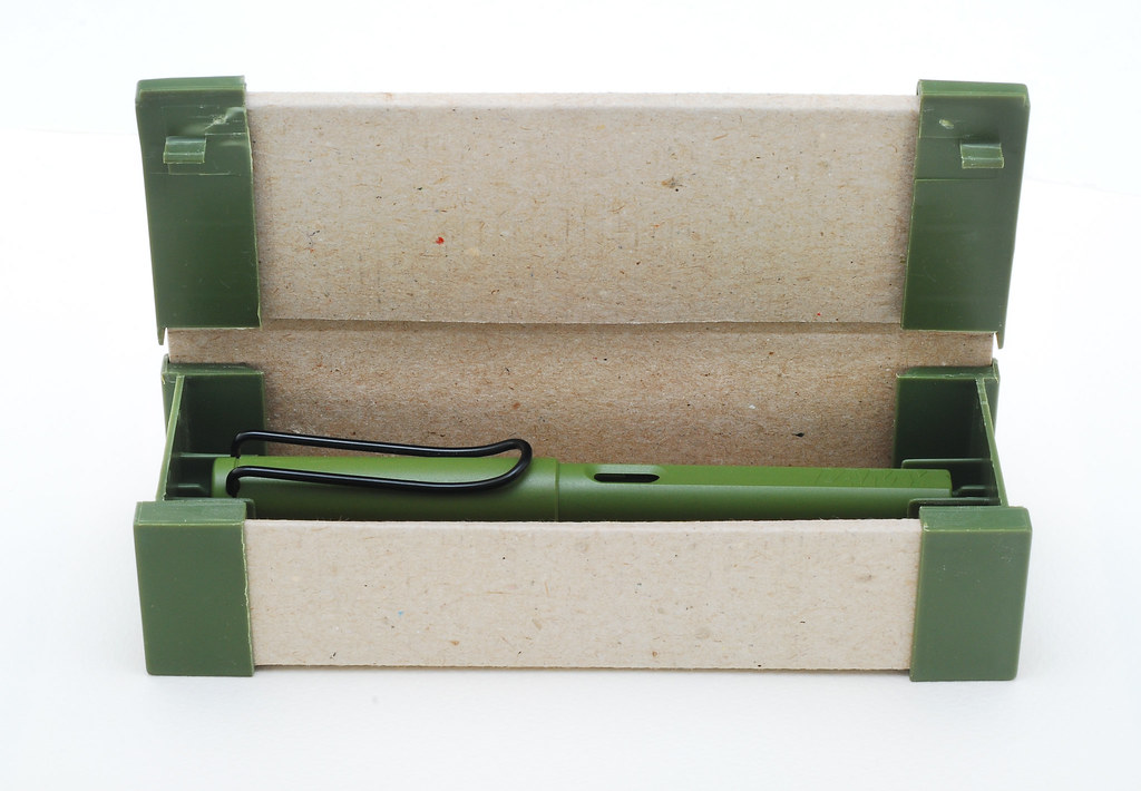
I have been a Lamy Safari user since the mid-1980s, but I have to admit that I don’t remember at all what my first Safari colour was. I am however quite sure that in came in a box like the one pictured below (linked to from Flickr). The box looked very cool, so I kept model figures in it for many years.

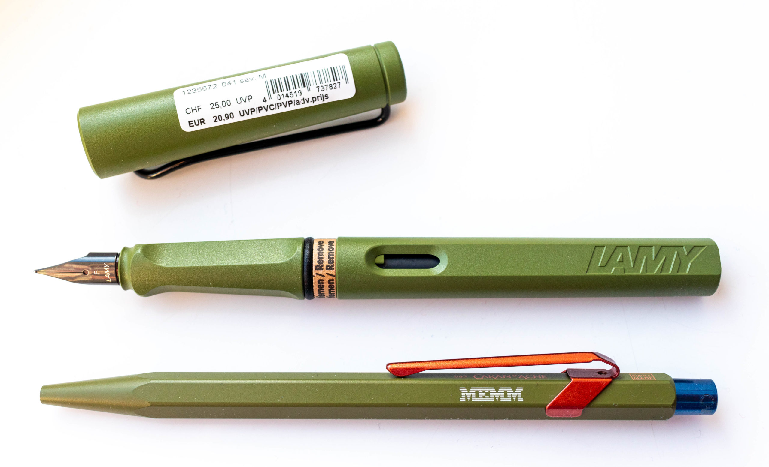
The Pen Company, where I got the engraved Caran d’Ache from, is just about the get new stock of the 2021 Lamy Safari colours in. I bought the savannah green and terra red fountain pens from Write Here and the savannah green ballpoint pen and rollerball from CultPens. Somehow Write Here’s search function seems to have a problem, so I didn’t even realise they also carry the non-fountain pens as they didn’t show up in a search. When I checked again today some of them did now show up.
The Write Here Logo that they managed to emboss on the official Lamy packaging came as a surprise – a great idea and looks fantastic.

Savannah green is certainly one of my favourite colours in terms of look, but it’s not quite my absolute favourite Safari – that is the grey version (sometimes referred to as griso). I had two and sent one to Sean of Contrapuntalism fame, but unfortunately the postal service managed to damage it in transport. The one I kept is still in it’s packaging. Maybe I should unpack it one of these days. It’s just too good looking to stay unused.
What are your favourite colours and do you prefer the ‘matt’ or the glossy’ pens?

Beautiful looking pen…I’m getting one in EF. When I receive this, I’ll make up my mind on the Terracotta. I too have been waiting for this homage…could never even half justify buying an original at serious collector prices. At least I have the 2008 lime green.
I like them all. The design is so versatile! It can hold its own being matte or glossy, having black or chrome or color coordinated trim. The Limited Edition fountain pen has been a steady buy during the last few years.
Thank you for the post.
The Caran d’Ache pen looks like the text is rendered in the typeface associated with IBM. Is that correct?
I hope you will enjoy the new pen. Do you think it is sustainable for Lamy to keep the series going indefinitely? Will collectors not get tired?
Kevin, I haven’t looked how much they sell for, but last time I checked, a few years ago, the prices were exorbitant. EF is a great choice. I usually go for EF, too, but wanted a different one this time. I hope you’ll get yours soon.
Ruurd, You are right. In most cases I find the matter ones nicer. Even though they got more expensive they’re still adorable enough to buy the occasional special edition 😀
Stephen, you’re right. That’s the older version of the horizontal line IBM fonts. I also have a 849 (different colour) in the Atari font from the VCS 2600 packaging and one in the Commodore 64 font (the one on the screen, not the one from the packaging).
That’s the funny thing about Lamy, it’s just a different colour, but that alone is appealing enough. On Lamy’s higher end pens special colours sell for serious money (search for the Bauhaus Lamy 2000 or the red one). When I had the Staedtler factory tour I mentioned the Mars micro in the special colours that were available a few years ago and their attitude was “what’s the point, it’s only a different colours, there’s no innovation in that”. Staedtler Japan had special colours more often than that, but Lamy is properly milking the special colour cow – and when it’s a nice colour I can’t resist.
Very good looking!
Beautiful! The Caran d’Ache 849 with the custom imprint is very nice too. May I ask where you had this done?
Rares and Gunther, thank you.
Gunther, the engraving is done by https://www.thepencompany.com/ they engrave pens you buy there for free.
You can see more at https://www.youtube.com/watch?v=Hofpqhq8Bx4 and at https://www.youtube.com/watch?v=3TfZiuIlA5A
I use the same logo on my keyboard: https://www.facebook.com/mmeckel/posts/10220474028898666
Pingback: Link Love: Stationery Vacation - Clipsi
Matthias, thank you for that detail regarding The Pen Company and the engraving! That is very appealing. – The font with the eight horizontal lines is great!