Aurora’s Blue Black ink
Kirit Dal, who I have recently mentioned in the Lamy Horror Picture Show blog post, was kind enough to send me Aurora’s latest ink: Their take on Blue Black.
I have used quite a few blue black inks in the past, actually.. for a few year it was my favourite colour – but I have never used an Aurora ink before. Not only that, I somehow I also never really read up on them, so this ink led me into unchartered territory. If you have already used Aurora inks my discoveries will be nothing new to you, but for me this ink provided a lot of firsts. More about them later.

Comparison
I compared the Aurora Blue Black to a few other blue black inks: Mont Blanc Midnight Blue (the newer Austrian version), Diamine Blu eBlack and Lamy Blue Black (the older iron gall version).
On Rhodia paper Lamy’s Blue Black was the most grey ink – and the only one that visible darkened after writing, so the assumption is that other inks don’t contain iron gall.
The Diamine was the most turquoise ink, and the worst behaved – meaning it was best at penetrating the paper and having a cheeky look out on the other side.
Mont Blanc’s Midnight Blue was the most purple and also the darkest.
Aurora’s Blue Black was the bluest of the inks and provided the following surprises.

Surprise 1: packaging
The first surprise came when I saw that the ink bottle was the best protected against spilling in transport I have seen so far.
Not only was the bottle in the box shrink-wrapped, under the lid there was also a plastic plug. I shouldn’t have tried removing it with my fingers as the air pressure in the bottle was different to the one in my environment and I had a right mess on my fingers and on the paper sheet under the bottle.
Surprise 2: a well behaved ink
The second surprise came when I started using the ink.
It was actually a better behaved ink than expected. By that I mean that it prefers to orderly stay on the paper instead of naughtily sucking into the paper and bleeding through. It also seems to dry faster than your average ink ..always a good thing. I do have blotters on my desk at home and in the office, but faster drying inks are just less trouble, plus if you have to use a blotter the bits of the writing where the ink was still wet usually end up looking lighter.

Even on poor quality photocopying paper it behaved very well, only showing signs of bleed through where the nib left a lot of ink on one spot.
On a Field Notes original/Kraft notebook with Finch Paper Opaque Smooth 60#T #Bright White’, the worst Field Notes paper I know it didn’t bleed though either.
One more thing to notice: this ink has some shading (but it’s certainly not the new shading king) and the dark areas are pretty dark. Depending on how wet your fountain pen writes this ink might look either greyish blue or nearly black.
Surprise 3: half erasable
The third surprise came when I tried to write with this ink on a Royal Mail postcard.

Having established that it’s a well behaved ink I thought I test it on a Royal Mail postcard as very few inks will work on this treated surface without spreading out across the paper. The surprise here was that the ink started to lose its blue component, as if the post card acts as an ink eraser. I have made a similar experience with the Thank You cards I got printed after our wedding in 2008. The ink on the Thank you Cards I wrote became invisible after a few weeks.
To test what’s going on with the Aurora Blue Black on this post card I tried an ink eraser on this ink. Immediately the blue component started to disappear [1]In many countries pupils have to use ‘Royal Blue’ inks which are erasable with chemical ink erasers, originally invented by Pelikan. When I was young they were called in killers and were … Continue reading.
Rinse time
To finish it all off I had a look how these inks behaving after enjoying a refreshing rinse under a cold water tap for several seconds.
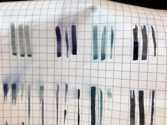
The Aurora ink suffered most. Virtually all of the blue seemed to have washed away with only the grey component remaining.
Unsurprisingly the iron gall ink seemed least affected, but it is of course harsher on your writing equipment. Well, not to put your fountain pen written documents under running water shouldn’t come as too much of a surprise, though.
Conclusion
The Aurora Blue Black is a great ink. You get some shading, you get well behaved, and you get a nice colour, serious but not too boring.
I hope to have a closer look again after having used this ink for several months.
I would like to thank Kirit Dal for sending me this ink. I think he might be the first seller in the UK to stock this ink. I have been told that he is well known at pen shows in the UK, but I haven’t been to any pen shows yet, so haven’t been able to meet him yet in person.
You can find more reviews of this ink at Squishy Ink and Pen Chalet.
References
| ↑1 | In many countries pupils have to use ‘Royal Blue’ inks which are erasable with chemical ink erasers, originally invented by Pelikan. When I was young they were called in killers and were very common. You usually can’t use normal ink to write over the erased ink. Instead you use a special ink from the other side of the ink eraser. There used to be better ink eraser you can write over with normal ink. These were available around the year 1990, if I remember right, but I haven’t seen any like that in a long time. |
|---|
Aurora’s Blue Black ink Read More »

