
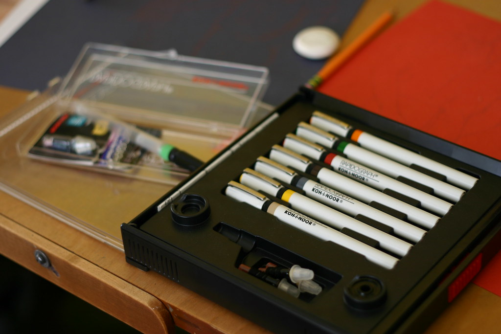
A fun fact involving pens, taken from the current issue (240) of Retro Gamer: The original design of the Atari logo was created using Radiograph pens.
One constant in the Atari story is its striking logo, long referred to as Fuji after its resemblance to the Japanese mountain. In 1972, Evelyn Seto was a production artist, working for George Opperman who had produced the original design, and it was her task to create the artwork for printing. “This was pre-computers, so it was done by hand,” she explains. “I had to draw and ink the symbol using tools such as French curves and Rapidograph technical drawing pens. We used the font style Harry for ‘ATARI’.
Retro Gamer 240, p. 23
The question is whether these were Rotrings or Koh-I-Noors. It seems more likely they were Rotrings. As far as I know the Rapidograph had been around for around two decades at that time.

This blog post contains embedded Flickr images.
Found two small, previously used plastic bottles of rotring ink for rapidograph (red and sepia brown?), which were purchased in early 70s when I was at art college.
Wasn’t too optimistic about using them again after all these years, but I was pleasantly surprised.
Very impressed by the quality of this product!