Time for another traces of graphite post.
As I kid I spent most of my pocket money on buying comics. Just to point it out though: in Europe the common comics at that time were not superhero comics, like in the USA. Instead the popular comics were Disney and Franco-Belgian comics.
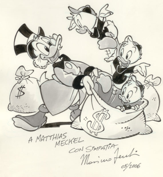
I read a lot of comics, but despite there being so many artists there’s probably no other single person that has influenced my ‘visual taste’ as much as the Italian comic artist this blog post is about. I love his way of rounding off corners. Things he draws just always seem to have perfect proportions and shapes.
In the past this artist’s drawing could be admired in the Fix and Foxi comics or in Knax, a free comic magazine provided by some banks. Back then printing the name of the artists who were working on a comic story wasn’t common, that only became common many years later – but when it became common I figured out that the style of drawing I liked most was from Massimo Fecchi.
Today he is working on Disney comics (Duck and Mouse) for Egmont. I think that might make him the only Italian comic artist drawing Disney comics for Egmont (in Denmark) instead of for Topolino / Panini Comics (in Italy).
Ten years ago I was lucky enough to get a drawing from him, which has first been hanging in my living room and after I moved it is on the wall, just where you enter the house.

I have recently asked him by email what tools he is using to create his comics.
He told me that he is using these four steps to create a page.
- He is drawing a rough outline of the page with a blue pencil. For this he is using Pilot’s 0.7 mm Color Eno leads in a Caran d’Ache 844, a pencil which he describes as the best.
- He then draws the lines with 0.5 mm Koh-I-Noor leads in B, in a Rotring Tikky (the older, German made Tikky II with the wavy grip section).
- Before inking with a brush we will draw fine details with Staedtler’s pigment liner (0.1 mm, 0.2 mm or 0.5 mm)
- In the end he will ink the drawings with a Winsor & Newton #2 brush from the 7 series.
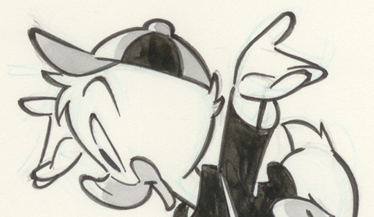
Here’s a magnification where you can see the blue lines from the rough outline

He was kind enough to let me have a look at the comic he is currently working on, so here’s a chance to compare how a page looks like after the second and after the fourth step – please open the images in a new tab so that you can see all the details.


Lovely! You can really see the life that the brush gives to his lines in that detail picture.
John, I am happy that you, as an artist, like it.
I also love the line variation and how Massimo (and other Italian artists) will interrupt a line, which makes the whole structure even better looking, e.g. around Huey’s pupils and his left wrist.