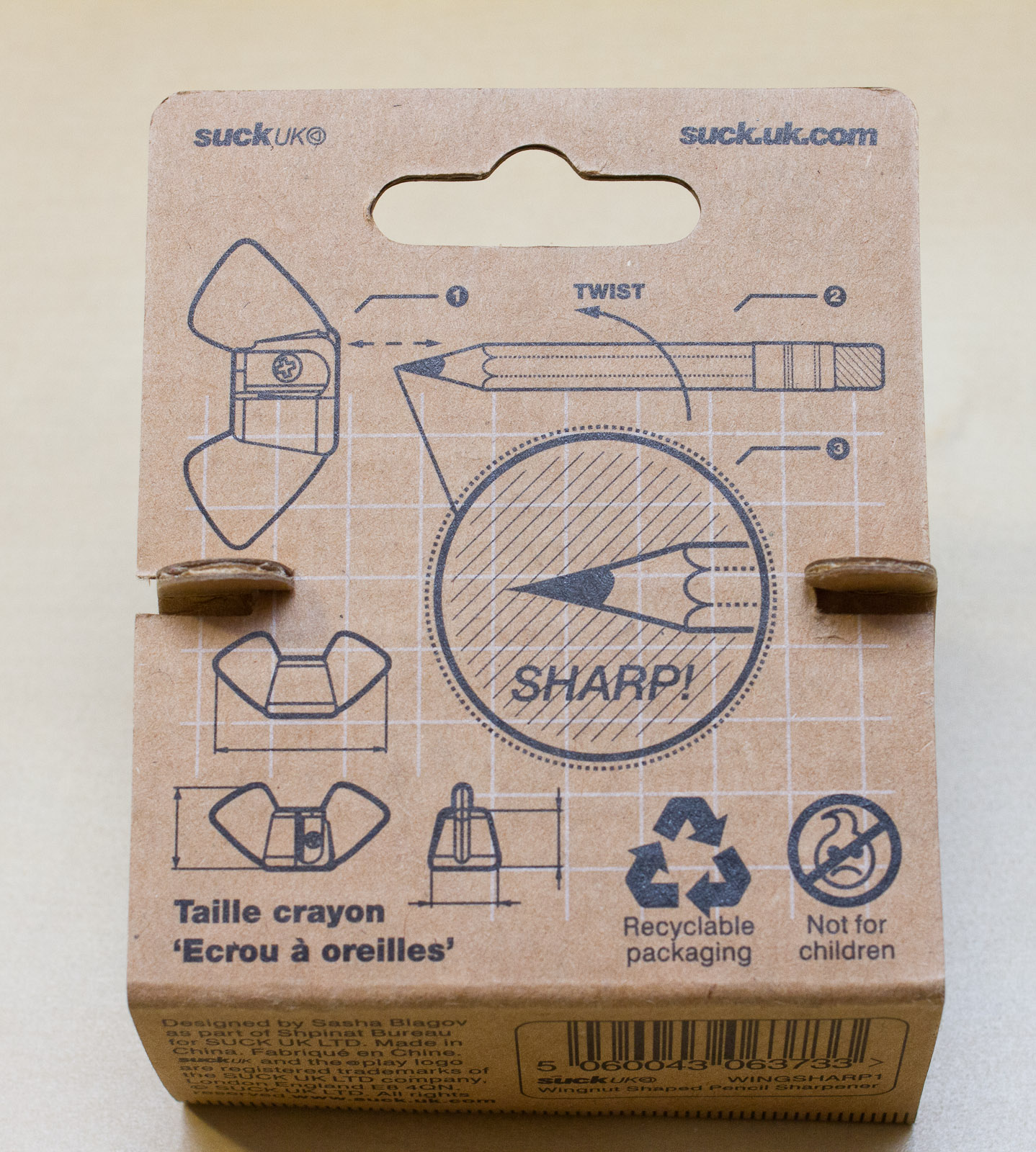
SUCK UK wingnut pencil sharpener

My latest acquisition: SUCK UK’s Wingnut pencil sharpener, made by Russian designer Sasha Blagov for the Ukranian Shpinat Bureau.
I bought this sharpener in Paperchase (in Selfridges) for £6 (~$9; €8).
It is, as the name suggests, a sharpener shaped like a wingnut.
First use
I did want to use an unsharpened pencil – you can see that the short blade of the wingnut sharpener will produce a much more obtuse angle than your average sharpener, so sharpening an already sharpened pencil with a normal angle down to a more obtuse angle would waste a lot of material. That means an unsharpened pencil was needed. The first pencil I tried to sharpen with it: a Venezuelan Mongol 480.

Sharpening did start well, but there soon was a point when it was difficult for the wood and lead to reach the blade, because the sharpening hole of the sharpener was too small for the pencil. My resulting annoyance with this sharpener is so big that I’ll to switch to a monologue now.
Is the Venezuelan Mongol wider than your average pencil? Maybe. Maybe that’s why it didn’t work. Hmm, let’s try another one. What other unsharpened pencils are on my desk – oh yes, there’s a Tombow Mono 100 in H. Let’s sharpen that one.
..
What? same problem again? Ok. I think I once read somewhere that the Tombow is wider than your average pencil, or did I mix that up? Anyway, let’s try another unsharpened pencil – here, a Chung Hwa 101 in 2B.
…
What the… The same thing happened again? ..and I spent £6 on this sharpener‽ [1]That certainly calls for an interrobang!

Design flaw
You’d think sharpening should be easy with this sharpener, but unfortunately there seems to be a design flaw which means that it is very difficult if not impossible to sharpen many pencils.
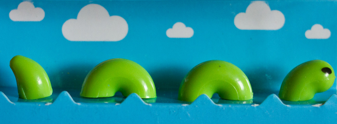
One problem is that the ‘cone’ you insert the pencil into starts to narrow immediately. Other prism sharpeners don’t narrow immediately, but have an area that helps to guide the pencil. This helps to keep the pencil straight, so you can always achieve a point with the same angle. Because there is no guidance for the pencil in the wingnut sharpener it is difficult to hold the pencil at the right angle. For some pencils I got an angle as acute as 24°, for other the angle was up to 37°. This means that you easily end up with an inconsistent angle (wasting material) or with a broken point.

Another problem is that even though the opening of the sharpener is ~8mm, which should be sufficient as the diameter of most pencils’ diameter isn’t more than that, the blade doesn’t start until a bit later, by which point the prism has already narrowed and is too narrow for most pencils.
Is the wingnut sharpener for coloured pencils?
I’m usually using graphite pencils, so I thought this sharpener might be made for coloured pencils, but a look at the ISZ’s sharpener guide shows that the diameter of the sharpening hole should be even bigger if was a sharpener for coloured pencils.

Conclusion
The wingnut sharpener leaves me very disappointed. It is obviously a novelty sharpener, but that shouldn’t mean that it’s unsuitable for most pencils. If it was just a bit bigger it would actually work. I wonder whether this sharpener was designed like this on purpose [2]Maybe the prototype did work with Russian pencils, they might be slimmer, who knows – but did SUCK UK not notice? or whether things went wrong when the plans were turned into the finished products.
I hope I can return the wingnut sharpener and get my money back, next time I visit Paperchase in Manchester.
 Price: January 2015
Exchange rates: February 2015
SUCK UK wingnut pencil sharpener Read More »