Coincidentally coinciding with Chinese New Year: a new addition to my Pelikan flock.
I couldn’t resist CultPen’s Pelikan discount offer and bought the ‘Traditional M120’. Upon arrival I filled it with Diamine Prussian Blue.
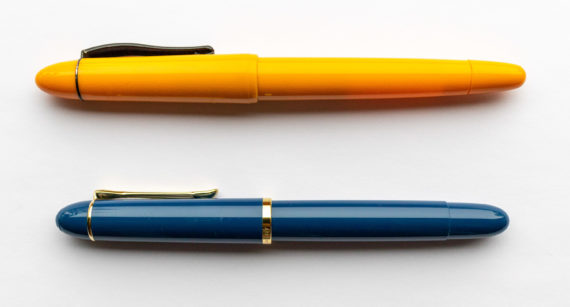
When I showed it to my wife, who usually loves Pelikan (except that blue M205 demonstrator I got in 2009), she compared the looks of the M120 to a Super5 and commented on the price.
When I ordered the M120 I didn’t think of the Super5 at all. Now that I made the connection it is so clear. Yes, they are similar, but putting them next to each other you realise how similar they are.
The colour of the M120 is beautiful, but the Super5 colours are beautiful as well. Pelikan and Super5 managed to find special colours that are the opposite of boring.
The Super5 is much cheaper, so unlike the Pelikan you don’t mind using it all the time. You don’t feel you have to protect it from scratches and the bad world out there. It takes cartridges – unlike the Pelikan which is a piston filler which always feels more high end. The Super5 is also special in a way: it is available without an Iridium point which makes for a nice and different writing experience.
Happy New Year of the Mouse to all Bleistift Readers. Enjoy your pens.
Like many people, I found out about Baron Fig’s 2013 Kickstarter from The Pen Addict podcast (it was episode 71). Back then the notebook didn’t have a name yet.
After the Kickstarter goal was reached the notebooks were sent out, got very good reviews and luckily Baron Fig kept making them post-Kickstarter and even created more products, becoming the Baron Fig company you see today.
I don’t think there’s is much I can add to the existing reviews in terms of new information, so instead I want to give you the European perspective on this notebook.
Importing and Shipping
The Baron Fig is difficult to get on this side of the pond. I haven’t found a shop selling it in the UK, but luckily shipping from the States is actually quite cheap. Postage for the $12 Confidant Pocket, for example, is only $2.95. This seems to be achieved by sending the notebooks through Germany (Field Notes send their notebooks through Sweden). The problem in the UK is that the moment you spend more than £15 you have to pay VAT [1]..but sometimes customs forget to charge you, which usually goes hand in hand with a hefty surcharge, how expensive depends on the carrier. When I was still living in Germany I was less often hit by these charges, but I don’t know whether this is still the case. The point here is that depending on which country you live in there might be unwanted extra charges if you order from the States.
The Count in Disguise
$12 (+$2.95) for a notebook, roughly A6 size [2]The Confidants are all a bit smaller than the equivalent A paper size,[3]..reminds me of the Lichtenberg drawing from this blog post. is not cheap, but once you look at this notebook’s competitors the price seems quite reasonable.
The Confidant on previous cloth bound notebooks
Cloth bound notebooks sell for a premium. They’re somehow even more expensive than leather bound notebooks. The closest competitor for the Confidant is probably the Linen Bound Notebook from the late Count’s [4]Usual disclaimer as mentioned in previous blog posts: He is not really a count. According to Part 2, Section 1, Article 109(2) of the Weimar Constitution privileges based on birth or social status … Continue reading Graf von Faber-Castell [5]Abbreviated: GvFC for easier reading. series, which you can see in this previous blog post.
The GvFC notebook and the Confidant
In fact, they are so similar, the Confidant is basically a version of the linen bound GvFC notebook with rounded edges and perforated pages (that’s where the title of this blog post comes in). I’m not sure whether this is accidental or a result of Baron Fig’s Kickstarter approach of ‘asking people all over the world what they like in a notebook’. The GvFC notebook has been around for a while [6]I am not sure when it came out. I got my first one in 2010, so some of the people asked might have suggested features based on the GvFC item.
In terms of similarities: both, the Confidant and the GvFC notebook are cloth bound and probably [7]I am not 100% sure. The Baron Fig Kickstarter mentioned 100g/m2 paper, but in an email I got from Baron Fig they mention 90g/m2 paper. use 100g/m2 paper. I have mentioned two of the differences already: the Confidant has rounded edges and perforated edges. Other differences are: the Confidant has more paper to choose from (dot grid, blank, ruled), the GvFC notebook has more colours to choose from (five different linen colours), the bookmark is different (width and colour) and most importantly: the price is different – quite different.
Confidant
GvFC
A4 / plus
$22
£30 (~$39)
A5 / flagship
$18
£25 (~$32)
A6 7 pocket
$12
£20 (~$26)
My experience
My Confidant is well made, but not as well made as the Graf von Faber-Castell notebook. Inside: mine has some materials/bubbles under the paper inside the lid, making it uneven. Outside: the cloth isn’t tight around the spine and some pages were not separated properly, as you can see in the video below. Stephen from Pencil Talk had the same problem with his Flagship (A5) Confidant [8]Mine is the Pocket one (A6). .
One way of looking at his would be to say that it shouldn’t happen to a small notebook that costs $12, but on the other hand, the similar GvFC notebook costs more than twice that amount, so the Confidant still seems good value for money.
First I thought my notebook doesn’t lie flat, a problem also described by Discover Analog, but then I realised that the Baron Fig description of ‘Opens Flat’ [9]Found at the bottom of https://www.baronfig.com/pages/confidantbuy" target="_blank" rel="noopener noreferrer">this page. refers to the pages being flat enough to write on, it doesn’t mean that the covers should lie flat on the table.
One more thing to mention about the paper: Andi Talarico from Baron Fig told me that the Vanguard and the Work/Play II use Baron Fig’s new upgraded paper, while the Confidant is still using the previous paper.
The Paper
Graphite Performance
Let’s have a look at the paper in terms of graphite performance.
As part of this comparison I have only compared the paper to Field Notes paper [10]..as they are the paper samples I have redone after discovering the colour base paper shift issue discussed in the Black Ice post..
To find more about how the paper is tested, please check the Ingersoll post.
The violin plots show that this is a great paper: It produces very dark lines of graphite (the violin plot for the Confidant’s paper ends very low) while the paper is quite light and bright (the violin plot starts quite high).
The confidant sample used for the violin plot
Violin plots, Confidant on the left
Ink Performance
Most of my inks are quite well behaved. Not surprisingly the paper dealt well with ink.
So I thought I take some of my slightly less well-behaved inks out, in this case, a waterproof ink, just because waterproof ink often goes deeper into the paper. The images below show that the waterproof ink didn’t bleed through and the reverse side of the paper was unaffected (open images in a new tab to see the high-res version).
Conclusion
To sum this blog post up in a few words: Quality control could be better. The paper is excellent. The notebook isn’t cheap, but good value for money compared to similar notebooks.
Price and exchange rates: June 2017
I would like to thank Andi Talarico from Baron Fig for the review sample I used for this boig post.
Usual disclaimer as mentioned in previous blog posts: He is not really a count. According to Part 2, Section 1, Article 109(2) of the Weimar Constitution privileges based on birth or social status and titles of nobility were abolished in the Weimar Republic in 1919. Graf (Count) is just part of his surname. In reality no one seems to care about this rule though.
I’m currently using my Super5 with the 0.7 nib a lot, but I made one mistake: I filled a Faber-Castell converter with the Aurora Blue-Black ink without checking first whether it fits. Well, the converter is too long to fit, but luckily you can remove the end caps of the new Super5 fountain pens [1]The purpose of this: So that you can create different colour combinations, e.g. a white pen with a red end cap, etc. ..so I have been using the Super5 without the end cap for the last weeks.
The new Super5 without the end cap
Somehow the Super5’s 0.7 nib makes me write quite differently: the writing is a bit bigger with letters being more condensed, not as tall. Well, it makes for an interesting change.
I can’t complain about the paper I’m using either. It’s from one of Rad and Hungry’s old subscription boxes, the Swedish one from maybe five years ago. Excellent paper!
I have used quite a few blue black inks in the past, actually.. for a few year it was my favourite colour – but I have never used an Aurora ink before. Not only that, I somehow I also never really read up on them, so this ink led me into unchartered territory. If you have already used Aurora inks my discoveries will be nothing new to you, but for me this ink provided a lot of firsts. More about them later.
Left to right: Aurora, Mont Blanc (new), Diamine, Lamy (old)
Comparison
I compared the Aurora Blue Black to a few other blue black inks: Mont Blanc Midnight Blue (the newer Austrian version), Diamine Blu eBlack and Lamy Blue Black (the older iron gall version).
On Rhodia paper Lamy’s Blue Black was the most grey ink – and the only one that visible darkened after writing, so the assumption is that other inks don’t contain iron gall.
The Diamine was the most turquoise ink, and the worst behaved – meaning it was best at penetrating the paper and having a cheeky look out on the other side.
Mont Blanc’s Midnight Blue was the most purple and also the darkest.
Aurora’s Blue Black was the bluest of the inks and provided the following surprises.
A lid and a plug…
Surprise 1: packaging
The first surprise came when I saw that the ink bottle was the best protected against spilling in transport I have seen so far.
Not only was the bottle in the box shrink-wrapped, under the lid there was also a plastic plug. I shouldn’t have tried removing it with my fingers as the air pressure in the bottle was different to the one in my environment and I had a right mess on my fingers and on the paper sheet under the bottle.
Surprise 2: a well behaved ink
The second surprise came when I started using the ink.
It was actually a better behaved ink than expected. By that I mean that it prefers to orderly stay on the paper instead of naughtily sucking into the paper and bleeding through. It also seems to dry faster than your average ink ..always a good thing. I do have blotters on my desk at home and in the office, but faster drying inks are just less trouble, plus if you have to use a blotter the bits of the writing where the ink was still wet usually end up looking lighter.
Left to right: Aurora, Mont Blanc (new), Diamine, Lamy (old)
Even on poor quality photocopying paper it behaved very well, only showing signs of bleed through where the nib left a lot of ink on one spot.
On a Field Notes original/Kraft notebook with Finch Paper Opaque Smooth 60#T #Bright White’, the worst Field Notes paper I know it didn’t bleed though either.
One more thing to notice: this ink has some shading (but it’s certainly not the new shading king) and the dark areas are pretty dark. Depending on how wet your fountain pen writes this ink might look either greyish blue or nearly black.
Surprise 3: half erasable
The third surprise came when I tried to write with this ink on a Royal Mail postcard.
Testing on Royal Mail postcards with a Super5 0.7 in Delhi Orange
Having established that it’s a well behaved ink I thought I test it on a Royal Mail postcard as very few inks will work on this treated surface without spreading out across the paper. The surprise here was that the ink started to lose its blue component, as if the post card acts as an ink eraser. I have made a similar experience with the Thank You cards I got printed after our wedding in 2008. The ink on the Thank you Cards I wrote became invisible after a few weeks.
To test what’s going on with the Aurora Blue Black on this post card I tried an ink eraser on this ink. Immediately the blue component started to disappear [1]In many countries pupils have to use ‘Royal Blue’ inks which are erasable with chemical ink erasers, originally invented by Pelikan. When I was young they were called in killers and were … Continue reading.
Rinse time
To finish it all off I had a look how these inks behaving after enjoying a refreshing rinse under a cold water tap for several seconds.
Left to right: Aurora, Mont Blanc (new), Diamine, Lamy (old)
The Aurora ink suffered most. Virtually all of the blue seemed to have washed away with only the grey component remaining.
Unsurprisingly the iron gall ink seemed least affected, but it is of course harsher on your writing equipment. Well, not to put your fountain pen written documents under running water shouldn’t come as too much of a surprise, though.
Conclusion
The Aurora Blue Black is a great ink. You get some shading, you get well behaved, and you get a nice colour, serious but not too boring.
I hope to have a closer look again after having used this ink for several months.
I would like to thank Kirit Dal for sending me this ink. I think he might be the first seller in the UK to stock this ink. I have been told that he is well known at pen shows in the UK, but I haven’t been to any pen shows yet, so haven’t been able to meet him yet in person.
In many countries pupils have to use ‘Royal Blue’ inks which are erasable with chemical ink erasers, originally invented by Pelikan. When I was young they were called in killers and were very common. You usually can’t use normal ink to write over the erased ink. Instead you use a special ink from the other side of the ink eraser. There used to be better ink eraser you can write over with normal ink. These were available around the year 1990, if I remember right, but I haven’t seen any like that in a long time.
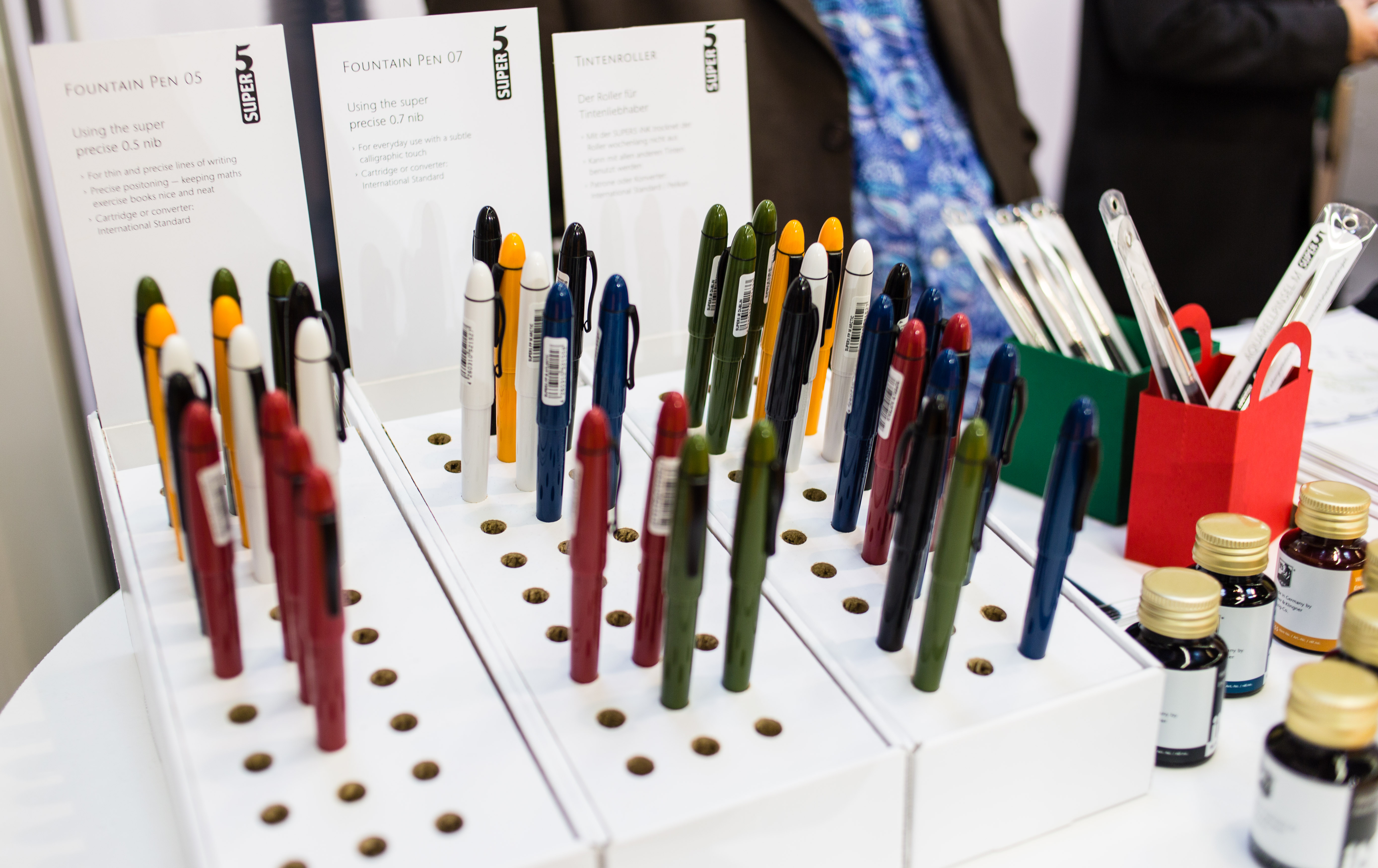
Super5 presented their new fountain pens, the 07 and the B) at Insights X. They belong to Papierlabor / Format from Darmstadt in Hesse (not to be mixed up with Austrian paper manufacturer Format Werk).
Additionally to the 0.5mm nibs they now also sell 0.7mm nibs, M nibs (1.0mm) and B nibs (1.5mm).
Like the 05, the 07 version has no iridium point – that’s what gives the Super5 the very different writing experience and style. The M and B versions do have iridium points, though.
Robert Neumann, the man behind the Super5 fountain pen.
Some sources on the Internet suggest that there is no iridium in fountain pens’ iridium points, e.g. this article, but when I asked at the stand about this I was told that there is in fact iridium in the iridium point of the nibs.
Also available at the stand were Super5/Papierlabor’s waterproof inks, their ink cleaner concentrate and their new brush with soft synthetic fibres.
Super5 fountain pens
When you see the new fountain pen colours on a screen they look good, but in reality they look absolutely amazing! Especially the blue and green versions, but also the yellow one look just so good to me.
Robert Neumann, the man behind the Super5 fountain pen, also told me about the flex nib verison of the fountain pen they are working on, together with JoWo. I love flex nibs, so I am definitely looking forward to their new fountain pen.
Super5 ink
By the way, the new pen bodies don’t have the logo printed on the body anymore. Instead they are embossed. I preferred the old look, not only because on the new body you can see on the outside where the thread is, but everyone has a different taste.
Top: the old Super5 body with the printed logo Bottom: the new body with the embossed logo
You might remember my leaky Super5. Luckily I got it swapped for another one.